Showing posts with label American Crafts. Show all posts

Sunday, January 27, 2013

Sketch it Out! My Bat Mitzvah Journey Begins


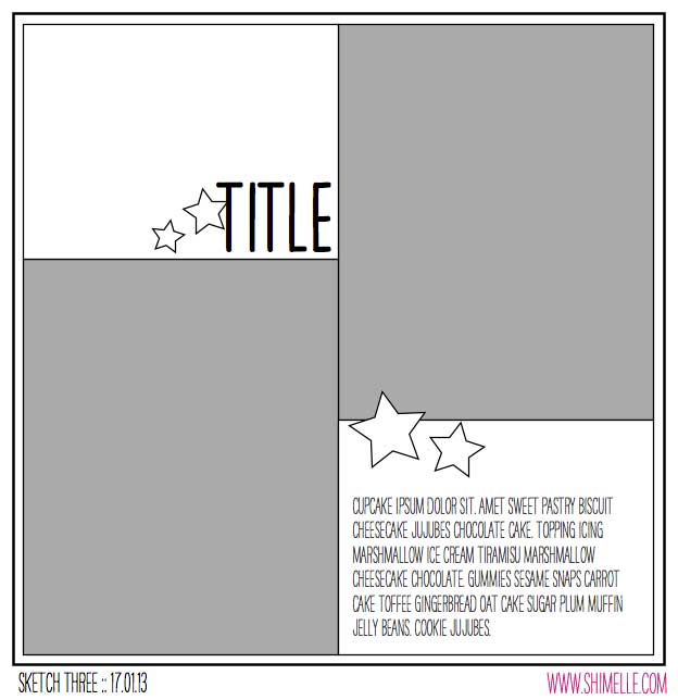
scrapbook sketch by shimelle laine @ shimelle.com

If you are looking for the Scraphappier LOAD213 blog hop, check here.

First of all, I am not Jewish. Second of all, I am not coming of age. My best friend is planning her daughter's Bat Mitzvah and I have been asked to create a scrapbook album all about the young lady in question. I feel very privileged to have been asked. E is a very special young lady. I often see a bit of myself at that age in her, though of course she is uniquely her own self. I regard her, more as a niece, than just as my best friend's daughter. I want to ensure this album is extra special. I have begin making tentative plans with E's mom about what it should include.


E's mom is planning on sending some photos my way, but I wanted to get a headstart on the album. It's not something I want to leave to the last minute. E and her friend's seem to think that I am a cool enough mom to be part of their instagram accounts. The coolest part of this are the photos I get to snag from the accounts. Though they are not always the highest quality, I get photos that are not staged and that truly reflect E right now, interacting with her sister and her friends.

A Girl Named E_______ by Christy Strickler Supplies| Cardstock: Colorbok; Patterned Paper, Alphas, Stickers, DieCuts: American Crafts; sketch from Shimelle.com


I chose a sketch from Shimelle.com. Originally, the sketch called for two photos, each in their own quadrant. Instead, I chose to place patterned paper and to then place a single photo over it all. After that, you could say the embellishments just fell into their perspective places.

Yes, I know the journaling is missing. I am purposefully doing that on some of the layouts for the Bat Mitsvah album. I am hoping to have friends or family comment on some of the layouts later on. You will also notice that E's name is covered. I will be sharing the layouts I create for this very special album. However, I don't have permission from all of the kid's parents to share their photo. To protect the kids, I will be covering names and sometimes faces from time to time.

Since I don't have all of the photos's from E's mom yet, I am still in the beginning phases of planning the album. I do want to include some of these instagram shots, but I am not sure what layouts will make the final cut. I figure more layouts than less to choose from will be better. Plus, what mom isn't going to love getting extra layouts featuring their kid?!?!


Enhanced by Zemanta

Tuesday, January 22, 2013

Sketch it Out! Back to Big Photos


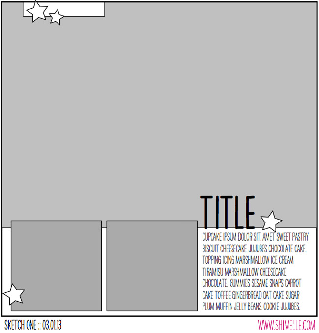
scrapbooking sketch by shimelle laine @ shimelle.com


It's been a busy month for me. This week continues to be a little hectic. Being on creative team can keep you cranking out layouts in between the moments when you step into your role of wife and mom. Sometimes, I need a creative timeout. So last night, I took a little break from writing tutorials for Scrapbook News and Review Magazine. I needed to recharge myself a little. Sometimes using a sketch does just the trick. I can sort of put my mind on creative cruise control and just plug in the elements the sketch requires.


I chose a sketch from Shimelle aka Glitter girl. Once again, I find myself using a nice big photo. Scrapping with big photos may seem hard to do. However, that one photo takes up a large amount of real estate on your canvas. This means you need just a few little embellishments here or there and before you know it, the layout is complete. The trick to working with a large photo is finding the right one for the spot. Then it can work alone or with a few smaller supporting photos.

The photo of  my son in the paint brush art car fit the bill nicely. I also just happened to have two supporting photos to fit into the sketch. Choosing the photos took up the longest chunk of my time. The rest of the layout is very simple. There are a lot of bright, bold colors featured here. I used a black canvas to keep the layout from becoming too wild. I also chose to keep the embellishing low key. I was able to create this layout in under an hour.

Adventure in Art by Christy Strickler
Supplies| Cardstock: Colorbok; Patterned Paper, Stickers, Die Cuts: Amy Tangering for American Crafts; Button: Basic Grey; Alphas: Sassafrass


I am often asked how I am able to create layouts so quickly. It took a little time to let myself learn that I could create quickly. Sketches make it easy.Learn to use them and to adapt them to fit your style and supplies. Having kits ready to go is also a big help. I have my supplies organized to enhance the way I work. It took time for me to learn about my creative process. I also had to accept who I was as a memory keeper. In doing so, I was able to tell myself that not every layout I create has to be complex. So now, when I have just a little time for a creative time out, I can create quickly with the satisfaction of having a layout, not only done, but adored.

For more inspiration for using Big Photos on your next layout, check out my Big Photos Pinterest Board.


Enhanced by Zemanta

Tuesday, November 20, 2012

Kitten Cuteness- Scrapbooking my Latest Photo Trend

Right now, one of my favorite subjects to scrapbook about is our new kitten. I have noticed that the topics I document follow trends. I will use photos of the same theme for several layouts in a row. I tend to get inspired by one topic and I come up with ideas for different ways to scrapbook that theme. Sometimes it's all about my son and his homeschool. Sometimes my pets.

Kitten Cuteness:Totally Photogenic by Christy Strickler Supplies| Patterned Paper, Brads,Die Cuts: American Crafts; Alphas: My Little Shoebox, American Crafts; Tape, Doilies: Recollections
Layout created for the Sketch of the week at Scrapbook News and Review Magazine's Blog;
Shared at the Purple Mailbox for Layout linky Love


This method works well for me since I tend to have groups of similar photos over a span of time. Think about how your photos inspire you and use that to your advantage.


Enhanced by Zemanta

Sunday, June 24, 2012

American Crafts Knock Out Punches- reviewed

I recently got to try out the American Crafts Knock Out punches. I received them in a carry style case with 6 interchangeable punches:
image from American Crafts
 I was a little concerned at first how the quality would compare to other punches on the market. However, the punches are pretty sturdy and the wing guides are easy to change in and out without fear of them breaking(especially for a clumsy person like me). For the price( especially if you can find a kit on sale), this would be a great way for someone who has very few punches to grow a collection.

What I Liked: easy to punch with, compact and easy to store,the carry case makes them easy to take to crops, not heavy like some punches are but still durable, good price as compared to other punches on the market

What I disliked: nothing really, although it might have been nice to have something to catch all the tiny paper scraps from the bottom of the punch

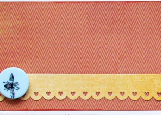
I made a layout for Scrapbook News and Review magazine with the punches. It's grid based, so I though I would share a sneak of one grid section:


Overall, I think this is a great punch system. I was excited to see other punches for this system available on American crafts website. I hope they choose to offer those in a kit as well, although the individual price per punch is still pretty good.

Friday, May 18, 2012

Load 512 Progress report

It's Friday! For the past few years, Friday has been my favorite part of the week. It means that when my husband comes home from work, there is nothing to do except for enjoying time as a family, scrapbooking and playing video games. This weekend is going to prove a bit challenging for me in regards to LOAD. Diablo 3 came out this week. I have been able to complete my pages in the early mornings, but now, with the weekend, Hubby is going to expect that I play this game with him. Quite honestly, I do want to play. Even my son can play with us. With rain in the forecast for the whole weekend, what better way to spend the weekend. The problem being, that hubby and I will most likely be playing the game pretty much non-stop. I know that sounds excessive, but you have to understand that this game has literally been a decade in the making. For fans like us, the Diable 3 release is EPIC. I guess I will be scrapping during the game's load time sequences. LOL It takes a long time to finish a page that way. However, you'd be surprised how doing a little thing here or there adds up to make a whole page. Last night, I stitched on an LO every time the game had to stop and load. Consequently, I have a page pretty much complete this morning.

As for the page I am sharing with you today, I must confess that part of it was made before hand. I started making base pages earlier on in the year. It's sort of a creative jump start for me. I play around with stamps, paints or found items in the house to see what effects I can get on paper. In the case of this layout, I had stamped with the bottom of a yogurt cup and some yellow acrylic paint.

Cardstock: Colorbok; Patterned Paper: American Crafts; Alphas: Sassafrass; Other: Buttons and ribbon
The daily prompt had been to use something from the trash. Since I had made this page a little while back,  and with the use of a yogurt cup rescued from the trash, it certainly fit the bill.

      It's a page made in under 30 minutes with a minimal use of supplies. Quick pages like these are another great way to jump start your creativity. I suggest choosing photos that don't have a great significance. You would not want to do a 30 minutes page of your wedding day( or maybe you would, but not me, I want it detailed and extravagant). These quick pages are also a wonderful way to use up scraps or spare supplies laying around on your desk.

I had taken these photos of my cat laying on my desk when I was practicing with my camera. Yep, you guessed it...another creative jump start for me. I am not a great photographer. So I like to practice and try things out with my camera settings. I end up with sets of photos like these that don't have a specific story to them. In this case, I did journal about practicing with my camera. However, you could easily use photos like these to tell a story about the subjects personality or to document a story for which you do not have any photos.

Ok, so now I am off to make my LOAD page for today. Ideas are already brewing in my head. I'll check back with more LOAD progress after the weekend. let's see of I can play my game and make my pages. Only time will tell!

Tuesday, May 15, 2012

Been Caught Napping

Do you ever get some paper or supplies and think " What in the world will I ever use this for?" I'm sure you have. Sometimes it comes in a kit. In this case, mine came in a mystery box from My Little Shoebox. I got several sheets of pastel laundry themed paper. I rarely scrap in pastels. I also had no wish to scrap about my laundry. Or at least I thought I didn't. Then I found Ju Ju Bee napping in the laundry basket. She might not have been too thrilled about waking up to have her photo taken. I was quite happy though. I now had a cute photo and the perfect paper to go with it.
Carstock: Colorbok; Patterned paper and die cut: My Little Shoebox
alphas: American Crafts; chipboard: KI Memories; Stickers: Colorbok
jewel: Imaginesce; brad: Basic grey; mist: October Afternoon
Other: canvas, wire hanger; Sketch: Lain Ehmann for LOAD512
To add to the laundry theme, I hand drew and cut a shirt out of canvas. I dyed it to match the papers with some October Afternoon mist. I decorated the shirt with some faux stitching and a flower sticker. The page came together quickly with the use of a sketch. Since the paper was double sided, there was no guess work in choosing what I needed. There is only one big draw back to this page. I hate giving away papers or throwing out older stash. I keep trying to convince myself to do so. However, this page seems to support the  argument to save everything.

Wednesday, March 28, 2012

12 tags of 2012

  I must admit, that I did not do one for February. There was just too much going on. I decided that I MUST try the one for March. Quite honestly, tags are not my thing. I like making them. I just don't remember to use them on my pages. So, I decided to make a 4x6 card for my March Project life pages. I know it will get used!
Kraft cardstock base, American crafts stamp
Stazon ink, chipboard, stickles
various stickers, glossy accents
Making Memories Alphas
I ended up making four leaf clovers out of chipboard. I hand drew them, then cut up a few stickers. Since I did not have the same embossing powder Tim used, I substituted stickles. I think it will be a nice addition to my March Project life page. Now, I just need to finish the February PL pages so I can start March.

Saturday, March 10, 2012

What's Your Trend?

 I recently realized that I have certain techniques that have become trends. I am not necessarily talking about industry trends. I am talking about the trends you may see in the way that you work. I have tried a lot of new things over the past year. Some of those things have become staples in the making of my scrapbook pages. Misting and paint are one of those. I hardly make a page on which one or both are not present. So much so, that many of my friends now identify a page as truly me when they see the mist and paint. Last year, I really felt the need to hand stitch on quite a lot of the pages I produced. I now find that I am not hand stitching quite so much these days. My latest love is to use pen to outline the letters on my titles. I saw it done during a Masterful Scrapbook Design Seminar. Now I hardly feel a page is complete without it.
Let's Scrap sketch 1-4-12 ribbon-jillibean soup, glimmer mist-fairway,sapphire and tiger lily,SEI ink blue ink, Fancy pants to the moon papers,Amer. Crafts thickers-orange alphas,My little Shoebox tiny type alphas, Sassafrass green alphas, K and co. star chipboard sticker. superhero bands- from our egg dying kit, tags made with toilet paper which was embossed, inked and cut to fit the tag.
Who knows which techniques will become a regular part of your design style or which ones may become your scrapbook trends. The important thing is to observe your process. As you do so, you will learn more about who you are and the things that work for you. This will be a big help in developing your confidence and in making your scrapbook budget go farther. You will know which supplies to buy, because you will know the supplies you use most. So now, take a look at your work and ask yourself what your scrapbook trends are.

Saturday, January 21, 2012

A Slightly Sour Adventure

  Last Easter, we took my son to a carnival at a local resort. There were a lot of great games, arts, crafts...and the opportunity to fill the bottle of your choice with powdered candy. What child could resist that?!?! There were a variety of flavors to choose from. Some sweet. Other sour. We advised my son not to choose the sour. He is not much for sour candies. Inevitably, some sour candy was put in his bottle.
    I'd like to show you his reaction to the candy. I did photograph it. Not to tease, but, I must say that I loved his reaction! Alas, it's part of my chinese whispers page for Club CK which I can not yet reveal( stay tuned). So for now, I will just share page one with you. I made it for the new CSI challenge group and I used some of the materials from my January Counterfeit kits. At CSI, you get a folder or case file like this one:
                         
Then you use it as inspiration for your page.It's sort of like a recipe challenge. Anyway, it provided a great jump off point for my page. The colours reminded me of the powdered candy. My counterfeit kit had yellow and turquoise papers in it. I felt like I could add some mists and embellishments to warm those colours up and meet the challenge requirements for CSI.
Creative Scrappers Sketch#198
Papers by sassafrass, pink Paislee and October Afternoon
DMC floss, Iroc jewels,
Ruby Rock it button
Little yellow Bicycle- tiny alphas and purple glitter alpa
Amer. crafts thicker-forest
salvaged ribbon
fruit punch stickles, pink paislee die cuts
  The title was inspired by the idea to document an adventure. The full title reads " Sandy Candy: a slightly sour adventure for the tastebuds."  The idea of using advice in the journaling set the stage for the story I told about my son and the sour flavors.
  That sort of odd looking thing under the title...well, it's a mask of sort. I made it from the top of some packaging. It's the part that would hang from a hook. I cut it out a bit more. I am not sure it it counts at the architectural element.It sort of looked architectural to me in an artsy sort of way. Regardless, I sort of liked how quirky it looked. I used this moss coloured glimmer mist which looks more blue green to me than deep green. I know I only really needed two pieces of evidence...but I did manage to get some other items from the evidence list on my page. The circles were cut from a sort of purple sheer ribbon. I hand stitched the swirls and added flowers and gems( my version of stones).

   Once again, I have managed to add some of my nemesis colours to a layout. I don't much care for yellow. Pink and purple are hard to get onto boy pages. On this page though, they had a little meaning. This carnival was at a resort hotel. So the yellow and turquoise remind me of the warmth of that day. Those colours, along with the pink and purple, are also colours of the candy. So it all sort of fit together. Adding the black to the page gave it a little masculinity. Overall though, it was the theme of the page that drove me to choose the elements that went on it. Proof positive that a page with a boy can have girl colours and flowers without being feminine.

Saturday, September 24, 2011

Scrap Our Stash On the Grid Challenge


When most people think of a grid design in scrapbooking, they tend to think of photos and papers evenly aligned. Yet here I was, painting wayward lines in a grid pattern on a piece of cardstock. The lines came first, and then came the photo. I began placing page elements around it...some floating free, other held fast with a bit of hand stitching. The placement is sort of haphazard with a plan. Fussycut items are anchored to the grid while the eye flows across it. The page reminds me of how my cat was rolling across the rug...and I hope it gives a sense of motion as you view it. I myself can see him now, wiggling and moving, pausing just long enough to shoot me that imploring look.

We R Memory Keepers papers- grandma's kitchen
K and company yellow frames- cut apart
acrylic paint
dmc floss
Kiasercraft tiny type alphas
Pink Paislee alphas
Colorbox chestnut roan ink

  In the making of this page, I have come to realize two things. 1. I almost  never use a frame as a frame. I almost always cut it apart. Sometime earlier this year, I came to the realization that I am allowed to alter and use the items in my stash as I want to. So if there is something in your stash, like a frame, and you want to cut it apart or change the colour of it, go for it! 2. One of my favourite tools is my hole punch. Yep, just a cheap school supply style hole punch! It works wonders on many pages. In this case, I punched out tiny stars from the patterned paper and sprinkled them on my page.

There is still plenty of time for you to try out the grid challenge at Scrap Our Stash. We would love to see tour work!

Saturday, August 20, 2011

To See My World Before My Eyes

   This was one of those incredible photos that just begged to be scrapped in a special way. It captured my son as he beheld the beauty of the mountains around him, something that a kid raised at sea level could really be amazed by. I feel very lucky that I got this shot. I would like to say it was intentional. However, it's one of those pictures that are discovered and coveted, hidden like a treasure amidst the photos on the camera's memory card.
  So now, with this awesome photo in hand, came the job of figuring out just how to scrap it. I wanted it to stand out from others in my album. While I love the myriad assortment of winter themed papers and embellishments in my stash, they did not quite capture the spirit of the photo. This then, leaves me with an argument I find myself facing all too often lately...why buy such themed papers? I guess I will address that later. After all, I rarely let go of anything in my stash. I was drawn to it, and so, I eventually find a use for everything. Anyway, back to the photo...
  I have long been drawn to winter themed paper kits with unusual colour palettes. Sadly, I have none in my current supplies. Given a colour challenge at Club CK to use orange, brown and pink, I chose to reach for my Crate Paper Pink Plum collection. I figured that I could use my Martha Stewart snowflake punch as a way to theme the papers as needed. I also had some word art in mind for the page. The only problem...it was yellow and orange. The yellow completely clashed with everything else I wanted to use.
Original Marcella K chipboard word art before I altered it.

In the past, I would have sighed and put the word art away. I would have kept it for another day when I found the right paper to go with it.Now that I have figured out there are no rules with my stash, I grabbed some pink paint and a detail brush. Three coats later, the word art is looking more like it belongs with the papers I chose. The paint was a little dull and the orange was lost in the pink. So I used a woodsy brown bic mark it to edge the letters and then covered the whole thing in a coat of glossy accents.
  The page itself took form quickly thanks to the kit and a Sassy lil Sketch. Inspiration from Scrappin to the Music's challenge #178 shaped the title. I ended up with a page I loved. One with a variety of texture and tone which perfectly match the story I wanted to tell.
Sassy Lil Sketch 8-16-11
Crate paper pink plum collection-papers, brad, die cut and sticker
Making memories ribbon and trims
Martha Stewart snowflake punch
colorbox chestnut roan ink
American crafts rub on alphas
Acrylic paint-baby pink
clossy accents
Marcella K chipboard title

The warm, vibrant colours match my son's snow suit as well as conveying a bright happiness. The texture of the trims remind me of my son bundled into the snow suit. Snow flake embellishments remind me that we were in the snowy mountains. Best of all, despite the pink in the colour palette, I don't find the page to be feminine. I love when I get to use pink on a boy page!

Friday, August 5, 2011

My August 2011 Counterfeit Kit

  I must confess that for this month's Counterfeit Kit challenge, I sort of just did a grab and go type of thing. I am in the middle of packing for a move. We are not moving far, but far enough. ;) Anyway, my hopes are to still be able to play with my stash while we await for our moving day. So I am trying to pack my supplies in such a way that I can still use them. Since I have been busy packing, I really did not have a lot of time to dedicate to making kits. I chose to grab some of my pre-packaged kits to which I then went overboard adding embellishments. I think I have enough variety in them to work with plenty of photos in various themes.
  I decided that it might be a good idea to work some more on my wedding album. I started it last year. I hate to admit it, but it's been a little over 13 years since I was married. I really didn't start scrapbooking until my son was born. His birth and the invention of the affordable digital camera really pushed my scrapbooking career( along with my husband's encouragement). Last year, I had gotten Basic Grey's periphery collection pack. Many of it's papers will be perfect for my main kit and for scrapping my special day.
Main Kit contents:
Basic Grey Periphery collection pack
pink paislee  Parisian anthology trims
crochet doily- from a thrift store
unknown ribbons
Pink Paislee Queen bee flip notes
My Mind's Eye clock die cut
American crafts chipboard shapes thickers
Studio Calico Journal card
Prima say it in crystals
beads- from the craft store
K And Co. Elizabeth Brownd metal art frame
maya road chipboard album
sassafrass vintage brooch

And while I am at it, I might as well have a go at my honeymoon photos. I have not yet touched my Treasure Box Club kit from last month. It has the Basic Grey Out of Print line in it. I figure that it's whimsical patterned papers might be a fun way to scrap our trip to New Orleans. I did add a few items to the kit. I can't help but add stuff sometimes. ;)
Limited Edition kit contents:
Basic grey's out of print papers: 2nd edition, daily news, reprint
publication, bits n pieces, special feature, batik and giclee
Amer. crafts mini jewle brads
Fancy pants die cut- damask Floral
7 gypsies metal tags
Amer. crafts pink check ribbon
Amer. crafts thickers- by the yard fabric letters
music fabric
Prima Flowers
7 gypsies Numero tissue paper
K and Co. chipboard frames
Making Memories Sabrina frame-pink
7 gypsies foldover stickers in classic black
7 gypsies train tickets
Studio Calico journal card
Prima say it in pearls
Pink paislee bayberry cottage cork buttons
Twinery twine in carribbean
Making Memories simply stated alphas
Glitz designs metallic rub on- damask
Webster's pages fabric flowers

For the album kit, I decided to just use last month's Fourth of July kit. I loved the kit I had made and I still have a few photos I did not get to scrap with it. I could have made a birthday kit similar to what was shown, but  the Fourth is America's Birthday...right? So to save time and scrap the photos I am motivated to work with, that's what I chose to do.
Album kit content:
Sassafrass papers and cardstock stickers from the cherry delicious line,
also from anthem and Life is Beautiful
October afternoon paper- from modern homemaker and road map
Cosmo cricket garden variety paper-sunshine
Basic Grey sticker trims-basics
Webster's pages flowers
Jenni Bowlin bingo card
prima flowers
K and Co. transparencies
Unknown ribbons
twist ties-recycled from my husband's dry cleaning
My Mind's Eye lost and found die cut
Simple Stories die cuts

Since life right now is going to involve a new home and also because I still have Easter photos to scrap, I chose Crate paper's neighborhood collection for my Creative kit. I felt it gave me a nice variety of papers for various topics. Finding embellishments to match it also came quite readily for me.
Creative kit contents:
Crate Paper's Neighbourhood collection pack
unknown die cut
Making memories Paperie greenhouse felt clips
Webster's pages princess petals
Craft Affair brads
Webster's Pages Designer threads
Making memories Chloe's closet frames
Making memories Spring pebble clips-butterflies
Maya Road felt badges-birds of a feather

When I saw the Theme park/fair add on kit, I knew exactly the one to use...my new echo park Summer days kit! I have some photos I have been wanting to scrap about us at a small fun park. I can't wait to see what the challenge will be for this kit!
Theme park kit contents:
echo park Summer days kit pack, chipboard and rub ons
doily- from Ikea curtain section
making memories Chloe's closet stick pins
sassafrass felties
Sassafrass in stiches clossoms in: kelly green, orange and kraft


Last month, I managed to make 7 layouts with my kits.I had so many ideas for more pages, but life had other ideas for me. I have managed to add past kits and past kit items to my August selection of supplies. I hope I can use up some partial packages and add to my page count for this month.

Tuesday, August 2, 2011

Quite the Trip!

    I will start off with a confession. I have an addiction to travel themed papers. This means that I have several travel theme paper collections, in their entirety, waiting to be used in my stash. I think I have more travel paper than I have trips to take. So either I need to take more trips or I need to find a way to use this paper up.( The same can be said for Halloween themed papers and pet papers, but that's a whole other post or two) So, now that I have that out of the way, I am happy to say that I have two travel themed pages to show you today. Two is a start in using stash up, right?
  I am very lucky, in that, when my husband travels he takes us along with us whenever he can. Earlier this year, he had a business conference in Aspen, Colorado. My son and I were very excited at the opportunity to see snow. Living in a warm climate means that snow is a wonderful, rare thing and not the hassle those who live with it know it to be. So I booked the tickets, knowing full well that travelling from where we lived to Colorado would take four connecting flights and an entire day of travel.
map by Little Yellow Bicycle
Arrows and patterened paper by Best Creation
7 gypsies brads
DMC floss
black alphas- Americna Crafts thickers
Making memories rub ons and rub on alphas
Prima e-line pearls
We R Memory keepers chipboard tag

I have had this wonderful map paper by little yellow bicycle for awhile now. I had the great idea of using brads and hand stitching to document our flights. This is one of those pages I just made. By that, I mean that there was not a big plan. I had a sort of idea and then just began putting stuff onto the page. It may not be perfect, but it's a page done. The process of doing a page like this is also very freeing. I find that when I am stuck and can not get myself inspired to scrap, making a page in this manner sort of opens the creative flood gates.
  Now that the creative flood gates were open, page two was completed in a snap. I saw this Sassy lil Sketch and the elements I wanted to use came together quickly and easily from my July Counterfeit Kit.
Sassy lil Sketch 7-14-11
Scrapfit workout #49-put a banner on it
We R Memory keepers papers and stickers
Making memories rub on planes


I wanted to document how light we chose to travel. So the suitcase paper worked well. I cut the subtitle from the name of the paper. I always check out the paper edges for small sections of pattern paper or words that can be used on pages.  This was one of those rare pages in which the only card stock used was to matte one of the photos. As a time saver, I cut the two wallet photos directly from the printed sheet leaving white edges from the photo paper for the matte.
  Traveling light had been an essential part of this trip. With four connecting flights between two airlines, our suitcases would have never made it safely to our destination. Our return trip was not much easier. We had three connecting flights with a ten hour layover in one airport and an overnight red eye. It was important for me to document how good a travel companion my son can be despite hard circumstances like that. He actually was a lot less cranky than I was. I had initially wanted to take photos of him at each airport. However, in some instances we were so busy scrambling to grab a meal or get to the next flight that this was not feasible. So I simply made sure to journal about our experience. Photos are not always necessary to tell the story.
  The next time you are feeling stuck or overwhelmed by the prospect of scrapping, relax and just begin putting stuff down on the page. You may end up loving what you create. You may learn a little more about the process you use when you scrap.Most of all, you will find your creative streak again.

Sunday, July 24, 2011

Wedding Day Sandcastle

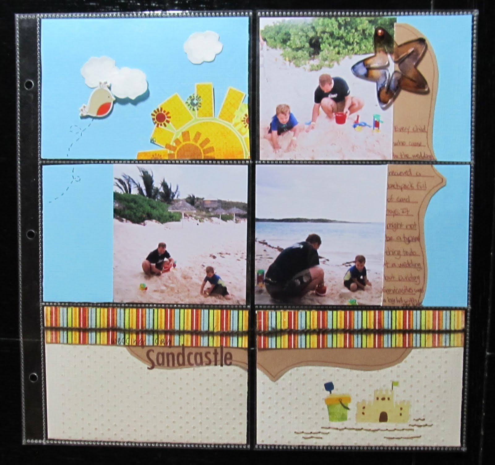
    A few years ago, We were invited to attend a beach wedding. It was a lot of fun, though I will admit it felt very odd to attend a wedding dressed in a bathing suit and beach attire. My son thought it was awesome. He hates to dress up. The bride also made sure all of the kids who attended would receive a backpack of sand toys. The sand toys kept all of the kids( and my husband) occupied while we awaited for the wedding to start. It was a definite win-win scenario!
   I left my camera at home since the wedding was at a beach. I opted for some disposable waterproof cameras as I had no idea what we might encounter in regards to sand and water. When I began scrapping these pictures, I decided to try some of the 4x6 pocket sleeve style page protectors rather than the traditional 12x12. I had received a package of them for free with an album purchase.I figured this would be a great opportunity to use them since the photos were all standard 4x6 prints. I found there were a lot of pro's and cons to using these page protectors. You really need to plan where these will go in your album as the pockets are on both sides of the page protector. Using the photo sizes the pockets are intended for makes things a lot easier. I think If I had used one of the kits, like the simple stories line, which are designed for these types of page protectors, I would have had a much easier time. Once I got going though, it made for a quick and easy page.
Items from my July counterfeit kit:
Fancy Pants Paper and rub on's
Making Memories alphas
not from kit:
Jillibean soup twine
dmc floss
DCWV chipboard bird
Studio G stamp in white inke with clear embossing powder
Coredinations CS embossed with swiss dots folder and sanded
Colorbok CS
Maya Road Acrylic starfish coloured with eggplant and ginger alcohol inks

I did crop the 4x6 photos down. Not cropping them would have allowed me to just slip them in the pocket. I also chose a Pagemaps sketch, which meant it took a little more time and thought. For a faster page, I could have just decorated 4x6 cards and journal spots and slipped those in. On a positive note, I was able to use scraps for almost the entire page!

Shown above, are the backs of some of the 4x6 blocks. The white sections are the photos. You can also see how I covered page scraps that would otherwise have had gaps or sections missing with other pieces of paper layered over it.
 I could have left the tan paper and white clouds plain. However, embossing them gave just a tad more texture to the page. The sand coloured Coredinations cardstock was embossed with swiss dots using my texture boutique. I lightly sanded it to reveal the slightly darker core colour. I chose to use white ink in a cloud shaped stamp with clear embossing powder to add a subtle lining to the clouds. While these would have been just fine plain, this tone on tone embossing gives it a more finished look as does the hand stitching under the sand castle rub on.
 Now that I have the hang of working with these type page protectors, I will certainly consider using them more often. I think I will try some soon with one of the kits that are designed for these. Maybe then, I will find I like them even more than I do now.
 

Monday, July 18, 2011

Cool...Like a Fool in a Pool

  It's a fun title. The rhyming sing song chant of it sort of gest you amped up for a fun scrapbook page. It's one of the rub on titles from Fancy pant's beach bum line. It was perfect for these shots of my son and husband in the pool. My son was actually being quite the silly fool on this particular day. Apparently, it's quite fun to swim underneath a waterfall...which he then decided to do over and over again. I guess it's a kid thing. My favourite part about these photos is how my husband is always nearby and smiling. He's not one to pose for photos very often ( partly because I take too many photos). Quite truthfully, these are candid shots of him watching our son...which makes the shots all the more special to me.
  I went a little out of my comfort zone for this page. I chose to try some free collage software recommended by Club CK. It's called Photovisi.You just go to their website, pick a collage and add photos. Then you can move your photos around and edit it.After you are done editing, you save the collage to your computer and print.The only downside is that when you print your collage, there is a small watermark on one corner. I cleverly hid it with the ric rac trim and swimsuit style banner.

Making Memorie sabrina frames, cut and painted turquoise
dmc floss
twinery twine in carribbean
Fancy Pants paper and rub on
maya road Ric rac
Basic grey brads

The rub on and swimsuit trunks are from my July Counterfeit kit. I fussy cut those swim trunks from some of the fancy pants paper. The photo corners were my son's idea. I had scraplifted this page from Kathleen Summers ( see her page here- Fabulous 4th). Her page has photo corners. looking through my stash just did not reveal the right thing. I had this MM frame from the Sabrina collection and my son made the comment that it was a shame it wasn't blue. This gave me the great idea to paint it with turquoise acrylic paint. I cut it apart and did just that. It left enough pieces for use of my second, complimentary page.

We R Memory Keepers chipboard sign
Maya road chipboard brackets with yellow acrylic paint, gold pen, and diamond stickles
We R Memory keepers eyelets
ATD sticker
American crafts rub on alphas
basic grey brads
  This is a page of my own design. I placed the photos, in what seemed to me, a pattern that reminded me of the slide's shape. I also chose the road sign for that reason. I used scraps from the previous page with more fussy cut swimsuits. I wanted brackets to match the sign, so I painted them yellow and used gold pen.
  I can feel really good about these pages because I used up several things from my stash that, before now, I had no clue what to do with: the frame, bathing suit patterned paper, and the road sign. Combining the travel and beach theme in my counterfeit kit really helped me see these products in a new way.

* also submitted at Scrapfit for WWU#9


Sunday, June 5, 2011

June's Counterfeit Kit

   It's that time again! Like a little kid, i have been eagerly awaiting the reveal of this month's Counterfeit Kit Challenge. While a part of me know's the things I will be using are already a part of my stash, another part of me is excited. Putting these kits together is almost as exciting as receiving a kit club in the mail! Those of you who have followed along with my other kits will not be surprised to see that, as usual, I went overboard as I shopped my stash. My only justification for that is that A. I did not spend any money in the making of this kit and B. I always intend on getting the most that I can out of it. Last month, I was able to make seven pages from my kit's supplies. This month, since I have no plans to travel and DH has a few paid holiday to burn, I hope to get even more pages done. Let's see if I can top seven pages.
   As for the kit itself, It may be a bit of a challenge with so many floral accents. Since the kit is styled after Burlap and Buttercups June 2011 kit, which has a slight summer tone, I am hoping I can utilize these summer florals in some masculine pages by playing up the colour palette. I got as close to the kit as I could in paper pattern and colour. I chose not to use any butterfly accents. Should I make any pages where I wish to use a butterfly, I shall cut one out of the Patterned paper from the kit.
Papers: turquoise- from the Best of K and CO.
Basic Grey basic-ledger
Crate paper restoration-Slip Cover
Crate Paper restoration-doilies
Sassafrass- Indie Girl-Pocahontas
Pink Paislee 365 degrees 6x6 pad
frame- Making Memories Chloe's Closet
Maya Road chipboard album-classic scroll frame
Maya Road Signature ribbon/trim in blue
Twinery Baker's Twine in Pea Pod and Caribbean
Sassafrass In stitch blossoms in kelly green,kraft, and vintage rose
Jenni Bowlin die cut journaling cards
Scenic route Garden grove laebls
Little Yellow Bicycle stick pins
Fancy Pants Write Now Rub ons
K and Co. fabric brads
Making Memories poolside brads
American Crafts thickers-Forest
Pink Paislee 365 degrees rub on
Pink Paislee 365 degrees borderlines


   You may be wondering about the chipboard album. I am not one to make mini albums, though I do greatly admire them. What I prefer to do, is to take the album apart and use the wonderful shapes on my pages. I thought the scroll pattern of this mini would make a wonderful substitute for the chipboard frames in the original kit. I can also opt to cut my own chipboard frames if need be.
  I also opted to make the add on summer kit. I chose a variety of papers from the scenic route grab bag I had received recently. They are the types of papers I might not reach for right away. I felt they complimented the papers from the main kit and that with the addition of the turquoise paper, the colours had a very summery feel to them. I do realize that there was only one bottle of mist in the original add on kit. However, lets face it, I LOVE to mist. So we all know it's highly likely for a variety of these mist colours to end up on a page.
papers: Sassafrass Indie Girl- free spirit
Sassafrass Indie Girlaffection
October Afternoon- patio umbrella
Scenic Route - Providence:Green st,Franklin St. and Scrap Strip
Scenic Route Sonoma- Plive Ave.
Making Memories Paperie greenhouse spiral journal book
Pink Paislee 365 degrees flip notes
Sassafrass paper whimsies- beatnik buds
K and Co. chipboard frames
Creative Memories black alphas
Making Memories simply stated rub on alphas
glimmer mists: patina, sapphire,tiger lily,viva pink,meadow green and candy apple red

  For both the main kit and the addition, I tried to choose papers I might not normally reach for. When I make these kits, I can often perceive new options for the papers and patterns that I might not have seen before. I also made it a point this time to choose some embellishments from pre-opened packages. I am challenging myself to try to finish those packages off. Stay tuned for further posts showcasing pages made with my June Counterfeit kit...

Thursday, April 14, 2011

April's Counterfeit Kit

  I know...I am a bit tardy to the party this month. However, I have a good excuse! AND...I have photos to prove it. Though you may not see the photos until a bit later. We have been traveling. I am glad to say we are safely home. As with any adventure, there is bound to be uncomfortable situations. There was no lack of those due to what a person must endure when one flies nowadays. Where were we flying to and from? Aspen, Colorado. My wonderful husband took us along on his recent business trip. My son and I enjoyed the snow and the mountains. My husband did manage to slip away now and then for some family time. Getting there and back was not fun, but that's another story for the scrapbook.
 Anyway, the only thing bad about traveling is that you can not take your scrapbook supplies with you. AT least not easily. So I missed making up my kit this month. I finally got the chance in the past day or so and now I get to share it. This month's Counterfeit kit challenge threw me for a loop. The vintage colors and some of the designs were hard for me to replicate from my stash...especially given the photos I am hoping to scrap this month. I tried my best to keep with the bird theme. There are some birds in there, but some other forest creatures came along too. It seems now may be a good time to get out some older camping trip photos as well as some of the recent ones that go with these papers. Maybe some fall photos will get scrapped as well.
October Afternoon Campfire 6x6 pad with matching chipboard,embellishments and stickers
Cosmo Cricket's Earth love in relive and repeat
Scrap Within reach carnival ride
Basic Grey Basics( for that ledger paper look)
K and Co. Diecuts with flowers, birds and various insects
Making Memories Passport alphas( canvas stickers)
Basic grey Life of the party micro mono alpha stickers
K and CO. Actopus to zed wood alphas
American Crafts rub on alphas-brown purkey
Maya Road felt badges- birds of a feather
Maya Road Crochet lace- cream
Fancy pants ribbons and ric rac trim
Maya road chipboard birds and alphas
Artsylicious splendid treasures in chocolate( felt leaves, flowers and buttons)
Bazzil chip- garden flowers
Maya Road Postage stamps-sheer
7 Gypsies postcard and insect cards
Making Memories tag
It's sort of an eclectic kit, but I still hope to put it to good use this month. Now I am off to print some recent photos and find my camping pics. Stay tuned for some new layouts....

Sunday, March 6, 2011

March's Counterfeit kit- Into the Woods

  I will be the first to admit that I went WAY overboard with this kit. I am finding that while shopping my stash, the same "must have" impulsiveness that sometimes hits me while shopping in real life scenarios is very evident here. It's a good thing it IS my stash...or hubby would be broke! Looking at what I chose this month, I know there is NO way I will use it all...but it's going to be fun trying to!
  This month's Counterfeit kit challenge  was inspired by Studio Calico's Into the Woods Kit. For my main kit, I chose to mimic the colour and nature theme as closely as possible. I have a lot of Sassafrass, so this was a wonderful opportunity to use some of that paper up.many of the papers I chose were double sided so I can get more bang for my buck, so to speak.
Papers: Cosmo Cricket- earth Love/Recycle,Artsylicious fine illustrated paper in chocolate
sassafrass-apple jack/translate, life is Beautiful/intertwined, Serendipty/chirp, chirp, brown paper
and cherry delicious
alphas: K and co. actopus to zed( loved the wood grain) and pink paislee in chocolate
tags from scrapbook ID in tangerine
Frames from k and co.
K and co. transparency
K and co. journal spots
My Mind's eye chipboard journal stickers
K and co. green stack chipboard ( for the owls, mushrooms, birds and wood grain pieces)


Since money is no object, I chose to have ALL of the add on kits. Why not?!?! Right? For the Babbling Brook add on, I thought some of my Basic Grey papers would closely match the pattern and colour. I chose Crate Paper's showers since this matched the water theme of the kit. Since I had a lot of the matching embellies, those popped into the kit as well.
Basic Grey papers: offbeat's nonchalant and casual
Crate paper: Season collection winter and showers, die cut paper- cloudy
Making Memories Passport alphas ( as a substitute for the handwritten paper)
Kaiser craft mini alphas in chocolate and white
American crafts mini marks rub on alphas in purkey
ribbon-unkown
K and co. brads
Artsylicious fabulous brads in chocolate
7 Gypsies foldover sticker book in Bureau ( as a substitute for the office pockets)
Marcella K adhesive chipboard in Sabrina
Crate Paper Season title stickers and borders

  I don't have anything quite like the circle stamp in the kit.I think I might be able to use my cricut to cut a mask or perhaps some recycled bottle lids to make my own stamp. I shall have to experiment with it.
   Now, for the Mossy Knoll kit... sounds a bit ominous. Or maybe mysterious. If I were buying this kit in real life, this would have been the point at which my budget would have been lost amongst the proverbial tall grasses. I actually made this add on kit before I made the others. I was searching to find a page with the blue stripes similar to the actual Studio calico kit. This is when  had my Eureka moment. The crate paper season kit was a perfect set to incorporate with  the sassafrass papers and nature theme.It had the right colours and a fun whimsical tone which went well with the Sassafrass papers.
Crate paper:  restoration ruffles( as a substitute for the calendar die cut)
Crate Paper die cut- restoration-Cents
Crate paper: seasons- Fall and Love papers
Sassafrass; Life is Beautiful-golden love and apple Jack
Crate Paper Season chipboard accents, plus restoration bicycle
Crate Paper Seasons art brads
Making Memories Chloe's Closet green leather frame
Making Memories Chloe's Closet clips-2
Prima lace
Webster's pages lace
ribbon unknown
Crate Paper Prudence Glitter borders
Crate paper prudence Alpha twist
K and co. Borders
Making Memories Paperie Greenhouse felt clips

I added some of the crate paper restoration papers to add the vintage feel of the original kit. I don't have any circus theme pages planned. If I change my mind, I might go out on the world wide web to find some vintage images to print off. One of my favourite sites for free vintage printables is found here.
  The sunny Clearing... The name connotes warmth. So I set out to duplicate the warm feeling of the original kit as best as I could. I noticed that Studio Calico used some Cosmo cricket paper. I don't have the fish tales paper, but I  do have Snorkel. I chose a sun and a bicycle from that collection. There is less paper here, b/c the gingham papers I have do not coordinate well with the other papers I have chosen. So I compensated with extra embellies.
Crate Paper: Season- friendly paper
Crate paper; restoration- fringe( has a wonderful orange pattern on the back)
Sassafrass: Life is Beautiful- rose thicket( a wonderful warm rose pattern on the back)
Pink Paislee Old school glitter alpha
Crate Paper restoration border stickers
Cosmo Cricket: snorkel collection- bicycle/lazy days and sunshine
Crate Paper chipboard flower border
Artsylicious deluxe brads
red crochet flower- from Ikea, it's a curtain decoration
Fancy Pants write now rub on's
Making Memories Chloe's closet square gem stickers
Fancy pants ric racs-red, yellow and cream
homemade red flower
crochet lace- unkown
Sassafrass in stitch blossoms-orange
Jillibean Soup clear stamps- top ten
Making Memories Chloe's Closet tags- 3
Making Memories Chloe's closet paper clips and clips

And now for the final kit.... wild flower. Since I have a boy, the original was too floral for me. I toned it down a bit with the more masculine colours and whimsical flowers of the crate paper Season collection.
Sassafrass paper- yellow hearts
Crate paper : Seasons- Spring and Summer
Crate paper; prudence-discretion paper
Crate paper Season journal stickers
Crate Paper Seasons rub ons
Maya Road Fresh chipboard-motifs
Artsylicious Splendid treasures in chocolate
Making Memories ribbons and trims
Cosmo Cricket lil. man ribbon


I had more trim than I originally intended. I just could not decide which one to pick...so I picked them all!
Now it's time to see what I can create with this kit. I already have a few pages in mind and with my husband having a three day weekend, I have plenty of time.