Showing posts with label rub-ons. Show all posts

Sunday, July 24, 2011

Wedding Day Sandcastle

    A few years ago, We were invited to attend a beach wedding. It was a lot of fun, though I will admit it felt very odd to attend a wedding dressed in a bathing suit and beach attire. My son thought it was awesome. He hates to dress up. The bride also made sure all of the kids who attended would receive a backpack of sand toys. The sand toys kept all of the kids( and my husband) occupied while we awaited for the wedding to start. It was a definite win-win scenario!
   I left my camera at home since the wedding was at a beach. I opted for some disposable waterproof cameras as I had no idea what we might encounter in regards to sand and water. When I began scrapping these pictures, I decided to try some of the 4x6 pocket sleeve style page protectors rather than the traditional 12x12. I had received a package of them for free with an album purchase.I figured this would be a great opportunity to use them since the photos were all standard 4x6 prints. I found there were a lot of pro's and cons to using these page protectors. You really need to plan where these will go in your album as the pockets are on both sides of the page protector. Using the photo sizes the pockets are intended for makes things a lot easier. I think If I had used one of the kits, like the simple stories line, which are designed for these types of page protectors, I would have had a much easier time. Once I got going though, it made for a quick and easy page.
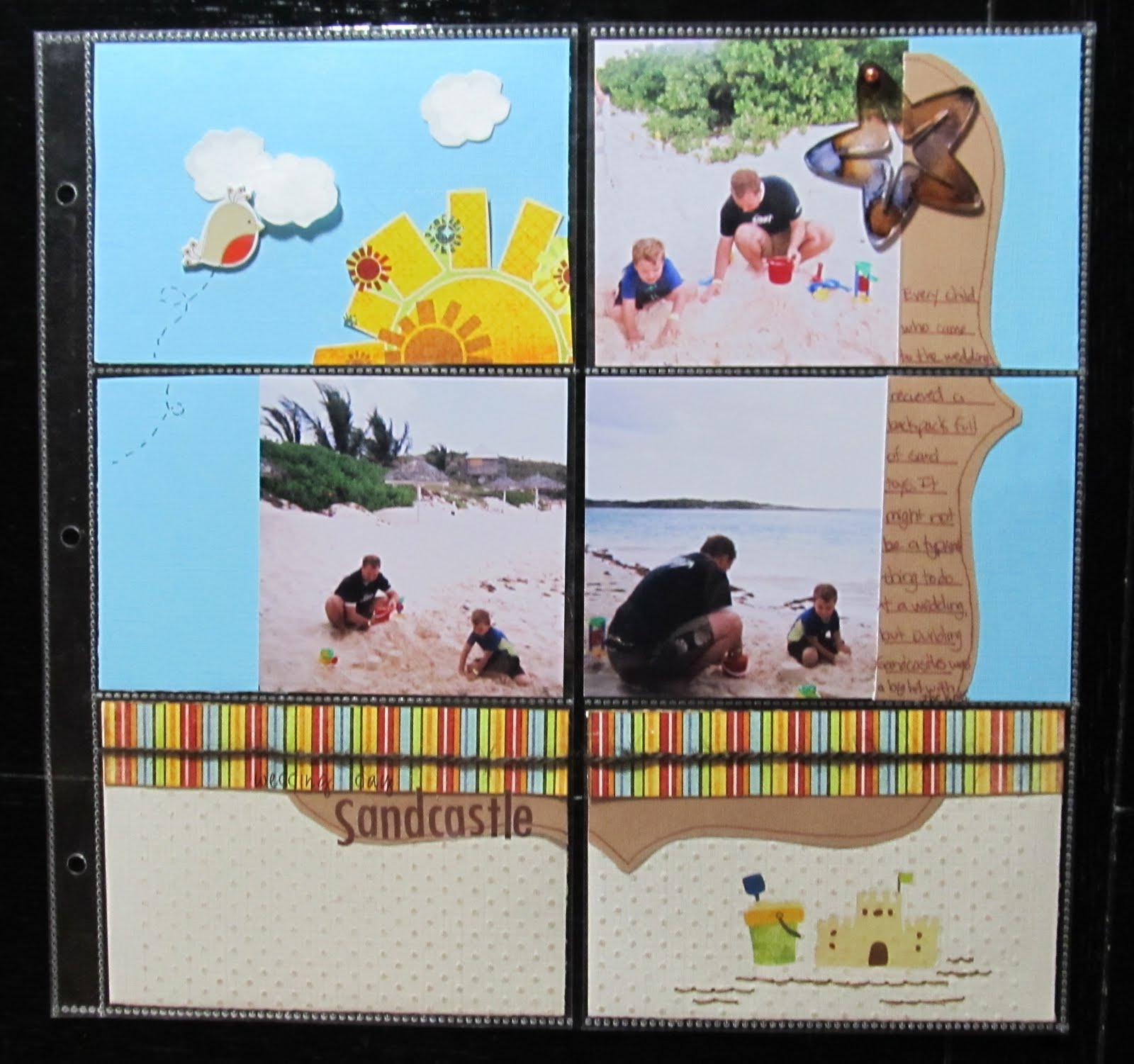
Items from my July counterfeit kit:
Fancy Pants Paper and rub on's
Making Memories alphas
not from kit:
Jillibean soup twine
dmc floss
DCWV chipboard bird
Studio G stamp in white inke with clear embossing powder
Coredinations CS embossed with swiss dots folder and sanded
Colorbok CS
Maya Road Acrylic starfish coloured with eggplant and ginger alcohol inks

I did crop the 4x6 photos down. Not cropping them would have allowed me to just slip them in the pocket. I also chose a Pagemaps sketch, which meant it took a little more time and thought. For a faster page, I could have just decorated 4x6 cards and journal spots and slipped those in. On a positive note, I was able to use scraps for almost the entire page!

Shown above, are the backs of some of the 4x6 blocks. The white sections are the photos. You can also see how I covered page scraps that would otherwise have had gaps or sections missing with other pieces of paper layered over it.
 I could have left the tan paper and white clouds plain. However, embossing them gave just a tad more texture to the page. The sand coloured Coredinations cardstock was embossed with swiss dots using my texture boutique. I lightly sanded it to reveal the slightly darker core colour. I chose to use white ink in a cloud shaped stamp with clear embossing powder to add a subtle lining to the clouds. While these would have been just fine plain, this tone on tone embossing gives it a more finished look as does the hand stitching under the sand castle rub on.
 Now that I have the hang of working with these type page protectors, I will certainly consider using them more often. I think I will try some soon with one of the kits that are designed for these. Maybe then, I will find I like them even more than I do now.
 

Monday, July 18, 2011

Cool...Like a Fool in a Pool

  It's a fun title. The rhyming sing song chant of it sort of gest you amped up for a fun scrapbook page. It's one of the rub on titles from Fancy pant's beach bum line. It was perfect for these shots of my son and husband in the pool. My son was actually being quite the silly fool on this particular day. Apparently, it's quite fun to swim underneath a waterfall...which he then decided to do over and over again. I guess it's a kid thing. My favourite part about these photos is how my husband is always nearby and smiling. He's not one to pose for photos very often ( partly because I take too many photos). Quite truthfully, these are candid shots of him watching our son...which makes the shots all the more special to me.
  I went a little out of my comfort zone for this page. I chose to try some free collage software recommended by Club CK. It's called Photovisi.You just go to their website, pick a collage and add photos. Then you can move your photos around and edit it.After you are done editing, you save the collage to your computer and print.The only downside is that when you print your collage, there is a small watermark on one corner. I cleverly hid it with the ric rac trim and swimsuit style banner.

Making Memorie sabrina frames, cut and painted turquoise
dmc floss
twinery twine in carribbean
Fancy Pants paper and rub on
maya road Ric rac
Basic grey brads

The rub on and swimsuit trunks are from my July Counterfeit kit. I fussy cut those swim trunks from some of the fancy pants paper. The photo corners were my son's idea. I had scraplifted this page from Kathleen Summers ( see her page here- Fabulous 4th). Her page has photo corners. looking through my stash just did not reveal the right thing. I had this MM frame from the Sabrina collection and my son made the comment that it was a shame it wasn't blue. This gave me the great idea to paint it with turquoise acrylic paint. I cut it apart and did just that. It left enough pieces for use of my second, complimentary page.

We R Memory Keepers chipboard sign
Maya road chipboard brackets with yellow acrylic paint, gold pen, and diamond stickles
We R Memory keepers eyelets
ATD sticker
American crafts rub on alphas
basic grey brads
  This is a page of my own design. I placed the photos, in what seemed to me, a pattern that reminded me of the slide's shape. I also chose the road sign for that reason. I used scraps from the previous page with more fussy cut swimsuits. I wanted brackets to match the sign, so I painted them yellow and used gold pen.
  I can feel really good about these pages because I used up several things from my stash that, before now, I had no clue what to do with: the frame, bathing suit patterned paper, and the road sign. Combining the travel and beach theme in my counterfeit kit really helped me see these products in a new way.

* also submitted at Scrapfit for WWU#9


Friday, September 10, 2010

Frugal friday tip: Refurbishing a rub-on

Recently, I did a swap on Club Ck in which the goal was to exchange "baddies"...also known as products in less than mint condition. I received several rub-ons. I have a love/hate relationship with rub-ons. They don't always go on as you would like them to. Sometimes spots are missing or just look less than perfect. In this case, parts of the rub-on were missing right from the rub-on sheet.

You can see the parts missing from the word friend.

I hate trashing anything, so, I pulled out a new and favorite stash item to fix them...Stickles.

The first step is to place the rub-on on your page in the desired location.

If parts of the rub-on are missing or broken, use a marker in a color as close as you can match, and fill in the missing parts. Just do your best.

notice how the black marker is not a direct match to the rub-on.

Next, apply stickles over the rub-0n. The stickles hide any mismatched colors, pen strokes, or unevenness  (if you are like me and can't perfectly match the font or shape of the rub-on).


In this case, I used diamond stickles. Coordinated color stickles or even perfect pearls would hide any imperfections and allow you to easily use a broken rub-on.                                                                     

*As posted at Scrap our Stash challenge spot.                                                             


Friday, August 20, 2010

It Girl

Sometimes, it's hard to use pink when you have a boy. My only baby girl is my little cat, Sweetpea. So when I get the chance, I highlight her as a subject in the photo and go crazy with girly colors and bling!


For It girl, I chose to use a black pearlized card stock for the background and white pearlized cardstock for the mattes. DCWV's All dressed up collection was the perfect patterned paper. I layered it over ripped pink cardstock and inked everything with ruby satin colorbox ink. The left page is a sketch from Sketches for you. I painted some chipboard letters pink and used fruit punch stickles on the top. Painting your stash is a great way to make it work for you. Don't be afraid to be versatile. The word girl are colorbox punch outs which I used Glossy accents over. Glossy accents provide wonderful dimension and can easily update older stickers or die cuts. I used Making memories 5th avenue trim and sewed small pearl beads onto it.

The brads are K and company, Sassafrass and Basic grey(with stickles on them). The crown and Feather are basic grey rub ons to which I added stickles and perfect pearls. The journal spot is a Fancy pants rub on in just that perfect shade of pink. So while my son is in the picture, I can add lots of fun pink and girly accents by focusing on my cat.

Submitted to : Sketches for you
                       Scrapfit

Monday, June 21, 2010

For My Husband


  My DS tends to dominate my lay outs. It's no secret that he is the center of the universe for DH and I. Add to that, the fact that DH is very rarely a willing subject for photos. DH will turn away or make silly faces. A few weeks ago, I issued a challenge on Club CK to take some must have summer photos. DH has a sunglasses fetish...so I figured I would do my best to capture him with them on and scrap the photos, silly or not. Well, I got those photos. Only they are not at all silly... and the more that I looked at them, The more that I realized this was not going to be an LO just about DH's love of sunglasses. So I waxed sentimental and the journaling became about my love of my wonderful husband. When I saw the 6-17 sketch on Sketchy Thursday, I felt these photos fit right onto it.
http://sketchythursdays.blogspot.com/2010/06/617-sketchy-thursdays-challenge.html


I wanted paper that made the lay out feel warm and special to me. I ended up choosing Basic grey's periphery because it was masculine, while capturing some of DH's favorite colors. I had the matching Basic grey ribbon and buttons. I cut the title on my cricut with the CK invitation font. The border is cut from a free svg file. A freind of mine made it. You can find it on her blog:
http://paperscrapsandpicturepassion.blogspot.com/2010/06/freebie-svg-file-day-5.html
I used some My Mind's Eye rub-ons on page 2.