Wednesday, September 29, 2010

I'm on FIRE!

    Well, I am not literally on fire! Technically, I sort of got into a slump. Not because of creativity. More because life threw me a curvebal in the form of sick kid, sick dog, and then me, well, getting sick. See the theme here. It's not a pretty one. That being said, everyone feels better and it's a rainy lazy day here. I am having a hard time falling back into the homeschool routine today with the sound of the rain beating on the roof. I feel so cozy! So what better thing to do than scrap...and what better topic to scrap than a campfire! So I took Scrap Whispers challenge 78 and literally scrapped a campfire.

I have had this pad of Paper Pizzazz Vacation papers for what must be at least 4 years now. We all have paper like that! I think I bought it on a whim. There are some great vacation papers in it...many are just specific to certain locales. For Example, there is an ENTIRE page of labels for trips around the world to cities like Paris, Washington D.C, San Francisco...well, I could go on. I must have really been hoping that buying the paper would make tickets to these destinations materialize. LOL Anyway, I finally made use of some of the camp themed papers here on this page. There was even a tag to fussycut. I used scraps of the paper to create faux ribbons. All of the papers were inked with colorbox Chestnut roan.

If you like the handmade flowers, you can find a tutorial here. They are really easy and fun to make. You just need to monitor your microwave so you don't have a campfire in your home. Seriously. While I did not start a fire this time...let's just say, there have been many accidental campfires in my kitchen. This is why we own a fire extinguisher.  And that's all I have to say about that...

Saturday, September 25, 2010

Go Green Challenge

Recycling is always a good thing. With acid free mist, there is a whole new world of possible embellishments or items that can be incorporated into a scrapbook page. When my son recently had a birthday, I had decided to make him some cinnamon rolls as a special breakfast. I decided to save the packaging and use it in the layout.


As I mentioned before, You will need an archival or acid free mist spray. You can follow the directions on the can to preserve the label or item for your page. I highly recommend NOT using anything that has been touched by food. As you can well imagine, it just might not be good for your photos. Labels though, can be a great way, not only to preserve the moment, but to also give a little look back at the way things were. Think back to how many times advertising and labels change with the trend. It just might take you back on a little trip down memory lane.

The other cool thing about this page is that I used scraps left over from creating the left side of the page. The polka dot paper is My Mind's EYE while everything else is Cosmo Cricket's Early bird line. Even the coffee mug sticker border was a scrap. I had cut it apart to use on the previous page.

The flowers used on both pages are Prima. For other ideas regarding  recycled items for projects, check out Scrap Fit's Workout#28.

Inspired by Children's Books

  I have always had a love of reading. I share that with my son. Even at the age of ten, he still enjoys our nightly reading...from novels to him now being the one to read to me. So, when Challenge Masters issued the week 4 challenge to scrap with a Favorite kid's book as your inspiration, it was a snap for me. The most difficult thing actually proved to be deciding which book to use, as I had several ideas.  I finally settled upon using " The Story of Ferdinand" by Munro Leaf.

The colors fit some of the ones in a set of photos about my son using a wheelchair. We had been at a science center, and he got to experience an obstacle course that a disabled person might have to navigate through on a daily basis. He learned a little empathy that day. When I think of the character of Ferdinand, I think of him as stoic, strong in himself, yet gentle and full of compassion. So the book seemed like a good fit.

I chose to use the colors from the cover and to add floral designs to the page. I used SEI's black orchid paper along with Pink Paislee 365 degrees on a Bazzill cardstock background. I chose to ink the photos and the papers in Colorbox black ink to help them stand out. I used basic grey stamps in White Frost ink to mimic the look of the white flowers on the cover. A few sequins added a fun tough to the page. To make the title match, I selected some CM stickers on which I used a Martha Stewart opaque chalk pen to add a white design. I then used some glossy accents on the stickers to add dimension.

The end result, IMO, makes the photos pop and have more meaning. I have a few other kid's books I think I may use in the near future. It was certainly a fun challenge that brought more meaning into the page than might have otherwise been there.

***Update: this project was highlighted as a top 3 pick at Frosted designs!

Wednesday, September 22, 2010

I have Tree Love!

   No, I am not out hugging any trees or anything like that.  I have a wonderful kit from the new Nikki Sivils collection, Tree Love. I can not tell you how very excited I was/ am for the opportunity to play with these gorgeous papers. I was also excited to hear, that Nikki herself was going to have a contest as part of the Sketch-a-thon at Sketches for All. It's always a lot of fun to see how different people will interpret the same sketch. It's even more interesting when several people have the same kit. Who knows what each person will come up with!?!? It's like a little paper adventure.

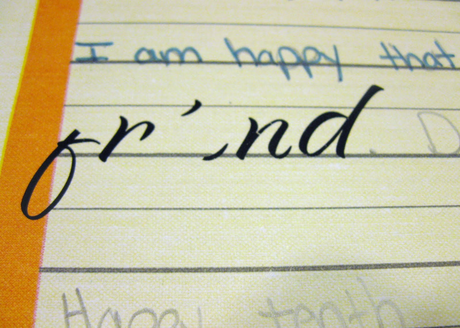
So now, I sat with ATG and scissors in hand, armed and ready with Nikki's sketch and her example.
                                     
Sketch Nikki Made for the Sketch-a-thon. Now how cool is that!
Nikki's example. ( I wish I had a dog like this one! Isn't he just awesome!)

 I had a wonderful selection of the 12x12 papers from Tree love, the matching 6x6 stack and some interesting embellies to choose from. I just had one problem...on one particular piece of 12x12 paper, I was in love with both sides but only had 1 piece! Now what's a girl to do? Get creative, that what!

So, I cut the tree border from one side. I then flipped the paper over.

I gathered my paper piercer, a pencil, and my plastic canvas square(which I use as a template). I then carefully marked and pierced holes to stitch the two pieces back together. * You want to be very careful not to pierce to close to the edge, as the paper will rip. Flimsy paper is also not easy to work with. You need a nice, heavy weight paper, like Nikki Sivils' so that the paper does not crumple as you work.

I next took some DMC floss and began stitching a zig zag pattern. So that the paper would stay better aligned, I stopped part way and then went to the other side of the paper. This anchored the two sheets together, which also made stitching the rest much easier.

* Just make sure, that if you choose to stitch a pattern as I did, that the  pattern will properly meet up in the center. Also, don't pull hard on the thread. You want it taut, but if you pull too hard, you will warp the paper and make it uneven.

The stitching reinforces the paper and holds it together. You could also just choose to adhere a strip of cardstock as reinforcement, rather than taking the time to stitch. if you don't want the slit to show, then substitute a paper border for the stitching.

Little tricks like these allow me to make the most of coordinating pattern papers. I will also say, that I LOVE 6x6 pads of paper. Though small, they pack a lot of bang for your buck. I used 1 sheet of the Tree Bark paper on the LO above. I simply cut blocks from it, inked the edges with Colorbox dark brown ink and adhered in the mosaic pattern shown. To make the leaf embellies, I punched the leaves from a 6x6 sheet of Be green paper and used my black marker to draw the lines. I drew 2-3 sets of lines to mimic the black lines on the trees of the border design. As you can see, Tree Love was the perfect paper to bring out the rich color of the caramel and that warm,cozy feeling of Fall. Everything on my page is from Nikki Sivils collection except for, the DMC floss, the ribbon(found in my scraps) and the title( which is an October Afternoon rub-on).

I also made a card utilizing Nikki's sketch. It's very easy to use card or LO sketches for any paper craft. Just remember this simple rule: You don't work for the sketch, the sketch works for you.

So be creative with what is around you. To see how my fellow DT girls interpreted Nikki Sivils' sketch, come on over to Sketches for All. I hope you'll also share your interpretation with us. If you do...you might even win a prize!                                                                                                                            

Tuesday, September 21, 2010

A Sassy Lil' Sketch

As you know by now from my previous post, Cherie from Sassy lil' Sketches is a guest at Sketches for all. We are so excited to have her there as part of the sketch-a-thon. I thought I would share my take on her sketch with you.


Yes, I rotated the sketch...and you can too. ;)

Since the sketch-a-thon is all about school and Fall,  I decided to do a page about my son learning computer programming. I used paper from DCWV's Tech generation stack. Since computer language is all 1's and 0's, I used them all over the page. I used Black magic glimmer mist and chipboard numbers to create a mask for the background. I stamped numbers on ribbon. I even was crazy enough to stitch them as a border on the page. All in all, I love the effect it made.

There is still a few days left of Cherie's contest. The sketch-a-thon goes on all month and we will soon be visited by Nikki Sivils. So pop on over...you have plenty of time to play!

Saturday, September 18, 2010

Draw Create Doodle

 For awhile now, I have wanted to document some of my son's art. I have seen collections of art photos on several scrapbook pages featured in magazines. It seems like such a great idea. My son draws so many things that it would be hard to save them all. This gives me a record of some of my favorites and I am sure I will love looking back at this page. I only wish I would have done something like this sooner. I definitely will have to go back and find a way to document the earlier years.

Right now, I am participating in Challenge Masters Project Scrapbook contest. As part of that, we were asked to create a 2 page layout, and for bonus points, that each of the pages should mirror the other.

* sorry for the photo quality. it's late at night, but I just had to share this!

I also wanted something special for my son's art work. I challenged myself to make a border that was fun and whimsical. I used paint, which is actually a challenge to me in itself. I always like the way others use it on their page, but often feel it is flat on mine. I hand drew the border with a pencil, then painted over the lines with MM meadow paint. The result did look flat, so I got out my DMC floss and stitched it by hand. I chose some older Karen Foster's stickers for the title(they have been in my stash forever) and I wanted to mirror their look on the page. To do that, I used blue chalk around some of the photos. I then stamped the words " art " and "muse" in white Colorbox ink on the chalk. I then added some hand stitching in a grid pattern for a kind of graphic feel.

 It still needed more color, so I used some Basic Grey and KI Memories brads and buttons on the grid. To maintain the mirror effect, each button or brad was placed on the grid in a location that corresponded to a brad or button on the opposite page. I varied the size and color though, so it would have more visual interest. I added brads to the title stickers as well. I placed my journaling in the same location and size space as the title. To mirror the color of the title and the title itself,I used CM stickers to emphasize the same words that were in the title.


Overall, I love the look and feel of the page. As I said, I regret not making one of these for my son's art earlier. Looks like a good project for the future!

Thursday, September 16, 2010

The Sketch-a-Thon continues...

The Sketch-a- thon has been a lot of fun so far. However, we're getting ready to jump right into the thick of things. Cherie from Sassy Lil Sketches will be joining us as our Guest designer on Friday. She'll be having a great prize along with a greta sketch...so hop on over and check things out at Sketches For You.

Saturday, September 11, 2010

make your own ruffle trim

   Ruffled trims have become a big trend in the scrapbooking world. I have always thought they were a pretty touch. Notice I said pretty. Well, that's because many of them have a feminine look. So I never chose to add any to my stash. So, when I saw a tutorial over at Ella to make your own trim, I was very excited. What a wonderful way to make the trim fit my boy themed pages.

  My page centers around my son eating a lollipop. During Bahamas Independence day, it's a wonderful tradition to head over to Mortimer's candy shop for some of their home made confections. My son looks forward to it every year. The lollipop is made in the colors of the Bahamas' flag. I had found this wonderful ribbon which also had these colors. So I chose that in place of felt for my ribbon border. The border was very easy and quick to make. I am in no way a great seamstress, but found that it didn't matter with this. Your stitches don't show and it's haphazard feel adds a fun tone to your page.

The sketch comes from Scrapfit's workout #27. I chose to try a reverse mask with paint and to extend the circle design onto the 2nd page. I always have the desire to use paint on a page. However, I often am stumped by it's look when I am finished. It never quite has the effect I am going for. In this case, I liked the look of the circles, but did not like the flat, matte finish.I hand stitched the circles. I looked at adding trims. I tried several other things, but finally decided upon using glossy accents over the paint. I embedded buttons in the circle as well, using them tone on tone for a dimensional effect. The results reminded me of hard candy, which seemed perfect given that the LO centered around a lollipop.

For some added interest, I added some scraps of cheesecloth which I stapled to the page, then smeared with paint. I used some scrapworks alphadots and Echo park stickers for the title.

BTW, if you have an interesting international dish or food to share, there is a scrap challenge to submit it to over at Sketches for you during the month of September. Don't forget, the sketch-a-thon has started there as well. It's not too late to get into the fun. The submissions are not due until 9-30-10. So head on over there for a chance at some great prizes.

Friday, September 10, 2010

Then and Now: One Concept, Two Takes

 Recently, I did a one hour challenge at club ck. I was very rushed. My son needed help with school, and that comes first. So after assisting him, I had about 30 minutes left to complete the challenge. I almost didn't...but then thought. What the heck, let's give it a go and see what you get. The overall result of my 25 mad dash of scrapping was not horrific. I had pulled out my Cosmo cricket earth love kit to make it easier on me. The challenge centered around showing a timeline of change. So I had quickly pulled together photos of my son highlighting 4 years of his life. I was in love with those photos. Each one depicting his sweet self at each wonderful stage of life.


There was just one problem...I was bothered by the fact that in my haste, I had covered my Sweet boy's hands in one of the photos. Not to mention the fact, that though I loved the border with the birds, as whimsical as it was ...it just wasn't working for me.


I generally come to a point in which a page is just considered done. This page, though simplistic, was important to me because it depicts my son's growth from 2001 until now. So I ended up making the page over. When I pulled the bird border off, the page was damaged. I wanted to salvage it, so I used an Martha Stewart punch to create a border on Cardstock. This, coupled with the Making memories ladybug trim from the Flutter collection, maintains the earthy feel of the paper while hiding the rips and tears. It also adds a little dimension to what was before, a very flat, basic page.


I changed the buttons from blue to yellow for a pop of color and also because the light blue just did not match the turquoise of the ladybugs. Though the page is still simplistic, I corrected what was bothering me about it and I feel, made it a little more interesting.

That being said, I will be shortly popping over to Scrapwhispers to enter this project in their "Then and Now' challenge.  I also have some future then and now projects planned. I would love to scrap about my son's change in favorite cartoons and also do a timeline for video games we have played from "then to now". So stay tuned...

Frugal friday tip: Refurbishing a rub-on

Recently, I did a swap on Club Ck in which the goal was to exchange "baddies"...also known as products in less than mint condition. I received several rub-ons. I have a love/hate relationship with rub-ons. They don't always go on as you would like them to. Sometimes spots are missing or just look less than perfect. In this case, parts of the rub-on were missing right from the rub-on sheet.

You can see the parts missing from the word friend.

I hate trashing anything, so, I pulled out a new and favorite stash item to fix them...Stickles.

The first step is to place the rub-on on your page in the desired location.

If parts of the rub-on are missing or broken, use a marker in a color as close as you can match, and fill in the missing parts. Just do your best.

notice how the black marker is not a direct match to the rub-on.

Next, apply stickles over the rub-0n. The stickles hide any mismatched colors, pen strokes, or unevenness  (if you are like me and can't perfectly match the font or shape of the rub-on).


In this case, I used diamond stickles. Coordinated color stickles or even perfect pearls would hide any imperfections and allow you to easily use a broken rub-on.                                                                     

*As posted at Scrap our Stash challenge spot.                                                             


Thursday, September 9, 2010

It's all Vegetal!

Yes, that's a word. At least, I think it is. It's vegetal...as in vegetation. I like using the word. It sounded interesting and upon reading that it was a challenge over at Method Playground in which I need to use something plant related. I set out to find some floral paper to use up in my stash. I settled upon some MM die cut 5th avenue paper. It's black and white color matched with what I need to complete an LO about dinner at Carmine's...an Lo which I am entering over at Challenge Masters, and, as is my usual pattern, am popping around the net submitting where it may best fit into with other challenges. The challenge masters week 2 challenge requires me to use colors that match the logo of a favorite food or place to eat. Coincidentally, We had just been to a local favorite restaurant: Carmines! I had taken a photo of the sign over the door. So I fussy cut this and used 3-d adhesive along with pink paislee letters to make the title pop on a polka dot background. I went to Carmine's website to look for more photos and a menu. It was a jack pot! If you ever visit someplace and don't have a photo, their website can be a goldmine for you or for ideas on how to scrap your trip.

I used some white crochet lace ribbon from Melissa Johnson. The black crochet trim was found at my local fabric store. The buttons were an awesome find. I was cleaning out a box of craft supplies and discovered them in a box. They were my great grandmother's. I used some MM and prima flowers embellished with  some prima pearls. I felt all of these elements matched the atmosphere of the restaurant. Carmine's is a family style, Italian place decorated in a style I like to call gaudy elegance. Some of the looks are very traditional, but there are tons of photos in various eclectic frames on the walls. Some of the lamps in the bar are mismatched in both color and style. So I felt that the crochet provided the home style feel of a family meal, while the mismatched buttons provided the eclectic feel. Diamond stickles on some of the dots and flowers of the paper added to this eclectic tone.

Monday, September 6, 2010

Cosmo Cricket Inspiration

  Recently, I felt very lucky to get my hands on some Cosmo Cricket kits. One I was lucky enough to win in an RAK. The other kits, I purchased for myself. I felt like it was about time to stop mooning over the kits and just get myself some. I am so glad that I did!

  Cosmo Cricket just posted an inspiration challenge to their blog. Using the cover of the home page, in this case, the pad of Pixie-licious paper, see what kind of project you could come up with.

I loved the block design of the pad's cover. So I went with that...but used the get Happy collection since I was scrapbooking about my son's favorite toy. To make the base CS a little more grungy to match the paper, I used some Black Magic Glimmer mist. I cut blocks out of the paper and then rounded the corners before placing them in a pattern similar to the cover's.


It's been a little while since I learned about the visual triangle. I recently signed up for a class at Masterful Scrapbooking design. In it, they talked about colors being used as part of that visual triangle. To be honest, I have done that before...but I was never aware of why I liked the effect. Armed with my new found awareness, I placed the blocks precisely to form the triangles. BTW, the only non-get happy pp is the arrow block. It's from the boyfriend collection. Somehow...I just felt that it went along with everything quite well. I used some stamps and colorbox Prussian Blue ink to make the title. I provided a little separation with some hand stitching. For visual interest, I added some staples and some hand stitching to the polka dot strips. The polka dot strips had some light blue lines...so I just followed those.

  Now...you might be wondering what the story is here. My Husband and son play quite a few video games. Starcraft had just come out. DS asked if there were any toys to spend his birthday money on. When we looked on-line, there was only this action figure on Ebay. He's a collector's edition from Blizzcon. He usually goes for over $70 in the auctions. So when my son asked to bid, I told him he could, but not to expect his birthday cash to be enough. When the bidding ended, we were all surprised that his $35 won him the toy. He is now my son's favorite thing.

   Well, what would this story be if I didn't scrap about the game. So on to page two... I scanned the covers of the box and then journaled some fast facts about the game in list form.


And while I am posting Cosmo cricket pages, I just had to share one more...

I used Early Bird to scrap about my son's birthday breakfast. This was a scraplift assignment from Sketches for you. I will admit...the polka dot paper is My Mind's Eye. I substituted it for the polka dot paper in the Cosmo kit b/c I really want the pattern on the other side of it for another page.


Thank you for looking. Don't forget to check out all of the great inspiration at Cosmo Cricket.

Saturday, September 4, 2010

Seasons of Change Blog Hop


Scrapbook challenges has a whole new look which is perfect considering we are moving on toward Fall. Fall is my favorite time of year...cooler weather, more time spent walking and out of doors, my anniversary, Halloween... I could keep going. Like I said, I love Fall. Anyhow, I digress. A lot of great things are happening at Scrapbook Challenges this weekend which include a blog hop, prizes and lots of challenges. So check it out. Before you go, have a peek at my take of this sketch for the blog hop.

I captured my son reading. While he is not reading to me in this particular photo, I journaled about how much I enjoy it when he does. He's a late reader due to some hearing issues. So seeing him read and having him read to me means a lot. I became a more fluent reader by reading to my grandfather to sleep at night. It fills me with a lot of joy when my son reads to me and reminds me of those times with my grandfather.

I chose this journal spot which my friend, Toree made for me in a Club CK swap. I love the bookworm and have been dieing to use him on a page. I added some white stitches with a Martha Stewart opaque pen. I felt like it gave a chalkboard/school theme feel to the border. The patterned paper is My Mind's Eye complete Boy stack. I loved it's grungy look and fall like colors.The title is made with American crafts thickers.

To get moving on the Scrapbook challenges blog hop, start over at Pamela's blog. To see other Scrapbook challenge members blogs and their take on the sketch, dont' forget to stop by Scrapbook challenges.

Thursday, September 2, 2010

Scrap Our Stash Border Challenge: Take Off Your Guard!

  Recently , I participated in Big Picture Scrapbooking's Big Idea Festival. I loved a lot of the projects, however, many of the supplies are just not available to me where I live. So what's a girl to do? Adapt, that's what. Make the design your own. so that's just what I did. I loved the look of Lisa day's bonus project and set out to use it with a series of photos about Junk-a-noo. What is Junk-a-noo you ask? It's a Bahamian tradition...sort of like Mardi gras or Carnivale. It occurs every year around July 10th (Bahamian Independence day) and around Christmas. Unfortunately, we have never been. It occurs in the middle of the night and literally runs past dawn. While we have never attended, we do see many of the costumes and float decorations around the island. I snapped some photos of my son with those decorations and decided they would make a fun page. I took inspiration from the bold colors of junk-a-noo and from the costumes. I chose the pinks and yellow oranges to draw from the colors in the photos. The turquoise was a nice contrast. I chose the sequins and pearls b/c they reminded me of the all of the shiny glitz of the costumes. The gold paper strip and the glittery Pink Paislee Letters further added to the glitz.


  Lisa's design is pretty evident in mine. I varied it by splashing some tiger lily and patina glimmer mist onto the background cardstock. I used some Crate Paper chipboard elements from the pink plum collection. Pages like these are a great way to slip in some girl colors without making the page look to feminine. I used some fussy cut elements from SEI's jocelyn collection to make the rosette's/round flowers and the border strip on the bottom. I cut strips of PP to make the scalloped border for the rosettes/flowers.


If you are like me, you may not have a lot of border punches. I simply don't have the storage space or the budget for them. In fact, I own only 2: an ancient fiskar's punch and an EK success notebook punch. So how did I make the border scalloped? A while back I saw this tip in creating Keepsakes and decided to try it...I took the guard off of my corner rounder, and then used it to punch down a strip of paper...which created a scalloped border.


Once you have the border punched, you can easily make it fit around a circle. This will work with any punch or strip of paper and is especially handy for heavier papers that are difficult to fold and pleat. Cut small slits in even increments along the strip. In my case, I chose every 2 scallops. Just be careful not to cut too far into the strip, or it may rip.

I chose to use glue dots to adhere the strip to the flower that I had fussycut. As you adhere each section, you can carefully bend and then slide the next section under the other.


This effectively produces a rounded edge with the strip.


I really enjoy the fun look to this page with the rounded borders. This could easily be done with a straight strip of paper or with most border punch designs.

The borders along the sides of the photos are made with Pink paislee artisan tape. I simply folded it as Lisa had in her design and I hand Stitched over it .

For more inspiration, don't forget to check out Scrap Our Stash. This month's challenge focuses on border punches. Let's see how you use yours!

Wednesday, September 1, 2010

September Challenge at Scrap Our Stash

The September challenge has posted!

The September Challenge is to use a Border Punch or decorative scissors on your project. You can use any kind of border punch or decorative scissors - no rules here - just use what you have. Be creative!

To participate in the Challenge just submit your projects by sending a picture and description to scrappinpsycho@live.com.

All projects will be posted here at Scrap Our Stash. All submissions must be received by 6:00 PM Central Time on September 30th. A winner will be chosen and given the opportunity to be a Guest Design Team Member for the month of November!

Be sure to check back daily for new Design Team, Guest Design Team, or Reader's projects to inspire you.

And to push you in the right direction, here is a wonderful Blog post that was just shared over at Club CK. You can create the look of the postage stamp punch by hand at home...
 http://abbygracevintage.blogspot.com/2010/08/how-to-create-border-punched-look.html