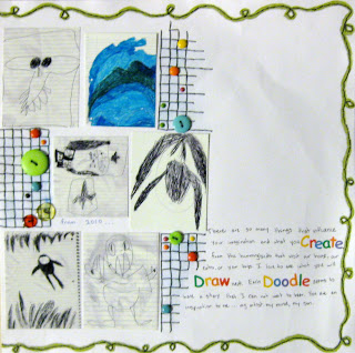
For awhile now, I have wanted to document some of my son's art. I have seen collections of art photos on several scrapbook pages featured in magazines. It seems like such a great idea. My son draws so many things that it would be hard to save them all. This gives me a record of some of my favorites and I am sure I will love looking back at this page. I only wish I would have done something like this sooner. I definitely will have to go back and find a way to document the earlier years.
Right now, I am participating in Challenge Masters Project Scrapbook contest. As part of that, we were asked to create a 2 page layout, and for bonus points, that each of the pages should mirror the other.
* sorry for the photo quality. it's late at night, but I just had to share this!
I also wanted something special for my son's art work. I challenged myself to make a border that was fun and whimsical. I used paint, which is actually a challenge to me in itself. I always like the way others use it on their page, but often feel it is flat on mine. I hand drew the border with a pencil, then painted over the lines with MM meadow paint. The result did look flat, so I got out my DMC floss and stitched it by hand. I chose some older Karen Foster's stickers for the title(they have been in my stash forever) and I wanted to mirror their look on the page. To do that, I used blue chalk around some of the photos. I then stamped the words " art " and "muse" in white Colorbox ink on the chalk. I then added some hand stitching in a grid pattern for a kind of graphic feel.

It still needed more color, so I used some Basic Grey and KI Memories brads and buttons on the grid. To maintain the mirror effect, each button or brad was placed on the grid in a location that corresponded to a brad or button on the opposite page. I varied the size and color though, so it would have more visual interest. I added brads to the title stickers as well. I placed my journaling in the same location and size space as the title. To mirror the color of the title and the title itself,I used CM stickers to emphasize the same words that were in the title.
Overall, I love the look and feel of the page. As I said, I regret not making one of these for my son's art earlier. Looks like a good project for the future!


No comments:
Post a Comment