 |
| Floral paper- cosmo cricket, polka dot paper- sassafrass, grid paper- october afternoon. Ribbon- MM, paperclip-MM, journal spot-Jillibean soup, flowers- sassafrass, waterfall stickles, glimmer mist in electric blue and viva pink, boy epoxy button- pink paislee, sweet acrylix button- KI memories, 7 gypsies red mini paperclip, October afternoon stickers, Martha Stweart background stamp with clear embossing powder, Webster's pages alphas with glossy accents, DMC floss Inspired by Peppermint Granberg's "First Day" |

Showing posts with label Cosmo Cricket. Show all posts
Showing posts with label Cosmo Cricket. Show all posts
Wednesday, April 4, 2012
Easter is almost here
My son is counting down the days. He is pretty spoiled. Last year we took him to the Easter Fair at the resort my husband works at. We might go again this year, since we all had a blast. They had a ton of crafts, games and of course, the usual fair foods like slushies and cotton candy.
I guess I need to get into the spirit of things. Easter sort of crept up on me this year. I don't even have our decorations up yet. I guess I better do that today. Whether you celebrate Easter or Passover, I wish you a wonderful holiday!


Monday, January 9, 2012
The Making of a Monster Shirt
I have a very vague memory of making an iron on shirt with my mom as a kid. The memory is so vague that I am not sure if it ever even happened. Saying that makes me feel quite sad. So much so that I hope my son manages to have more vivid memories of me. At the least, he will have tons of scrapbook pages to reference what some may believe is an over-documented childhood. Isn't it great to be a mamarazzi?!?!
Anyway, When I saw Amanda's page for the Scrap our Stash Pagerize this challenge, I knew I had to lift it. I loved the dynamic look of the circles on her page. I also liked how the smaller cropped photos acted like embellishments to support the main photo.
Can you spy my new favourite product? I began using them on my pages within the last few months. They are glass beads. I have some that have been in my stash for awhile now. They are sprinkled onto the word "monster" and then adhered using glossy accents. The little black beads were salvaged from one of my favourite evening bags( I was pretty sad when it broke!). I am finding that glass beads are an economical way to add a little more umph to my pages without breaking the bank. I have made my own stick pins as well as using them to decorate pages or embellishments. I hope to add more colours to my stash at some point in the future. Meanwhile, I am glad I finally pulled these out to play with.
If you have something new to share or would like to pagerize Amanda's page, please pop over to Scrap Our Stash and drop us a note.
Anyway, When I saw Amanda's page for the Scrap our Stash Pagerize this challenge, I knew I had to lift it. I loved the dynamic look of the circles on her page. I also liked how the smaller cropped photos acted like embellishments to support the main photo.
 |
| SEI papers, Basci Grey Brads,DMC floss, glass beads artsylicious green brad, Fancy pants star sticker papr trunk alphas, basic grey woolie Cosmo cricket chipboard arrow with souffle pen in white colorbox black ink |
If you have something new to share or would like to pagerize Amanda's page, please pop over to Scrap Our Stash and drop us a note.
Tuesday, December 6, 2011
The Silly Rabbit
Yes, I know it may seem odd to scrap an Easter page during December. However, the photo wwas really begging me to scrap it. I was keeping current pretty well up until a few months ago. Now I am woefully behind. Aren't we all though!?!? Anyway, here's a little something spring during the cold months of winter. We had taken my son to an Easter carnival earlier this year. When I saw the rabbit walking around, I knew I wanted a photo of my son with him. My son obliged and the rabbit added a little silliness to the whole thing which equaled the perfect photo!
update: on 12-8-11, this page was chosen as a Sketchy Thursday Fave! I am so excited. This is the first time I have been picked!
 |
| Sketchy Thursday 12-1-11 sketch- Cosmo cricket papers-floral and bunnies, polka dot paper-sassafrass, sassafrass flowers, cosmo cricket border sticker, Sassafrass chipboard, pink paislee button, DMC floss, MM ribbon, American crafts rub on letters, Webster's pages alph stickers with glossy accents, glimmer mist in Electric blue and viva pink |
Saturday, November 12, 2011
Sneaking in Some Pink and Yellow
I think everyone has a colour nemesis. Two of mine are pink and yellow. Yellow...I just don't care for a whole lot. Pink... well, I've talked before about how a male dominated household means scrapping with pink is not a regular occurrence. So I really surprised myself with this next LO for the November challenge at Scrap Our Stash. I pulled out this plaid paper by Cosmo Cricket. The yellow and pink reminded me so of a cozy morning. It became the basis for the design behind Pancake Morning.
While there is nothing wrong with pancakes from a box, it's really not hard to just make your own mix. My son loves helping me and so, when the challenge to scrap a family recipe was issued, it was the perfect excuse to make pancakes for breakfast. I should do this more often. I guess I am just more of a " let's have cereal" type of mom. Anyway, to make your own pancakes " not from a box", try this recipe"
Ingredients: 1 1/4 cups flour, 1/4 cup of sugar( yes I know it's a lot of sugar. We like em' sweet. You can reduce the sugar if you want to), 1 Tbsp. baking powder, 1 egg, 1 cup milk, 2 Tbsp. vegetable oil
- stir dry ingredients together
- in a separate bowl, mix egg milk and oil. then mix with dry ingredients
- spoon onto a heated pan, allow to bubble, then flip and cook until golden brown
It's such an easy recipe! It makes a lot more than we can eat. So I proportion the leftover pancakes into zip loc bags and freeze. I then have my own toaster pancakes!
To make the page more quickly, I left the white edges from the photo paper.The smaller photos are all one sheet of wallet size photos, three to a row. Some of them printed in groups with the photos in those rows aligning the same direction. I kept one group of three and simply cropped away the excess white. I cut the two photos which were horizontal and left the vertical photos in groups of two. This allowed me to save time( and supplies) by having photos that were already matted and easy to place on the page.

While there is nothing wrong with pancakes from a box, it's really not hard to just make your own mix. My son loves helping me and so, when the challenge to scrap a family recipe was issued, it was the perfect excuse to make pancakes for breakfast. I should do this more often. I guess I am just more of a " let's have cereal" type of mom. Anyway, to make your own pancakes " not from a box", try this recipe"
Ingredients: 1 1/4 cups flour, 1/4 cup of sugar( yes I know it's a lot of sugar. We like em' sweet. You can reduce the sugar if you want to), 1 Tbsp. baking powder, 1 egg, 1 cup milk, 2 Tbsp. vegetable oil
- stir dry ingredients together
- in a separate bowl, mix egg milk and oil. then mix with dry ingredients
- spoon onto a heated pan, allow to bubble, then flip and cook until golden brown
It's such an easy recipe! It makes a lot more than we can eat. So I proportion the leftover pancakes into zip loc bags and freeze. I then have my own toaster pancakes!
 |
| paper- Cosmo Cricket ribbon- unknown BG paper clip Sassafrass flowers glass beads K and Co. chipboard- Let's eat Pink Paislee pink foam alphas Rusty pickle brown alphas glossy accents Webster's pages sparkler button knife and Fork- unknown tiger lily glimmer mist Plum pudding smooch spritz maya road sheer journal spot- recipe card |
I don't have a lot of cooking themed embellishments in my stash. I had a Eureka moment when I discovered food themed embellishments in my travel supplies. Prior to this page, I might never have thought to look in my travel stash for such a thing. I noticed many of the travel themed collections had papers or items about places you had eaten. So next time I have a cooking themed page, I will also look to the travel themed papers.
I am very happy with the title. Glossy accents is one of my go to adhesives. It allowed me to add dimension to the flat brown letters. Now they look more like epoxy letters and I was able to add some glass beads to add more texture.

This year, my goal was to learn how to take better photos of my pages. I am best at photographing one page LO's. Two pagers are very difficult given that they often have a warped or bent look to them. With this two pager, I think I finally found a trick to reduce the warped look and get a more flat, even photo. I placed the LO on a travel trunk which reached to my knees. I was then able to bend over the photo and I found that if I cocked my wrist as I photographed the page, the page came out more flat as I cropped in afterwards. So try finding something to lay your page on that is about the height of your knees and experiment with moving the angle of your wrist.
Overall, I really enjoyed making this page...from staging a photo shoot with a pancake breakfast, to adding the finishing touches on the page. Yes, it's true...I staged the photos. So now it's your turn. Find a recipe you like and stage your own photos to make a wonderful LO. Don't forget to submit it to Scrap Our Stash.
Thursday, July 28, 2011
Flowers for the Fourth? July Counterfeit Kit Challenge blog hop
Welcome to the July Blog Hop for the Counterfeit Kit Challenge! You should have arrived here from Angela's Blog. If you are lost or arrived here first by mistake, hop on over to The Counterfeit Kit's website to find the right path. I hope you enjoy all of the projects being shared!
If you had come to me last month and asked me which papers from my stash would be used to scrap our family Fourth of July memories, Floral prints would definitely not have been on the list. Yet here they are on this next page! I got the idea from the counterfeit kit club challenge.If you don't know what it is( though most likely you do if you are hopping along)... The idea is to scraplift a kit from a kit club using what you have in your stash. One of the kits I saw had a lot of blue and red floral papers in them. Since flowers are not always easy to use on a page for boys, I felt this would be a great opportunity to use them. Oh...and would you believe there are travel themed items on the page too!?!? The journal spot and the tab sticker on the corner of the photo are from travel collections.
If you had come to me last month and asked me which papers from my stash would be used to scrap our family Fourth of July memories, Floral prints would definitely not have been on the list. Yet here they are on this next page! I got the idea from the counterfeit kit club challenge.If you don't know what it is( though most likely you do if you are hopping along)... The idea is to scraplift a kit from a kit club using what you have in your stash. One of the kits I saw had a lot of blue and red floral papers in them. Since flowers are not always easy to use on a page for boys, I felt this would be a great opportunity to use them. Oh...and would you believe there are travel themed items on the page too!?!? The journal spot and the tab sticker on the corner of the photo are from travel collections.
 |
| page maps sketch For Counterfeit Kit's 4th of July sketch challenge starburst paper- Cosmo Cricket all other papers Sassafrass sassafrass border Prima flowers foof a la buttons 7 gypsies tab sticker and paper clip Journal spot unknown( Maybe K and Co.) Making Memories rub on alphas hand made denim flowers Basic grey Border sticker-cut apart |
Originally, this was going to be a page about sparklers. However, I kept looking at this photo of my son and a sort of, deeper meaning manifested itself. He doesn't have the "trying too hard,sicky sweet smile" that he has had lately. It's the real him...just sweet and pure. So I journaled about that. The title for this page comes from a song by Bob Marley called "three little birds" which is the current challenge at Scrapping the Music.
I did manage to make another page about the sparklers. We have not had any at the fourth for several years. So it was a nice treat for my son to have some and to share the fun with friends this year. Once again, the floral paper came through for me. I think it gives it sort of a vintage, yet warm feel to the page.
 |
| Sketch Inspiration #229 diamond Stickles otherwise, everything use are scraps are from the above layout |
I printed out my photos in wallet size. They were so nicely done on the photo paper, that I trimmed it down and used it as a collage style block. It was a HUGE time saver. My rub on alphas did not go on perfectly. I used a black marker to fix the letters as best I could. The "f" is still a little wiggly though.
The next time you are feeling a little blue about not having the right themed papers in your stash, check out a kit club or the counterfeit Kit challenge. It just might give you some ideas to help you rethink how to use products you already own. Now it's time for you to hop on to Emily's Blog.
Tuesday, July 19, 2011
The Method Behind the Little Monsters
I am in the process of training for a Marathon. It's not the kind you run. It's the kind you scrap. It's also known as the Mother LOAD. Over the next few weeks, we'll be training to scrap 26 pages over the course of 26 days. For those of you who don't know what LOAD stands for, it means LayOut A Day. Finding the time to make a scrapbook page every single day is quite the undertaking. I have completed two other LOAD's this year. During the first one, in February, I managed to create a page every day. For the second one, in May, I managed to make a lot of pages but did not get to scrap daily. I did learn a lot during both. The main thing being that letting go of perfection is fine. Just choose your photos and products and start scrapping. I have made a lot more pages since then. I find that I am loving more of my pages now that I have freed myself from making them perfect. After all, people are looking at your albums for the story, not your page composition.
As part of the Mother Load, we were asked to go over our creative process. While creating pages this week, I realized that I have more than one process. I think this is a good thing, as it open me up to different means of inspiration. I thought I would share a couple of those creative methods with you today.
The first page was inspired by an HTC phone ad that I saw while reading a magazine at the hair salon. It looked a lot like this one:
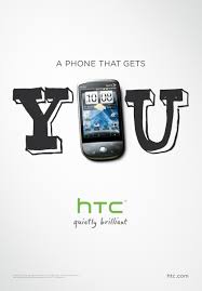
So I snapped a photo of it on my smart phone. What I liked most about it was how the phone made the letter O in the center of You. I wanted to do something like it on a page.I actually held onto it for awhile until I came across the right photos. I ended up using a photo and hand stitching to create the O in Monster's.
This was one of those photos that I had been unsure what to do with. Sometimes ideas or thoughts sort of stew around for a bit in my head.The same went for the paper( no clue how to use it), but once I got the idea for the title, the page came together. By sticking with the SEI kit, I was able to quickly select papers and stickers to go on the page. Paint has become a go to medium for me. I can always get the colour I need versus spending time searching for the perfect Cardstock. In this case, the paint helped tone down the busy pattern. I used to hang onto elements like the sticker because I felt they had to be used a certain way as they were intended. Now, I have no fear about altering them. In this case, it was designed to be about one person. I just chose to cross over the word "is" and write in the word "are" so that I could include all of the kids' names. I also made an error on this page. I wrote the date incorrectly. While I was able to wipe it off, it left a smudge. I decided I was ok with it, since the page was a bit messy anyway.
Sometimes photos inspire me. Other times, I see a sketch and instantly know what photo to use with it. I tend to print off a bunch of photos and I have them in my albums in the order I want the finished pages to be in. When I saw the Sketchy Thursday 7-14-11 sketch, I knew at once which photo I wanted to scrap. I had a second little monster themed photo.
Having made the prior page, it was easy to find and use the same supplies. In fact, I often tuck scraps from the first completed page into the album right along with the other photos. Then they are right there when I am ready to work on page two. Having the sketch right there meant it was easy to pull the elements I wanted for the page from the scraps. The title took a little more thought. often on the second page, I will not include a title or will make a subtitle. In this case, the title is part of the journaling which reads " I could hear them giggling. So I peaked under the bed and 6 eyes stared back at me." The white paint helps anchor the photo on the page along with the shelf created by the scraps and stitching. A visual triangle has been created with the orange monster, orange writing in the journaling, and the orange strip of paper under the title.
I have a few other creative methods that inspire me to work. Most of the time it's a photo. Sometimes, it's a new product or a kit I made from shopping my stash. What allows me the most time to scrap is the way I arrange my photos. I think that's something I shall have to photograph and share in another blog post.
As part of the Mother Load, we were asked to go over our creative process. While creating pages this week, I realized that I have more than one process. I think this is a good thing, as it open me up to different means of inspiration. I thought I would share a couple of those creative methods with you today.
The first page was inspired by an HTC phone ad that I saw while reading a magazine at the hair salon. It looked a lot like this one:
So I snapped a photo of it on my smart phone. What I liked most about it was how the phone made the letter O in the center of You. I wanted to do something like it on a page.I actually held onto it for awhile until I came across the right photos. I ended up using a photo and hand stitching to create the O in Monster's.
 |
| SEI papers and sticker Basic Grey alphas paper trunk Black alphas colorbox black ink |
This was one of those photos that I had been unsure what to do with. Sometimes ideas or thoughts sort of stew around for a bit in my head.The same went for the paper( no clue how to use it), but once I got the idea for the title, the page came together. By sticking with the SEI kit, I was able to quickly select papers and stickers to go on the page. Paint has become a go to medium for me. I can always get the colour I need versus spending time searching for the perfect Cardstock. In this case, the paint helped tone down the busy pattern. I used to hang onto elements like the sticker because I felt they had to be used a certain way as they were intended. Now, I have no fear about altering them. In this case, it was designed to be about one person. I just chose to cross over the word "is" and write in the word "are" so that I could include all of the kids' names. I also made an error on this page. I wrote the date incorrectly. While I was able to wipe it off, it left a smudge. I decided I was ok with it, since the page was a bit messy anyway.
Sometimes photos inspire me. Other times, I see a sketch and instantly know what photo to use with it. I tend to print off a bunch of photos and I have them in my albums in the order I want the finished pages to be in. When I saw the Sketchy Thursday 7-14-11 sketch, I knew at once which photo I wanted to scrap. I had a second little monster themed photo.
 |
Sei papers and puffy black alphas Cosmo Cricket tiny type alphas dmc floss white acrylic paint Sassafrass chipboard number Sketchy Thursday's 7-14-11 sketch |
Having made the prior page, it was easy to find and use the same supplies. In fact, I often tuck scraps from the first completed page into the album right along with the other photos. Then they are right there when I am ready to work on page two. Having the sketch right there meant it was easy to pull the elements I wanted for the page from the scraps. The title took a little more thought. often on the second page, I will not include a title or will make a subtitle. In this case, the title is part of the journaling which reads " I could hear them giggling. So I peaked under the bed and 6 eyes stared back at me." The white paint helps anchor the photo on the page along with the shelf created by the scraps and stitching. A visual triangle has been created with the orange monster, orange writing in the journaling, and the orange strip of paper under the title.
I have a few other creative methods that inspire me to work. Most of the time it's a photo. Sometimes, it's a new product or a kit I made from shopping my stash. What allows me the most time to scrap is the way I arrange my photos. I think that's something I shall have to photograph and share in another blog post.
Tuesday, June 28, 2011
The Rainbow Connection
Sometimes a song will just spin around and around in your head. For whatever reason, Kermit the frog singing " the rainbow Connection" popped into my skull every time I looked at these photos of my son with the food colouring. We were conducting an experiment for school. It really had nothing to do with colour. The experiment focused more on the properties of water and it's movement. The colour just facilitated our ability to see the movement of the water through the tubes. The idea was to produce a syphon effect and to get the water flowing between each container. The colours would mix and you would have this sort of rainbow between the curved tubes and the bowls. The photo in the lab manual was spectacular looking. Our experiment, well...less spectacular. We did get it to work though not as intensely as the lab manual suggested it would be. What we did have was another moment of mom and son sharing their love of science...a connection if you will. So that's where the title really took shape...the song, the rainbow of colours we used, and the connection between myself and my son. I guess you could say that Kermit was singing inside my head for a reason.
I chose to use one of Scraphappy.org's 15 minute page idea for this. As usual, it took me longer than 15 minutes to complete it. It was more like 20-30. None-the-less, I find 15 minute page sketches quite satisfying and an overall sound way to get fast, but cool pages that I love. Initially, I had only wanted to use the Sassafrass paper, Cosmo cricket ribbon and various chipboard parts for the title. My son took one look at the page and said something to the effect of, " I know you taught me about white space, but that page is just too white. Add some more colour to it." So, taking his advice, I splattered a lot of glimmer mist all over the page. It produced some very happy non-white white space which seemed to please him quite a bit.
Page two was easy to produce. I simply extended the design over to the second page on the left. It truly was a 15 minute page...well, sort of. The journalling made it take longer than 15 minutes, but who is really counting, right? Overall, it's a simple two pager with a lot of pop. I am happy with the results and am now off to try for another quick page before my son wakes up for the day.
I chose to use one of Scraphappy.org's 15 minute page idea for this. As usual, it took me longer than 15 minutes to complete it. It was more like 20-30. None-the-less, I find 15 minute page sketches quite satisfying and an overall sound way to get fast, but cool pages that I love. Initially, I had only wanted to use the Sassafrass paper, Cosmo cricket ribbon and various chipboard parts for the title. My son took one look at the page and said something to the effect of, " I know you taught me about white space, but that page is just too white. Add some more colour to it." So, taking his advice, I splattered a lot of glimmer mist all over the page. It produced some very happy non-white white space which seemed to please him quite a bit.
 |
| Sassafrass paper Cosmo Criket ribbon SEI inke blue ink(on paper edges0 glimmer mist- tiger lily, sapphire, meadow green and candy apple red bread tage with Nerdy bird fussy cut rainbow dude from sassafrass Inkadinkadoo bracket stamp in green paint with marker Sassafrass chipboard alphas(rainbow) American crafts minimarks rub on alphas on crate paper chipboard cloud Maya Road william chipnpard ( connection) Bic mark it in playful purple |
Page two was easy to produce. I simply extended the design over to the second page on the left. It truly was a 15 minute page...well, sort of. The journalling made it take longer than 15 minutes, but who is really counting, right? Overall, it's a simple two pager with a lot of pop. I am happy with the results and am now off to try for another quick page before my son wakes up for the day.
Tuesday, May 17, 2011
Some Belated Mother's Day Inspiration
This month, Artastic's challenge involves a Mary Cassat painting in honour of Mother's day. While I am a big fan of Cassat, I found it a little difficult to find just the right photos for this challenge. I scoured everything I have. Mom and baby photos of my son and I have long since been scrapped. I did find some vintage photos which I have been meaning to get into albums, so I chose one of those. It's a photo of my grandparents holding my uncle.
I love that I was able to use vintage buttons from my great-grandmother's button box on this page!I feel it's kind of a nice touch and adds a little memorabilia as well.
 |
| Pagemaps sketch papers-Cosmo Cricket and October Afternoon Crate paper rub on and chipboard border Jenni Bowlin stick pins vintage buttons lace unknown title-fancy pants rub on K and Co journal tag |
I love that I was able to use vintage buttons from my great-grandmother's button box on this page!I feel it's kind of a nice touch and adds a little memorabilia as well.
Thursday, May 5, 2011
May's Counterfeit Kit
Here we are in May...already! Boy this year is flying past. This will be my 3rd counterfeit kit. I am very happy to be participating in this challenge. I am definitely enjoying shopping my stash, trying new ways to make my own embellishments and just making pages with my monthly kit. May's Counterfeit kit was an easy one for me to make up. I think it's going to be easy for me to use a lot more from it as well. This month, the kit is a fun, summer kit with a playful childlike tone from Work in Progress. So without further ado, here is my version:
Of course, as many of you know, I simply can not resist a good add on. Really, there is no excuse not to since I am shopping my stash. So I jumped in with both feet when it came to making up a boy inspired kit. For whatever reason this month, the number theme seems to really be a big thing for me. I used a lot of papers and embellishments with numbers of various shapes and sizes. It will be interesting to see how these gets used on pages throughout the month.
You might recognize a few things from previous kits. I decided to challenge myself yo use things I put into past kits but never used. So let's see how I do. I am off to play...
 |
| papers: Fancy pants- It's your day(stripe) Cosmo Cricket-Chaplain ( large black page with number) My Mind's Eye- red polka dot Basic Grey- life of the party-confetti cake polka dot Basic grey- life of the party- how you' ve grown-rulers basic grey- life of the party- noise makers-green with plaid dots Sassafrass-anthem Sassafrass anthem-translate Alphas; Basic Grey life of the party Cosmo Cricket- flour sack MISC: Basic Grey life of the party brads Sassafrass paper whimsies cards Fancy pants yellow ric rac Lil' davis designs castaway rub ons Maya road chipboard stars Sassafrass cardstock stickers |
 |
| Paper: Crate Paper-Toy Box-playdate Crate Paper Emma's Shoppe- playhouse Crate paper Toyr box-build Echo Park Sweet Summertime- raspberry delight Echo Park Sweet Summertime sunny spots All other papers-Sassafrass Alphas- K and Co. Brenda Walton chip box Sassafrass pocket full of rosies Sassafrass Woodland Whimsy Misc: Crate Paper toy box borders Crate paper toy Box chipboard Studio Calico numbers card Sassafrass Paper whimsies-flowers ribbon and trims-unknown Maya road wood bongo numbers Fancy pants it's your day buttons Sassafrass in stitch blossoms-deep blue Sassafrass brads-vintage gems Crate Papers restoration collection brads Sassafrass felties-June bug Basic Grey woolies-wonder K and. Co ticket border remnant K and Co. frame |
You might recognize a few things from previous kits. I decided to challenge myself yo use things I put into past kits but never used. So let's see how I do. I am off to play...
Thursday, March 17, 2011
Winter Sunshine
Spring is pretty much here, although, where I live, it feels like summer. We haven't really had a spring this year. Nor did we really have fall in 2010. The weather has been either really hot or really cold with no in between. The only reason that I know it's spring is because of the calendar, tax season and the time change. All of which has left me feeling tired and overworked. I find myself falling asleep during homeschool or down about things in general. Spring is supposed to be about renewal. So when did spring become all about taxes and time? As my son says, " the older you become, the more the magic and wonder of childhood goes away." He wonders at adults who end up constantly being serious and he tells me he does not want to grow up. I really can't say I blame him for feeling as he does. However, as I told him last night, as he lamented the fact that he was not sure there were real leprechauns( he recently discovered that his parents play the part of leprechaun and Easter bunny), sometimes we have to find our own magic and wonder amidst the daily grind of life. For me, the magic and wonder lies in the relationship I have with my husband and son. I see it when I am with them and then relive it through the pages I scrapbook.
Speaking of which...today I have chosen to revel in the remembered warmth of some winter sunshine. I live in a tropical climate. That means, on one day, you may find yourself snuggled in a jacket for an overcast day with 50 degree weather( I know that's not cold to all of you, but it is to me). Then on the next day, the weather is warm and sunny enough to go for a swim at the beach.

I captured these moments last December and chose to scrap them using my counterfeit kit.The Sassafrass paper reminded me of the sun. I chose a pink cardstock to lend the page a tropical feel. The brown brought back a stronger, masculine touch.
For " Down by the harbor", I again chose the Sassafrass papers. I reversed my Cosmo Cricket papers to reveal a brown, sea gull like pattern. We were eating out at a harborside restaurant and my son wanted to see if sea gulls liked onion rings.Since gulls are not present in the photos, the imagery of the patterned paper was perfect.
Though I like grid style layouts a lot, I am usually not very proficient with them. I can measure with all of my tools, but somehow, I am always a little off kilter. I have learned to be ok with that. On this particular page, I used journalling strips to hide my slightly off balanced sections of the grid.
Now I am off to hide my son's shoes before he wakes up. After all, it's what a leprechaun would do. Just because he knows I am the leprechaun doesn't mean the fun has to stop, right? Happy ST. Patrick's day!
Speaking of which...today I have chosen to revel in the remembered warmth of some winter sunshine. I live in a tropical climate. That means, on one day, you may find yourself snuggled in a jacket for an overcast day with 50 degree weather( I know that's not cold to all of you, but it is to me). Then on the next day, the weather is warm and sunny enough to go for a swim at the beach.
 |
| Two Peas in a Bucket Stretch Your Sketch |

I captured these moments last December and chose to scrap them using my counterfeit kit.The Sassafrass paper reminded me of the sun. I chose a pink cardstock to lend the page a tropical feel. The brown brought back a stronger, masculine touch.
For " Down by the harbor", I again chose the Sassafrass papers. I reversed my Cosmo Cricket papers to reveal a brown, sea gull like pattern. We were eating out at a harborside restaurant and my son wanted to see if sea gulls liked onion rings.Since gulls are not present in the photos, the imagery of the patterned paper was perfect.
 |
| Scraphappy.org March 15 minute LO |
Now I am off to hide my son's shoes before he wakes up. After all, it's what a leprechaun would do. Just because he knows I am the leprechaun doesn't mean the fun has to stop, right? Happy ST. Patrick's day!
Sunday, March 6, 2011
March's Counterfeit kit- Into the Woods
I will be the first to admit that I went WAY overboard with this kit. I am finding that while shopping my stash, the same "must have" impulsiveness that sometimes hits me while shopping in real life scenarios is very evident here. It's a good thing it IS my stash...or hubby would be broke! Looking at what I chose this month, I know there is NO way I will use it all...but it's going to be fun trying to!
This month's Counterfeit kit challenge was inspired by Studio Calico's Into the Woods Kit. For my main kit, I chose to mimic the colour and nature theme as closely as possible. I have a lot of Sassafrass, so this was a wonderful opportunity to use some of that paper up.many of the papers I chose were double sided so I can get more bang for my buck, so to speak.
Since money is no object, I chose to have ALL of the add on kits. Why not?!?! Right? For the Babbling Brook add on, I thought some of my Basic Grey papers would closely match the pattern and colour. I chose Crate Paper's showers since this matched the water theme of the kit. Since I had a lot of the matching embellies, those popped into the kit as well.
I don't have anything quite like the circle stamp in the kit.I think I might be able to use my cricut to cut a mask or perhaps some recycled bottle lids to make my own stamp. I shall have to experiment with it.
Now, for the Mossy Knoll kit... sounds a bit ominous. Or maybe mysterious. If I were buying this kit in real life, this would have been the point at which my budget would have been lost amongst the proverbial tall grasses. I actually made this add on kit before I made the others. I was searching to find a page with the blue stripes similar to the actual Studio calico kit. This is when had my Eureka moment. The crate paper season kit was a perfect set to incorporate with the sassafrass papers and nature theme.It had the right colours and a fun whimsical tone which went well with the Sassafrass papers.
I added some of the crate paper restoration papers to add the vintage feel of the original kit. I don't have any circus theme pages planned. If I change my mind, I might go out on the world wide web to find some vintage images to print off. One of my favourite sites for free vintage printables is found here.
The sunny Clearing... The name connotes warmth. So I set out to duplicate the warm feeling of the original kit as best as I could. I noticed that Studio Calico used some Cosmo cricket paper. I don't have the fish tales paper, but I do have Snorkel. I chose a sun and a bicycle from that collection. There is less paper here, b/c the gingham papers I have do not coordinate well with the other papers I have chosen. So I compensated with extra embellies.
And now for the final kit.... wild flower. Since I have a boy, the original was too floral for me. I toned it down a bit with the more masculine colours and whimsical flowers of the crate paper Season collection.
I had more trim than I originally intended. I just could not decide which one to pick...so I picked them all!
Now it's time to see what I can create with this kit. I already have a few pages in mind and with my husband having a three day weekend, I have plenty of time.
This month's Counterfeit kit challenge was inspired by Studio Calico's Into the Woods Kit. For my main kit, I chose to mimic the colour and nature theme as closely as possible. I have a lot of Sassafrass, so this was a wonderful opportunity to use some of that paper up.many of the papers I chose were double sided so I can get more bang for my buck, so to speak.
 |
| Papers: Cosmo Cricket- earth Love/Recycle,Artsylicious fine illustrated paper in chocolate sassafrass-apple jack/translate, life is Beautiful/intertwined, Serendipty/chirp, chirp, brown paper and cherry delicious alphas: K and co. actopus to zed( loved the wood grain) and pink paislee in chocolate tags from scrapbook ID in tangerine Frames from k and co. K and co. transparency K and co. journal spots My Mind's eye chipboard journal stickers K and co. green stack chipboard ( for the owls, mushrooms, birds and wood grain pieces) |
Since money is no object, I chose to have ALL of the add on kits. Why not?!?! Right? For the Babbling Brook add on, I thought some of my Basic Grey papers would closely match the pattern and colour. I chose Crate Paper's showers since this matched the water theme of the kit. Since I had a lot of the matching embellies, those popped into the kit as well.
 |
| Basic Grey papers: offbeat's nonchalant and casual Crate paper: Season collection winter and showers, die cut paper- cloudy Making Memories Passport alphas ( as a substitute for the handwritten paper) Kaiser craft mini alphas in chocolate and white American crafts mini marks rub on alphas in purkey ribbon-unkown K and co. brads Artsylicious fabulous brads in chocolate 7 Gypsies foldover sticker book in Bureau ( as a substitute for the office pockets) Marcella K adhesive chipboard in Sabrina Crate Paper Season title stickers and borders |
Now, for the Mossy Knoll kit... sounds a bit ominous. Or maybe mysterious. If I were buying this kit in real life, this would have been the point at which my budget would have been lost amongst the proverbial tall grasses. I actually made this add on kit before I made the others. I was searching to find a page with the blue stripes similar to the actual Studio calico kit. This is when had my Eureka moment. The crate paper season kit was a perfect set to incorporate with the sassafrass papers and nature theme.It had the right colours and a fun whimsical tone which went well with the Sassafrass papers.
 |
| Crate paper: restoration ruffles( as a substitute for the calendar die cut) Crate Paper die cut- restoration-Cents Crate paper: seasons- Fall and Love papers Sassafrass; Life is Beautiful-golden love and apple Jack Crate Paper Season chipboard accents, plus restoration bicycle Crate Paper Seasons art brads Making Memories Chloe's Closet green leather frame Making Memories Chloe's Closet clips-2 Prima lace Webster's pages lace ribbon unknown Crate Paper Prudence Glitter borders Crate paper prudence Alpha twist K and co. Borders Making Memories Paperie Greenhouse felt clips |
I added some of the crate paper restoration papers to add the vintage feel of the original kit. I don't have any circus theme pages planned. If I change my mind, I might go out on the world wide web to find some vintage images to print off. One of my favourite sites for free vintage printables is found here.
The sunny Clearing... The name connotes warmth. So I set out to duplicate the warm feeling of the original kit as best as I could. I noticed that Studio Calico used some Cosmo cricket paper. I don't have the fish tales paper, but I do have Snorkel. I chose a sun and a bicycle from that collection. There is less paper here, b/c the gingham papers I have do not coordinate well with the other papers I have chosen. So I compensated with extra embellies.
 |
| Crate Paper: Season- friendly paper Crate paper; restoration- fringe( has a wonderful orange pattern on the back) Sassafrass: Life is Beautiful- rose thicket( a wonderful warm rose pattern on the back) Pink Paislee Old school glitter alpha Crate Paper restoration border stickers Cosmo Cricket: snorkel collection- bicycle/lazy days and sunshine Crate Paper chipboard flower border Artsylicious deluxe brads red crochet flower- from Ikea, it's a curtain decoration Fancy Pants write now rub on's Making Memories Chloe's closet square gem stickers Fancy pants ric racs-red, yellow and cream homemade red flower crochet lace- unkown Sassafrass in stitch blossoms-orange Jillibean Soup clear stamps- top ten Making Memories Chloe's Closet tags- 3 Making Memories Chloe's closet paper clips and clips |
And now for the final kit.... wild flower. Since I have a boy, the original was too floral for me. I toned it down a bit with the more masculine colours and whimsical flowers of the crate paper Season collection.
 |
| Sassafrass paper- yellow hearts Crate paper : Seasons- Spring and Summer Crate paper; prudence-discretion paper Crate paper Season journal stickers Crate Paper Seasons rub ons Maya Road Fresh chipboard-motifs Artsylicious Splendid treasures in chocolate Making Memories ribbons and trims Cosmo Cricket lil. man ribbon |
I had more trim than I originally intended. I just could not decide which one to pick...so I picked them all!
Now it's time to see what I can create with this kit. I already have a few pages in mind and with my husband having a three day weekend, I have plenty of time.
Sunday, February 13, 2011
Finding Inspiration on Ebay
This is my first year participating in LOAD211(aka Layout a Day 2011). The theme this year is to find inspiration. On our challenge for day two, we were asked to go onto eBay and to do a web search for our name(or the name of a loved one). Then choose something on page one that inspired you to make a page.It was something I never thought to try before. I honestly did not expect much to appear with my name in it. However, a variety of novels and DVD's appeared. I settled for the cover of an Agatha Christie DVD. I could envision it as a sketch for some of my photos.
It ended up being a simple yet satisfying page. I invite you to try it out if you are missing a little mojo in your life right now. If you do find some mojo and want to share your work, pop on over to Scrap Our Stash. We'd love to post it for Show and Tell Sundays.
 |
| Amer. Crafts Cardstock, Cosmo Cricket Snorkel papers Colorbok arrow, Basic Grey Brads, Colorbox Chestnut Roan Ink |
Saturday, September 25, 2010
Go Green Challenge
Recycling is always a good thing. With acid free mist, there is a whole new world of possible embellishments or items that can be incorporated into a scrapbook page. When my son recently had a birthday, I had decided to make him some cinnamon rolls as a special breakfast. I decided to save the packaging and use it in the layout.

As I mentioned before, You will need an archival or acid free mist spray. You can follow the directions on the can to preserve the label or item for your page. I highly recommend NOT using anything that has been touched by food. As you can well imagine, it just might not be good for your photos. Labels though, can be a great way, not only to preserve the moment, but to also give a little look back at the way things were. Think back to how many times advertising and labels change with the trend. It just might take you back on a little trip down memory lane.
The other cool thing about this page is that I used scraps left over from creating the left side of the page. The polka dot paper is My Mind's EYE while everything else is Cosmo Cricket's Early bird line. Even the coffee mug sticker border was a scrap. I had cut it apart to use on the previous page.


As I mentioned before, You will need an archival or acid free mist spray. You can follow the directions on the can to preserve the label or item for your page. I highly recommend NOT using anything that has been touched by food. As you can well imagine, it just might not be good for your photos. Labels though, can be a great way, not only to preserve the moment, but to also give a little look back at the way things were. Think back to how many times advertising and labels change with the trend. It just might take you back on a little trip down memory lane.
The other cool thing about this page is that I used scraps left over from creating the left side of the page. The polka dot paper is My Mind's EYE while everything else is Cosmo Cricket's Early bird line. Even the coffee mug sticker border was a scrap. I had cut it apart to use on the previous page.

The flowers used on both pages are Prima. For other ideas regarding recycled items for projects, check out Scrap Fit's Workout#28.
Friday, September 10, 2010
Then and Now: One Concept, Two Takes
Recently, I did a one hour challenge at club ck. I was very rushed. My son needed help with school, and that comes first. So after assisting him, I had about 30 minutes left to complete the challenge. I almost didn't...but then thought. What the heck, let's give it a go and see what you get. The overall result of my 25 mad dash of scrapping was not horrific. I had pulled out my Cosmo cricket earth love kit to make it easier on me. The challenge centered around showing a timeline of change. So I had quickly pulled together photos of my son highlighting 4 years of his life. I was in love with those photos. Each one depicting his sweet self at each wonderful stage of life.

There was just one problem...I was bothered by the fact that in my haste, I had covered my Sweet boy's hands in one of the photos. Not to mention the fact, that though I loved the border with the birds, as whimsical as it was ...it just wasn't working for me.
I generally come to a point in which a page is just considered done. This page, though simplistic, was important to me because it depicts my son's growth from 2001 until now. So I ended up making the page over. When I pulled the bird border off, the page was damaged. I wanted to salvage it, so I used an Martha Stewart punch to create a border on Cardstock. This, coupled with the Making memories ladybug trim from the Flutter collection, maintains the earthy feel of the paper while hiding the rips and tears. It also adds a little dimension to what was before, a very flat, basic page.

I changed the buttons from blue to yellow for a pop of color and also because the light blue just did not match the turquoise of the ladybugs. Though the page is still simplistic, I corrected what was bothering me about it and I feel, made it a little more interesting.
That being said, I will be shortly popping over to Scrapwhispers to enter this project in their "Then and Now' challenge. I also have some future then and now projects planned. I would love to scrap about my son's change in favorite cartoons and also do a timeline for video games we have played from "then to now". So stay tuned...

There was just one problem...I was bothered by the fact that in my haste, I had covered my Sweet boy's hands in one of the photos. Not to mention the fact, that though I loved the border with the birds, as whimsical as it was ...it just wasn't working for me.
I generally come to a point in which a page is just considered done. This page, though simplistic, was important to me because it depicts my son's growth from 2001 until now. So I ended up making the page over. When I pulled the bird border off, the page was damaged. I wanted to salvage it, so I used an Martha Stewart punch to create a border on Cardstock. This, coupled with the Making memories ladybug trim from the Flutter collection, maintains the earthy feel of the paper while hiding the rips and tears. It also adds a little dimension to what was before, a very flat, basic page.

I changed the buttons from blue to yellow for a pop of color and also because the light blue just did not match the turquoise of the ladybugs. Though the page is still simplistic, I corrected what was bothering me about it and I feel, made it a little more interesting.
That being said, I will be shortly popping over to Scrapwhispers to enter this project in their "Then and Now' challenge. I also have some future then and now projects planned. I would love to scrap about my son's change in favorite cartoons and also do a timeline for video games we have played from "then to now". So stay tuned...
Monday, September 6, 2010
Cosmo Cricket Inspiration
Recently, I felt very lucky to get my hands on some Cosmo Cricket kits. One I was lucky enough to win in an RAK. The other kits, I purchased for myself. I felt like it was about time to stop mooning over the kits and just get myself some. I am so glad that I did!
Cosmo Cricket just posted an inspiration challenge to their blog. Using the cover of the home page, in this case, the pad of Pixie-licious paper, see what kind of project you could come up with.
 I loved the block design of the pad's cover. So I went with that...but used the get Happy collection since I was scrapbooking about my son's favorite toy. To make the base CS a little more grungy to match the paper, I used some Black Magic Glimmer mist. I cut blocks out of the paper and then rounded the corners before placing them in a pattern similar to the cover's.
 It's been a little while since I learned about the visual triangle. I recently signed up for a class at Masterful Scrapbooking design. In it, they talked about colors being used as part of that visual triangle. To be honest, I have done that before...but I was never aware of why I liked the effect. Armed with my new found awareness, I placed the blocks precisely to form the triangles. BTW, the only non-get happy pp is the arrow block. It's from the boyfriend collection. Somehow...I just felt that it went along with everything quite well. I used some stamps and colorbox Prussian Blue ink to make the title. I provided a little separation with some hand stitching. For visual interest, I added some staples and some hand stitching to the polka dot strips. The polka dot strips had some light blue lines...so I just followed those.
Now...you might be wondering what the story is here. My Husband and son play quite a few video games. Starcraft had just come out. DS asked if there were any toys to spend his birthday money on. When we looked on-line, there was only this action figure on Ebay. He's a collector's edition from Blizzcon. He usually goes for over $70 in the auctions. So when my son asked to bid, I told him he could, but not to expect his birthday cash to be enough. When the bidding ended, we were all surprised that his $35 won him the toy. He is now my son's favorite thing.
Well, what would this story be if I didn't scrap about the game. So on to page two... I scanned the covers of the box and then journaled some fast facts about the game in list form.

And while I am posting Cosmo cricket pages, I just had to share one more...
 I used Early Bird to scrap about my son's birthday breakfast. This was a scraplift assignment from Sketches for you. I will admit...the polka dot paper is My Mind's Eye. I substituted it for the polka dot paper in the Cosmo kit b/c I really want the pattern on the other side of it for another page.
Cosmo Cricket just posted an inspiration challenge to their blog. Using the cover of the home page, in this case, the pad of Pixie-licious paper, see what kind of project you could come up with.

Now...you might be wondering what the story is here. My Husband and son play quite a few video games. Starcraft had just come out. DS asked if there were any toys to spend his birthday money on. When we looked on-line, there was only this action figure on Ebay. He's a collector's edition from Blizzcon. He usually goes for over $70 in the auctions. So when my son asked to bid, I told him he could, but not to expect his birthday cash to be enough. When the bidding ended, we were all surprised that his $35 won him the toy. He is now my son's favorite thing.
Well, what would this story be if I didn't scrap about the game. So on to page two... I scanned the covers of the box and then journaled some fast facts about the game in list form.

And while I am posting Cosmo cricket pages, I just had to share one more...

Thank you for looking. Don't forget to check out all of the great inspiration at Cosmo Cricket.
Wednesday, August 25, 2010
You Have...
For awhile now, I have been wanting to do a page about my son's characteristics. We always tell him things like " you have mommy's nose and Daddy's eyes." So, while we were waiting in the car for his swim lessons, I snapped off some photos of his hands, feet, and other features. I created this page based on a project at Big Picture Scrapbooking.

I used Some glimmer mist in tiger lily and patina to splatter the background onto the white cardstock. The flowers are prima's e-line as are the blue jewels. The patterned papers are crate paper and cosmo cricket. I used a very old fiskars punch. For the title, I used black cardstock to add a shadow effect and to highlight it. I journaled about his personality traits and who he gets some of those from and then on the photos, I added journal strips about where his physical characteristics came from.


I used Some glimmer mist in tiger lily and patina to splatter the background onto the white cardstock. The flowers are prima's e-line as are the blue jewels. The patterned papers are crate paper and cosmo cricket. I used a very old fiskars punch. For the title, I used black cardstock to add a shadow effect and to highlight it. I journaled about his personality traits and who he gets some of those from and then on the photos, I added journal strips about where his physical characteristics came from.

Wednesday, August 18, 2010
Using a circle template
Club creating keepsakes has proven to be a great source of tips and information. I learned about one of my best and cheapest tools from a club ck peep. I always liked hand stitching, but had never tried it. I thought it would be to hard or take up too much time. When I learned about using plastic canvas as a template, all of that changed. As you can see from this photo of a recent layout, nice even circle are a breeze!

I have 2 templates. One is a rectangle and one is a circle. I purchased them for under a dollar in the plastic canvas and sewing section of my local craft store. I can use them not only for stitching, but also for brads or anything else I want to put on my page in a nice even manner. You simply lay the canvas template down, and use a pencil to mark where your brad(or in this case, punched circle) will go.
 As you can see, it is easy to keep a nice even line. Because you can see through the canvas,You can easily change the size of the circle you want...simple select a circle and then follow the squares around that circle as you mark with your pencil.

 It really makes stitching so easy!
For flourishes or designs, I recommend the Bazzill In Stitches templates.They make adding a little stitched flair to your pages so easy.

I will say, I don't find the need to use the ones for words or letters. I simply hand draw, use a die cut letter or use a stencil as a guide for my letters...then I use the paper piercer to poke the holes and stitch.
If you do hand stitch on a page, practical scrappers is having a stitch challenge this week!
***Updated: the Jeep LO was featured as a Practical Scrappers top 3!
I used the template to align the brads as well as to stitch the circles. This Layout was completed for sketches for you.The paper is Creative imaginations. The green brads are Basic grey. The star brads are Making Memories Just chillin' line.


Paper used is Cosmo cricket Boyfriend collection. this is a Let's Scrap Sketch and part of the club ck one hour challenge: use hole punched circles.
For stitching, I usually mark every other hole. I then go back with a paper piercer to pre-make the holes before I stitch. 
For flourishes or designs, I recommend the Bazzill In Stitches templates.They make adding a little stitched flair to your pages so easy.

The paper is fussy cut Basic Grey. I also hand cut the stars from the porcelain collection. I used Heide Swapp mirror hearts.
If you do hand stitch on a page, practical scrappers is having a stitch challenge this week!
***Updated: the Jeep LO was featured as a Practical Scrappers top 3!
Tuesday, August 10, 2010
Capturing A Hummingbird
I had never seen a live hummingbird until recent years. Now I am lucky enough to see them quite frequently. The community which we recently moved to seems to support a thriving population. I have long wished to capture them on film. It's a daunting task considering that they won't come too close and fly at incredible speeds. For whatever reason, on this particular day, one hummingbird decided to hang out on our patio. Not to mention, that she was gracious enough to allow me to come within a few feet of her. I saw her flitting about, teasing our cat with her aerial acrobatics, and thought she would fly away as soon as I came out the front door with my camera. She just flew around...watching me. I snapped furiously...and though the photos are not of the greatest composition, I am so happy that I captured her photo.

I chose DCWV Far eastern stack paper for its red flowers...since hummingbirds love them so much. I fussy cut some of the branches and blooms.The background card stock is also DCWV. Since it had an oriental feel to the paper, I rubbed platinum colorbox ink on a red strip of card stock. I added a gold brocade Crate Paper trim. This is Sketchy Thursday's 8-5-10 sketch.
The above is page two of the layout. I completed page one during a Club CK one hour challenge. I used part of a chipboard stack remnant to create a frame. I inked it with Autumn Leaves red ink and colorbox Platinum. The alphabet has been in my stash for some time. I don't even remember who makes it. To update it and add dimension, I used glossy accents over the letters. The brads are K and company.


I chose DCWV Far eastern stack paper for its red flowers...since hummingbirds love them so much. I fussy cut some of the branches and blooms.The background card stock is also DCWV. Since it had an oriental feel to the paper, I rubbed platinum colorbox ink on a red strip of card stock. I added a gold brocade Crate Paper trim. This is Sketchy Thursday's 8-5-10 sketch.
The above is page two of the layout. I completed page one during a Club CK one hour challenge. I used part of a chipboard stack remnant to create a frame. I inked it with Autumn Leaves red ink and colorbox Platinum. The alphabet has been in my stash for some time. I don't even remember who makes it. To update it and add dimension, I used glossy accents over the letters. The brads are K and company.

Saturday, July 17, 2010
Camp is over and now...
it's back to work. I had a great time participating in the Club Creating keepsakes summer camp activities. I used up more stash, which is always a good thing and means more pages are complete. As always, I try to combine challenges, both to save time and to push my limits. For my last Club CK project ( journaling), I chose to complete the July 1st Scraplift over at Sketches for You and Frosted's Border punch challenge. I also chose to make the sample for my July Start it Simple Color challenge posted at Sketches for you. My color palette was fun but challenging. It's called Hello calli: http://www.colourlovers.com/palette/1214904/Hello_Cali .
This Lo by Stacy R. was a wonderful page to scraplift:
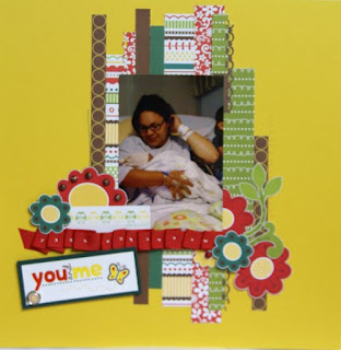 It's a fun and appealing page. I had a great time lifting it.
I chose PP from Cosmo Cricket's Boyfriend collection since I felt it best went with an LO about my DH at work. I also used some grid PP by Fancy pants. On some of the strips, I used an EK success notebook punch to match the work theme. Sometimes, color from a palette can be subtly used, especially when it's one you don't care for or don't have a lot of in your stash. In my LO, I used brown in the form of Catseye colorbox ink to ink the edges of the paper. The yellow/orange was used sparingly as an accent in the form of foofala buttons and the title. I chose the CK newsprint font as I felt it fit the theme of the page well. I also liked the "business" feel of the Basic Grey periphery ribbon. The 7 Gypsies journal tag also fit the theme well.
Here is my take from Stacy's page:

There is still time to play. So check out these sites and submit a creation of your own.
Sketches for you: http://sketchesforyou.ning.com/
Frosted:
http://frosteddesigns.blogspot.com/2010/07/lets-see-those-border-punches.html
This Lo by Stacy R. was a wonderful page to scraplift:

I chose PP from Cosmo Cricket's Boyfriend collection since I felt it best went with an LO about my DH at work. I also used some grid PP by Fancy pants. On some of the strips, I used an EK success notebook punch to match the work theme. Sometimes, color from a palette can be subtly used, especially when it's one you don't care for or don't have a lot of in your stash. In my LO, I used brown in the form of Catseye colorbox ink to ink the edges of the paper. The yellow/orange was used sparingly as an accent in the form of foofala buttons and the title. I chose the CK newsprint font as I felt it fit the theme of the page well. I also liked the "business" feel of the Basic Grey periphery ribbon. The 7 Gypsies journal tag also fit the theme well.
Here is my take from Stacy's page:

There is still time to play. So check out these sites and submit a creation of your own.
Sketches for you: http://sketchesforyou.ning.com/
Frosted:
http://frosteddesigns.blogspot.com/2010/07/lets-see-those-border-punches.html
Tuesday, June 15, 2010
Crazy About Stars
I recently read a tutorial about making folded paper stars...and now I am hooked. I just have to figure out what else I can fold or crease. I will admit, that on my last 3 layouts, I have found an excuse to add a paper star.
To learn how to make a folded star, go here:
http://scrapbookandcardstodaymag.typepad.com/scrapbook_cards_today_blo/2010/06/paper-stars-with-kimber-.html

For the current Studio calico blog challenge :
http://studiocalico.blogspot.com/2010/06/be-bold-challenge.html and for the challenge over on Frosted designs: http://frosteddesigns.blogspot.com/2010/06/tgif-and-you-know-what-that-means.html , I created this layout about my son and his obsession with me taking his photo while he's underwater. All of the photos were taken using a disposable underwater camera. While I wish I had a nice digital underwater camera or the adaptor for my digital one, I find these cameras work pretty well. I love the bold turquoise color of the photographs...and when I matched the red cardstock to my son's red shirt, I loved the boldness of the color combo. So I chose to stick with these two colors for the whole layout. I cut the star using my cricut, but you could use any die cut or star punch. You could also trace a star cookie cutter. Use your bone folder to crease and fold the star. I folded and refolded a few times to make the creases more pronounced. I chose to add diamond stickles to the star so they would match the chipboard alphas(manufacturer unknown).it doesn't show well in the photo, but the alphas have glitter on them. To help the star keep it's dimension and to help adhere it to the page, I glued part of a cotton ball inside. The ribbon is from Cosmo Cricket's Honey Pie. Since the colors and title were so bold, I chose to keep the layout more simple.
I hope you'll be seeing some stars on one of your next layouts.
Update: and thanks to a comment from craftygirl...I just submited this Lo to Pratical scrappers. Thank you for the tip!
To learn how to make a folded star, go here:
http://scrapbookandcardstodaymag.typepad.com/scrapbook_cards_today_blo/2010/06/paper-stars-with-kimber-.html

For the current Studio calico blog challenge :
http://studiocalico.blogspot.com/2010/06/be-bold-challenge.html and for the challenge over on Frosted designs: http://frosteddesigns.blogspot.com/2010/06/tgif-and-you-know-what-that-means.html , I created this layout about my son and his obsession with me taking his photo while he's underwater. All of the photos were taken using a disposable underwater camera. While I wish I had a nice digital underwater camera or the adaptor for my digital one, I find these cameras work pretty well. I love the bold turquoise color of the photographs...and when I matched the red cardstock to my son's red shirt, I loved the boldness of the color combo. So I chose to stick with these two colors for the whole layout. I cut the star using my cricut, but you could use any die cut or star punch. You could also trace a star cookie cutter. Use your bone folder to crease and fold the star. I folded and refolded a few times to make the creases more pronounced. I chose to add diamond stickles to the star so they would match the chipboard alphas(manufacturer unknown).it doesn't show well in the photo, but the alphas have glitter on them. To help the star keep it's dimension and to help adhere it to the page, I glued part of a cotton ball inside. The ribbon is from Cosmo Cricket's Honey Pie. Since the colors and title were so bold, I chose to keep the layout more simple.
I hope you'll be seeing some stars on one of your next layouts.
Update: and thanks to a comment from craftygirl...I just submited this Lo to Pratical scrappers. Thank you for the tip!
Subscribe to:
Posts (Atom)