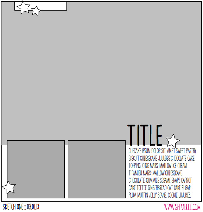
It's been a busy month for me. This week continues to be a little hectic. Being on creative team can keep you cranking out layouts in between the moments when you step into your role of wife and mom. Sometimes, I need a creative timeout. So last night, I took a little break from writing tutorials for Scrapbook News and Review Magazine. I needed to recharge myself a little. Sometimes using a sketch does just the trick. I can sort of put my mind on creative cruise control and just plug in the elements the sketch requires.
I chose a sketch from Shimelle aka Glitter girl. Once again, I find myself using a nice big photo. Scrapping with big photos may seem hard to do. However, that one photo takes up a large amount of real estate on your canvas. This means you need just a few little embellishments here or there and before you know it, the layout is complete. The trick to working with a large photo is finding the right one for the spot. Then it can work alone or with a few smaller supporting photos.
The photo of my son in the paint brush art car fit the bill nicely. I also just happened to have two supporting photos to fit into the sketch. Choosing the photos took up the longest chunk of my time. The rest of the layout is very simple. There are a lot of bright, bold colors featured here. I used a black canvas to keep the layout from becoming too wild. I also chose to keep the embellishing low key. I was able to create this layout in under an hour.
Adventure in Art by Christy Strickler
Supplies| Cardstock: Colorbok; Patterned Paper, Stickers, Die Cuts: Amy Tangering for American Crafts; Button: Basic Grey; Alphas: Sassafrass
I am often asked how I am able to create layouts so quickly. It took a little time to let myself learn that I could create quickly. Sketches make it easy.Learn to use them and to adapt them to fit your style and supplies. Having kits ready to go is also a big help. I have my supplies organized to enhance the way I work. It took time for me to learn about my creative process. I also had to accept who I was as a memory keeper. In doing so, I was able to tell myself that not every layout I create has to be complex. So now, when I have just a little time for a creative time out, I can create quickly with the satisfaction of having a layout, not only done, but adored.
For more inspiration for using Big Photos on your next layout, check out my Big Photos Pinterest Board.


Really cute Christy!! I love the large photo paired with the two smaller ones. I tend to stay away from large photos, because I like to embellish my page and I always feel like it doesn't give me room to do that. But I did have one for a Blog Hop that's coming up and the sketch used a big photo, and I really liked working with it.
ReplyDeleteSo nice to meet another Christy! Your layout is wonderful. The modern feel of the alphas go perfectly with the photo.
ReplyDelete