Showing posts with label fussy cut. Show all posts

Saturday, December 3, 2011

The Twelve Tags of Christmas-Day 2

The tag for day two was simpler than day one. I think it's a good thing as it took me two days to make the first tag! LOL Once again, I did not have many of the materials, so I improvised.
Materials: Tim Holtz metal charm
Colorbox gold ink and Chestnut roan ink,
making memories snaps
Pink Paislee trim, twine, Bazzil cardstock
Holly  from K and Co. paper
diamond stickler

I used a printed kraft paper from the Paper Studio. To get the same effect as having the resist paper, I stamped the word Christmas with rusty pickle alphas and clear embossing powder. After I heat set the powder, I rubbed white acrylic paint across the paper. I quickly wiped it down to reveal the word. The holly was fussy cut from the k and co.paper. I hand cut the border on the bottom from chipboard. Inking it in cold achieved a nice, metal like appearance.
    I really liked how Tim had the indentations in his brads. I chose to use snaps. I did not attach them to the chipboard right away.Instead, I crimped the back of the snaps in my crop-o-dile. to do this, place the snap in the crop-o-dile without any paper. Then punch down. The result is a somewhat flattened back to the snap.

I then flipped the snap over and used the bump in the crop-o-dile to add the dent. Once I had five done, I used glossy accents to adhere them to the page. It's so much easier than trying to set the snap directly into the paper.
  I drew the dear by hand, then carefully cut it out. I inked the edges with the chestnut roan, then carefully edged it with Diamond stickles. My son says he likes it better than the day one tag! No kidding! LOL and this one was so much less work for me! Sometimes, simple really is best I guess!

Saturday, September 24, 2011

Scrap Our Stash On the Grid Challenge


When most people think of a grid design in scrapbooking, they tend to think of photos and papers evenly aligned. Yet here I was, painting wayward lines in a grid pattern on a piece of cardstock. The lines came first, and then came the photo. I began placing page elements around it...some floating free, other held fast with a bit of hand stitching. The placement is sort of haphazard with a plan. Fussycut items are anchored to the grid while the eye flows across it. The page reminds me of how my cat was rolling across the rug...and I hope it gives a sense of motion as you view it. I myself can see him now, wiggling and moving, pausing just long enough to shoot me that imploring look.

We R Memory Keepers papers- grandma's kitchen
K and company yellow frames- cut apart
acrylic paint
dmc floss
Kiasercraft tiny type alphas
Pink Paislee alphas
Colorbox chestnut roan ink

  In the making of this page, I have come to realize two things. 1. I almost  never use a frame as a frame. I almost always cut it apart. Sometime earlier this year, I came to the realization that I am allowed to alter and use the items in my stash as I want to. So if there is something in your stash, like a frame, and you want to cut it apart or change the colour of it, go for it! 2. One of my favourite tools is my hole punch. Yep, just a cheap school supply style hole punch! It works wonders on many pages. In this case, I punched out tiny stars from the patterned paper and sprinkled them on my page.

There is still plenty of time for you to try out the grid challenge at Scrap Our Stash. We would love to see tour work!

Sunday, July 24, 2011

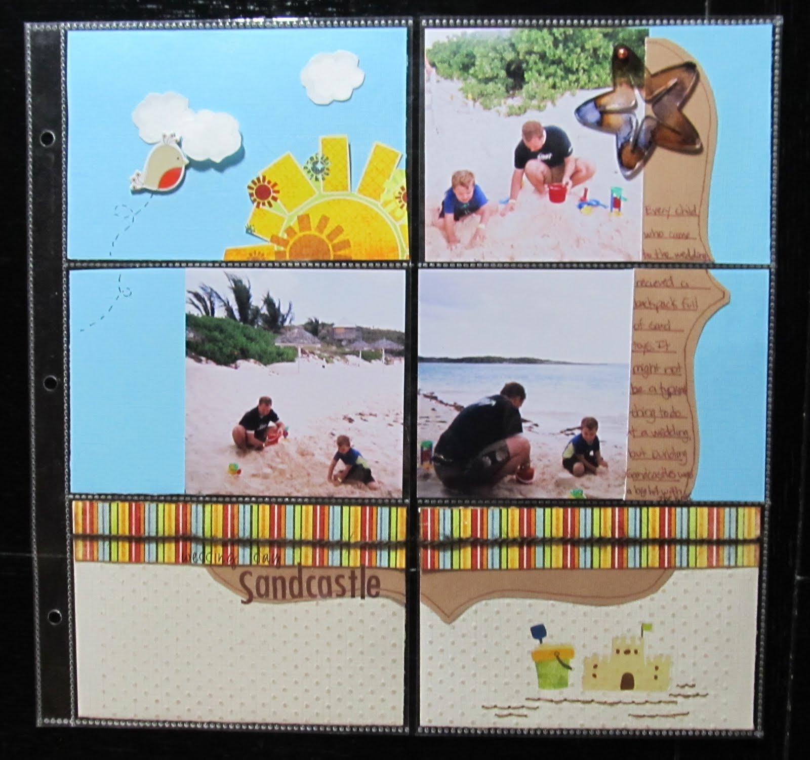
Wedding Day Sandcastle

    A few years ago, We were invited to attend a beach wedding. It was a lot of fun, though I will admit it felt very odd to attend a wedding dressed in a bathing suit and beach attire. My son thought it was awesome. He hates to dress up. The bride also made sure all of the kids who attended would receive a backpack of sand toys. The sand toys kept all of the kids( and my husband) occupied while we awaited for the wedding to start. It was a definite win-win scenario!
   I left my camera at home since the wedding was at a beach. I opted for some disposable waterproof cameras as I had no idea what we might encounter in regards to sand and water. When I began scrapping these pictures, I decided to try some of the 4x6 pocket sleeve style page protectors rather than the traditional 12x12. I had received a package of them for free with an album purchase.I figured this would be a great opportunity to use them since the photos were all standard 4x6 prints. I found there were a lot of pro's and cons to using these page protectors. You really need to plan where these will go in your album as the pockets are on both sides of the page protector. Using the photo sizes the pockets are intended for makes things a lot easier. I think If I had used one of the kits, like the simple stories line, which are designed for these types of page protectors, I would have had a much easier time. Once I got going though, it made for a quick and easy page.
Items from my July counterfeit kit:
Fancy Pants Paper and rub on's
Making Memories alphas
not from kit:
Jillibean soup twine
dmc floss
DCWV chipboard bird
Studio G stamp in white inke with clear embossing powder
Coredinations CS embossed with swiss dots folder and sanded
Colorbok CS
Maya Road Acrylic starfish coloured with eggplant and ginger alcohol inks

I did crop the 4x6 photos down. Not cropping them would have allowed me to just slip them in the pocket. I also chose a Pagemaps sketch, which meant it took a little more time and thought. For a faster page, I could have just decorated 4x6 cards and journal spots and slipped those in. On a positive note, I was able to use scraps for almost the entire page!

Shown above, are the backs of some of the 4x6 blocks. The white sections are the photos. You can also see how I covered page scraps that would otherwise have had gaps or sections missing with other pieces of paper layered over it.
 I could have left the tan paper and white clouds plain. However, embossing them gave just a tad more texture to the page. The sand coloured Coredinations cardstock was embossed with swiss dots using my texture boutique. I lightly sanded it to reveal the slightly darker core colour. I chose to use white ink in a cloud shaped stamp with clear embossing powder to add a subtle lining to the clouds. While these would have been just fine plain, this tone on tone embossing gives it a more finished look as does the hand stitching under the sand castle rub on.
 Now that I have the hang of working with these type page protectors, I will certainly consider using them more often. I think I will try some soon with one of the kits that are designed for these. Maybe then, I will find I like them even more than I do now.
 

Tuesday, July 19, 2011

The Method Behind the Little Monsters

  I am in the process of training for a Marathon. It's not the kind you run. It's the kind you scrap. It's also known as the Mother LOAD. Over the next few weeks, we'll be training to scrap 26 pages over the course of 26 days. For those of you who don't know what LOAD stands for, it means LayOut A Day. Finding the time to make a scrapbook page every single day is quite the undertaking. I have completed two other LOAD's this year. During the first one, in February, I managed to create a page every day. For the second one, in May, I managed to make a lot of pages but did not get to scrap daily. I did learn a lot during both. The main thing being that letting go of perfection is fine. Just choose your photos and products and start scrapping. I have made a lot more pages since then. I find that I am loving more of my pages now that I have freed myself from making them perfect. After all, people are looking at your albums for the story, not your page composition.
 As part of the Mother Load, we were asked to go over our creative process. While creating pages this week, I realized that I have more than one process. I think this is a good thing, as it open me up to different means of inspiration. I thought I would share a couple of those creative methods with you today.
  The first page was inspired by an HTC phone ad that I saw while reading a magazine at the hair salon. It looked a lot like this one:    
                                                           
                                                     
So I snapped a photo of it on my smart phone. What I liked most about it was how the phone made the letter O in the center of You. I wanted to do something like it on a page.I actually held onto it for awhile until I came across the right photos. I ended up using a photo and hand stitching to create the O in Monster's.
SEI papers and sticker
Basic Grey alphas
paper trunk Black alphas
colorbox black ink

This was one of those photos that I had been unsure what to do with. Sometimes ideas or thoughts sort of stew around for a bit in my head.The same went for the paper( no clue how to use it), but once I got the idea for the title, the page came together. By sticking with the SEI kit, I was able to quickly select papers and stickers to go on the page. Paint has become a go to medium for me. I can always get the colour I need versus spending time searching for the perfect Cardstock. In this case, the paint helped tone down the busy pattern. I used to hang onto elements like the sticker because I felt they had to be used a certain way as they were intended. Now, I have no fear about altering them. In this case, it was designed to be about one person. I just chose to cross over the word "is" and write in the word "are" so that I could include all of the kids' names. I also made an error on this page. I wrote the date incorrectly. While I was able to wipe it off, it left a smudge. I decided I was ok with it, since the page was a bit messy anyway.
 Sometimes photos inspire me. Other times, I see a sketch and instantly know what photo to use with it. I tend to print off a bunch of photos and I have them in my albums in the order I want the finished pages to be in. When I saw the Sketchy Thursday 7-14-11 sketch, I knew at once which photo I wanted to scrap. I had a second little monster themed photo.

Sei papers and puffy black alphas
Cosmo Cricket tiny type alphas
dmc floss
white acrylic paint
Sassafrass chipboard number
Sketchy Thursday's 7-14-11 sketch

Having made the prior page, it was easy to find and use the same supplies. In fact, I often tuck scraps from the first completed page into the album right along with the other photos. Then they are right there when I am ready to work on page two. Having the sketch right there meant it was easy to pull the elements I wanted for the page from the scraps. The title took a little more thought. often on the second page, I will not include a title or will make a subtitle. In this case, the title is part of the journaling which reads " I could hear them giggling. So I peaked under the bed and 6 eyes stared back at me." The white paint helps anchor the photo on the page along with the shelf created by the scraps and stitching. A visual triangle has been created with the orange monster, orange writing in the journaling, and the orange strip of paper under the title.
  I have a few other creative methods that inspire me to work. Most of the time it's a photo. Sometimes, it's a new product or a kit I made from shopping my stash. What allows me the most time to scrap is the way I arrange my photos. I think that's something I shall have to photograph and share in another blog post.

Monday, June 27, 2011

Soft Kitty, Warm Kitty

   If you watch the Big Bang Theory( one of our favourite shows) than you might recognize the little song. My husband suggested I use it for a page about our cats. It's one of the few times he has had an idea ( or interest in sharing one) for a scrapbook page. So of course, I obliged him. I chose a soft palette form my June Counterfeit kit.The pink and blue tones of the Sassafrass indie girl papers seemed the purrfect way to convey the warm snuggly feeling of my cat's napping.

Scraplift of "Love These Moments" By Kelly Noel
Sassafrass papers, pink glitter alpha, and paper whimsy flower
Basic Grey Brads
Colorbox Stucco ink.
  On both pages, I chose to use foam adhesive to lift parts of the patterned blocks from the paper. I had seen this on other pages before, and had loved the way it added dimension to the page. On the second page, I was struggling a bit with photo placement. I realized that cutting one of the photos in half made the page more interesting.
Sassafrass June Sketch challenge

I don't know about you, but photos of cats always make me smile. Now I am off, to hopefully use up more of that counterfeit kit. Seems like life keeps getting in the way of scrapbooking lately!


Sunday, June 5, 2011

A Little Bit of Hot Air

  So what comes to mind when you think of hot air? Some might think of the hot summer weather. My husband might jokingly tell you it's the things I say. In regard to science, it's what can make a balloon go up. No...I didn't take a ride in a hot air balloon, though part of me wishes I had. It would have been a wonderful way to teach my son, first hand, about the heating and cooling properties of air. We settled for our own tiny little hot air balloon, made in the comfort of our kitchen with a party balloon and some heated water. We attached a little balloon to an empty glass bottle, then boiled the bottle. My son's reactions to such simple things never cease to amaze me. As the balloon began to expand and rise, he cried out in sheer amazement. Then as we began the process of cooling the bottle in a container of cold water, I heard his tell-tale exclamation of  "ooohhh, cool!" Another lesson learned. Another series of cute photos to scrap. More requests of " Can we start with science today?" What can I say except that I love being able to homeschool my son.
  The experiment and photo taking was the easy part. Picking the right paper was also very easy for me. I had gotten some Kaisercraft papers with balloons in a recent club kit last Fall. How I was going to align the photo and place them on my page seemed to elude me. This past week, a challenge was issued at From Screen 2 Scrap which featured the movie poster from Disney's UP. When I saw that poster I knew it would be the perfect challenge to use these photos on, but I also knew how the photos should be placed on the page.
                                                                       
    Before placing the photos, I splattered the card stock with some home made mist. I had mixed some walnut ink with silver paint as a sort of experiment. The walnut stain had turned the silver paint into this wonderful golden mist. I next matted the photos on a cream and brown paper, rolling and tearing the edges as I went. I felt like it gave a "well travelled" feel to the papers as did adding a little Colorbox Chestnut roan ink. As I placed the photos, I followed the images of the people in the poster.I anchored the photos to the page with strips of patterned paper. I used the title and date as places to add my title and embellishments. I used my new WE R Memory Keepers cloud stamp on the page. and then strategically added chipboard and fussy cut images of hot Air Balloons. I used 3-d foam on the fussy cut balloons to add dimension. Little Yellow Bicycle alpha stickers and some older scrabble style letters created the title floating among the clouds.

  I love how the elements add a hint as to what the photos are about, even though we did not get to experience a real Hot Air Balloon adventure. Using the poster as a guide, I was able to make a fun, yet quick page to add to my album. The poster is also a reminder that we can make a scrapbook page sketch from anything we see. We don't necessarily need someone to make a sketch for us. So if you are stuck in a creative bind, try checking out a few movie posters or ads for inspiration.

Thursday, March 31, 2011

Angry Birds

  No...this isn't anything to do with Alfred Hitchcock. As I am writing this, I am also wondering how many people out there know who Hitchcock is. ( My son had no clue) Which makes me feel a bit old...but then I digress. This is about a silly little phone app. You see, last fall, my husband got me a new android smart phone. After which, we searched the app store to see what fun games we could find. Angry Birds was one of those games. If you have never played, the object of the game is to shoot various types of cartoon birds at some green pigs who hide themselves in strange looking buildings. Sound ridiculous? Well, it is...but, it's also fun and addicting. Which leads me to my next scrapbook page. Both my son and my husband liked the game so much, that at first, I barely got to use my phone. I snapped these photos of my son's cute facial expressions as he was playing the game.
Practical Scrappers March Sketch

I went on-line and found a photo of the game which had the name of the game in it. This enabled me to print it and then fussy cut the title. All of the papers, chipboard and stickers are from Crate Paper's Seasons collection. I chose them because of the birds. I only had one chipboard bird and I wanted to give the impression of the birds flying across the page. So I used the chipboard shape to trace and then cut out additional birds from the paper.  I used a white gel pen and a Martha Stewart white chalk marker to add the bird's details. My sew easy left a series of holes which simulated the birds' movement.
Scrapfit workout#40 - sketch

Having a little green pig on the page was a must. So I cut a small circle, added a green chipboard button and hand cut some ears. With some google eyes added, I now had a cute pig for my page.
 So...if you have a smart phone and have yet to try it, I highly recommend angry birds. If your family catches on and steals your phone, well...take some photos and scrap them while you wait to get your phone back.
 

Sunday, November 21, 2010

Climb: an exploration of inspiration

   Paint can be a tricky medium. It looks awesome on a page but yet, it is such a permanent thing to commit to. It takes a little getting used to when you are trying it out on a page. I find that the more I use it, the more comfortable I am becoming with it.

For " Climb" I felt that paint was just the thing to use on the page. It's a page I completed for a combination of challenges at Sketches 4 All. One challenge being a scraplift and another being an ad inspiration challenge. I also added the challenge to use circles on the page and my own posted challenge...to make a hand made embellishment. Here are the 2 inspirational pieces from which I created my own page:

by Stacy R.


ad inspiration challenge photo

The basic design of Climb is a very close scraplift of Stacy 's page. I have been wanting to go back to basics...back to when I frequently used pens or markers on a page as part of the design. I did that a lot when I first started scrapbooking and somewhere along the way, I forgot that pens were for more than journaling. I used my new Bic Marc it's to draw a border around the white paint on the kraft paper. Overall, I placed many of my page's elelments the same way she did.

From the ad, I took the color. I love the bright splash of green and orange on the white. Those colors instantly drew me to the trees in the Jillibean Soup papers. However, the black base was too much, too strong. So I chose a more organic approach with the kraft paper and the browns. It also better matched the outdoor photos. I loved the repetitive circles of the trees. So I fussy cut some more Jillibean paper and made the circle into scallops. I used papertrunks circle pattern from the Batik collection to stamp some white circles onto kraft. Layering this trim over the scallop provided a more finished look to the page. I fingerpainted a circle onto a piece of scrap kraft. Some handstitching and painted rays made a sun. However, the sun was still flat. Stitched swirls similar to the splashes of paint in the ad provided a more complete and interesting  sun. A Handstitched title and date ad to the homespun/natural tone. The bird( from K and company) completes the nature imagery.

I am definately more comfortable with the paint than the times I have used it before. It's easy to combine challenges and inspiration into one page. It can leave you with a wonderful page that you love and enjoy sharing.

Saturday, August 7, 2010

My First Sketch!

I never thought I would be one to draw my own sketch. Yet, here was a challenge that required me to do just that! At first, I was really intimidated. Finally, I just decided to slide the photos around on the page and then work from there. This worked well for me as I began to see ideas form while sliding the photos around. I finally settled on a design and then sketched what I had made.

I used my cricut to cut the title with "a red bucket" font. The journal spot is K and Company. I tore a cs border, used an old fiskars border punch on another shade of green, then added some ek success fiber. I fussy cut some K and Co. scalloped pp from the recycle green grass matte stack. I then added a cloud 9 design baby boy stitched sparkle sticker. I fussy cut the green flower from the DCWV all dressed up stack and added a brad. The little green flowers were part of a ribbon strip I got in a rak. I cut them apart and added a green pearl to each. I stamped dots with green moss colorbox ink and a pencil eraser.

I am really happy with how this turned out and now I think I can draw a sketch almost any time I would like to. To try your hand at this challenge, pop on over to Sketches for you.

Wednesday, July 14, 2010

Bloom

 It's been a long time since I have used my embossing powders.Years, in fact. So when Club CK had an embossing challenge for its summer camp, I pulled out my old heat gun. I ended up using a free paper piecing pattern from Club CK. I stamped the bird with colorbox blue lagoon and then heat embossed some blue powder over the top. Instead of using the branches that came with the pattern, I fussy cut some branches from a DCWV green stack paper. The nest is also from the green stack. I wanted the nest to "pop" so I tried another recommendation from Club CK. I used my crop-o-dile to emboss the dots on the paper. I don't have a cuttlebug yet, so this was a nice easy alternative.You can see a sample of the nest partially embossed here:

 A little tip...if it's a thick glossy paper, don't press too hard or you'll "crack" the finish. I decided to use a Maya road acrylic paisley which I had inked with Stream alcohol ink. I decorated with some diamond stickles, a staple in my supplies...and voila! A lovely bird in nest. I now have the Club Ck nature badge. I'll have to go back to earn the heat embossing badge...but it does help me use up some stash.
   The background paper is DCWV greenstack. I loved the rest of the stack, but until today had no idea what I would use this particular sheet for. The edges are inked in prussian colorbox ink, while the yellow CS is inked in apple green. The inked edges just help define things a little more...at least in my eyes. the title was cut with the AMORE att font on my cricut. This was completed using the sketchy Thursday 7-8 sketch challenge. http://sketchythursdays.blogspot.com/2010/07/78-sketch-challenge.html

For anyone completeing the club CK heat embossing challenge, don't forget to submit your Lo to Practical Scrappers. They are having an embossing challenge this week: http://www.practicalscrappers.com/2010/07/this-weeks-challenge-is-embossing.html


I honestly do not know what the name of the berry is in the photos. Guess I need to do some research...

Saturday, July 10, 2010

With All My Heart....finally

Thirteen years ago this Fall, I married the most wonderful man. I have been so in love with my husband from the first day I met him. Yet, I have not scrapped ANY of our wedding until today. I started scrapbooking when my son was a little over a year old. I was first introduced to the hobby at a Creative Memories party. With all of the photos of my son, I never got to go back to my wedding album. So, when a few months ago, I mentioned to a Friend that I was going to scrap some photos of her wedding, she jokingly said I shouldn't until I had finished my own. So, I made it a goal of mine to get to work on my wedding album.

I saw a sketch on Sketches for you  
http://sketchesforyou.ning.com/group/sketchcrazy/forum/topics/sketch-crazy-2-sketch and thought it would be the perfect jumping off point.

I chose to use Basic Grey Porcelain. I spritzed a little meadow glimmer mist on the cardstock, just to give it a little separation from the mat. I fussy cut the mat and then traced Heidi Swap heart mirrors. i wanted a border of hearts, but I felt they should all match the shape of the heart mirrors. A little cat's eye ink around the edges of the hearts added a finished look. I cut the title from a K and company vellum quotes stack. To make it more special, I used diamond and fruit punch stickles. I chose to stitch the fluorish in ecru floss, so I would not draw attention away from the photo.

Monday, July 5, 2010

Owls and BellBottoms

I was recently challenged to scrap a graduation day photo( a challenge over at Sketches for You). I don't have any of my own. My Dad has those. I have a few of DH and none of DS( who is too young for high school). I do have this one of my mom...which caught my eye and got me to thinking. I was thinking, not of her graduation day ( I obviously was not there), but of growing up in the 70's. Seeing her photo brought back memories of Brown and orange furniture, the Macrame Owl she made for the living room, and the outfit she made me wear. It was all white with Blue and orange owls all over it. AN owl T-shirt and white bell bottoms(literally plastered with owls). So, inspired by these thoughts, I created an LO all about her day. I'll have to call my Dad for the specific details(my mom is no longer with us), but I must say, I really feel like I captured the feelings of the era quite well.


I used mostly Sassafrass PP. I fussycut the owl, stitched on his belly and added real buttons for eyes( he had printed ones). I used more yellow DMC floss around the mat.The brown PP is Recollections. I loved how the blue diffused the brown and yellow tone of the older photo. The flowers are also Sassafrass. The title was cut on my cricut using CK Far Out font.

 This was a Scraplift project on Scrapbook Challenges. I am proud to say it was one of today's featured photos.

Tuesday, June 8, 2010

Let's Gloss over it!

   Because I love gloss. When I was younger, I preferred lipstick.Now...it's almost always lip gloss. My favorite splurge being a small tub of Christian Dior gloss that just makes my lips so soft and shiny. But wait...this blog isn't about beauty tips. It's about scrapbook pages. So what does gloss have to do with anything? Well, It's about a bottle of Glossy Accents to be exact. And I have discovered that I love it about as much as my lip gloss.
   Initially, I had wanted a bottle of Diamond Glaze. Unfortunately, the Little Scrapbook store closest to me does not carry it...but they do carry Glossy accents. Same difference, or so I am told. I still want to try Diamond Glaze, if only to compare. For now though, I am liking what I can create with the Glossy Accents.
   So, what did I make? Well, I wanted to do something special for DH's birthday photo. I decided to make a frame for the photo that said Happy Birthday...and then use the glossy accents to suspend some sequins into the letters. It was a lot of work, but I do like what I made. AND... I was able to submit it for the Sketchy Thursday's 6-03 challenge:


  So, Now you are asking yourself, how did I make this frame? Well, If life were easy, I'd have a Big Cricut. As it stands, I only have a baby bug. So, I couldn't just make the frame fit into the cutting mat. Honestly, you could make this type of frame even without a cricut or die cut machine. You will need to have the following:
-Patience
-an exacto knife or other craft knife
-letters( these can be chipboard letters, stencils, or print letters using your word processor and cut them out to make your own stencil)
-Glossy accents or Diamond Glaze


You can see in this photo the white CS letter I traced.

1. Trace around the edge of the photo that you want to frame onto a piece of Cardstock.
2.Take  your letters(or numbers or even shapes for that matter), trace them around the edge of the rectangle( in this case 4x6) as desired.
3. use your craft knife to fussycut the frame out.
4. apply the glossy accents or Diamond glaze to the letters. Before I did so, I put pieces of cut up sequins onto the letters. On some letters, I painted with smooch ink so it would have a slight shimmery effect under the clear glaze. You could also use confetti, glitter, small beads, sand...use your creativity to figure out what you want to add to your creation.
5. let dry and then adhere photo.

Here is a photo at an angle so that you can see the raised effect of the glaze. The Glossy Accents are also a great way to turn old flat stickers into epoxy style stickers.


Thursday, June 3, 2010

Pinch me...cuz I might be dreaming

It's been a few days since I found out...but I still can't quite believe it. I was asked to be a guest designer for July over on Scrap Our Stash Challenge. http://scrapourstash.blogspot.com/
WOW...I am so excited!!! this is my first guest design spot ever!!! Here is the LO that started it all...


It's my son's hand on mine. I completed it for the "get out of your box" challenge over at Scap Our Stash and for the Color room's Palette#7 challenge. My box...well, I tend to only use color photos. so I decided to experiment with black and white. Fussy cutting is something I never did before, b/c it looked like so much work and time was involved. Boy was I wrong! Now I really love fussycutting. In this case, I fussycut some Sassafrass PP and then used 3-d foam at intervals to add dimension to the page. the fussycutting was just what the page needed.

So...now I am off to work on some more challenges. I'd love to get that sketch challenge and June stitch challenge done. I have had some ideas floating around in my head. And i just need to get them down on paper...

If you need some ideas, stop by Scrap Our Stash  http://scrapourstash.blogspot.com/
or one of my other favorite challenge sites:
The Color Room: http://thecolorroom.ning.com/
Let's Scrap: http://letsscrap.ning.com/rapbook
Scrapbook Challenges: http://scrapbookchallenges.ning.com/
Just to name a few.

Wednesday, June 2, 2010

Danger! Sharks!!!


A few years ago, we had the wonderful opportunity to go on a deep sea fishing excursion near Nassau,Bahamas. it also happened to be my son's first ever fishing trip. I ended up with a lot of great photos! So many, that I ended up with two 2-page Layouts!

  I created this first LO  using a sketch from Let's scrap.
http://letsscrap.ning.com/photo/ls128-november-25?context=album&albumId=2186252%3AAlbum%3A94293

I have been wanting to scrap these photos for a long time. I had even bought a specialty paper from Wubie papers for this LO. However, for the longest time, I never knew how I wanted to work with that paper. Now that I am doing more fussycutting, I felt a little more confident about cutting the paper. I cut a slit along the fishing rod which allowed me to slide in a photo of my son and, at the same time, hide someone's arm that had gotten into the shot. I had so many oddly sized photos that I wanted to use. So, on the right hand page, I tore a strip of DCWV white core cardstock. This allowed me to group like photos together while distracting from the various sizes.


The 2nd LO utilized a Sketchy Thursday's 5-27-10 sketch:
http://sketchythursdays.blogspot.com/2010/05/527-sketch-challenge.html


 I loved the way that the words wrapped around the borders on the sketch...but every time I tried to type a word border or write one, I was unhappy with the results. I have seen a lot of color on color punches used lately and have wanted to experiment with the look. So I used my cricut and cut arrows and "Danger Shark" with the Cry Kitty font in white cardstock. I then created a border around the edges. The red "danger" signs are fussy cut from a sheet of Creative imaginations transparency. I cut the sharks using an SVG file on my cricut and then sprayed them with Sapphire glimmer mist. For the background, I framed the white 12x12 cardstock so i would leave a white border...and then spritzed the center with Patina Glimmer mist. I journaled on leftover paper strips, then inked the edges with Colorbox Prussian blue. Overall I like the results...it's just hard to keep the page flat as the glimmer mist made it buckle a little.


On a side note...I have just found another great challenge site: http://www.practicalscrappers.com/
and I hope to submit this page there for the vellum and transparency challenge.

Saturday, May 22, 2010

Danger: Falling Coconuts!


I decided I would try out the sketch for the June Guest design team challenge on Sketchy Thursdays. I really like their sketches. At first, I wasn't going to submit it because I am just not sure if my SB pages are "there" yet. I am definitely still evolving in this craft. Then I thought about it and figured "why not." It doesn't hurt to submit and in the end, even if I don't get chosen, I have another page completed.

To that end, I had some photos of the damage caused by a coconut falling from the palm tree into our courtyard. I also just happened to get the PP I had ordered from Club Scrap. On a side note, I simply ordered the Castaway PP b/c it so very much fits a lot of the photos I have taken in Florida and the Bahamas. I am still not so sure about becoming a monthly subscriber. So back to the LO, I used some of the castaway PP as the background for this LO. I fussy cut the palm trees so I could slide white CS under the branches. The coconut diagram, "Oh nuts" die cut and the journal spot are also from the Castaway collection.I cut a small danger sign from a piece of creative imagination acetate. The red PP  and (on the 2nd page) the teal PP are Making memories passport collection as is the blue ribbon border. The red ribbon is Cosmo Cricket Cogsmo. I inked the edges of the CS and chipboard arrows with Catseye colorbox ink in moss green.  The arrows are making memories jigsaw arrows.

This is the single page inspired by the Sketchy Thursdays June guest design team sketch( found here: http://sketchythursdays.blogspot.com/2010/05/june-guest-design-team-challenge.html )


and the 2 page LO showing the complete coconut story: