 |
| Let's Scrap sketch 1-4-12 ribbon-jillibean soup, glimmer mist-fairway,sapphire and tiger lily,SEI ink blue ink, Fancy pants to the moon papers,Amer. Crafts thickers-orange alphas,My little Shoebox tiny type alphas, Sassafrass green alphas, K and co. star chipboard sticker. superhero bands- from our egg dying kit, tags made with toilet paper which was embossed, inked and cut to fit the tag. |

Showing posts with label embossing. Show all posts
Showing posts with label embossing. Show all posts
Saturday, March 10, 2012
What's Your Trend?
I recently realized that I have certain techniques that have become trends. I am not necessarily talking about industry trends. I am talking about the trends you may see in the way that you work. I have tried a lot of new things over the past year. Some of those things have become staples in the making of my scrapbook pages. Misting and paint are one of those. I hardly make a page on which one or both are not present. So much so, that many of my friends now identify a page as truly me when they see the mist and paint. Last year, I really felt the need to hand stitch on quite a lot of the pages I produced. I now find that I am not hand stitching quite so much these days. My latest love is to use pen to outline the letters on my titles. I saw it done during a Masterful Scrapbook Design Seminar. Now I hardly feel a page is complete without it.
Who knows which techniques will become a regular part of your design style or which ones may become your scrapbook trends. The important thing is to observe your process. As you do so, you will learn more about who you are and the things that work for you. This will be a big help in developing your confidence and in making your scrapbook budget go farther. You will know which supplies to buy, because you will know the supplies you use most. So now, take a look at your work and ask yourself what your scrapbook trends are.


Friday, December 2, 2011
The Twelve Tags of Christmas-day 1
Last year, I was introduced to the Twelve Tags of Christmas event on Tim Holtz' Blog. While I did not participate, I did learn a thing or two. This year, I decided to try some of the tags myself. I must admit, that while I do like a lot of Tim Holtz' products, I do not own very many of them. Perhaps, at some point in the future, I will be able to acquire more.Meanwhile, I made due with the stash I had on hand.I decided to share some of what I did here along with my version of the tag...which is a bit more like a title block.
First of all let me say that I do not have the same tag Tim used. Indeed, I do not even know the size measurements of said tag. I chose to use a piece of cardstock 4 1/4 inches x 4 inches. There is no special reason the tag is this size other than that, I decided to draw the title by hand to mimic the" Noel" used on Tim's tag. In doing so, My not so awesome skills of drawing meant the title was a certain size. So I had to make the cardstock base in an appropriate size to match the title and hold all of the elements. So yes, if you just did a double take, I did say that I hand drew the title. I pulled out a piece of grungeboard and did my very best to make my "Noel" look like Tim's.It need not be awesome or perfect for it will be covered with glitter. Glitter and paint can hide a lot of mess from erasing.
 After drawing the title, I carefully cut it out using an exacto knife. Try to do it in small stretches, cutting small bits out at a time. Also, don't stress if you accidentally rip bits off, which happened to me. Remember, Paint and glitter can hide a lot of things.
 Look carefully and you will see that the top of the N is missing part of what I drew. Also, the flourish under the L lost some of it's tip. Just to review, after I cut this, I then decided on the size Cardstock that I would use as a base.
The first thing to really catch my eye were the paper pine cones. I wanted to make one so badly! Not having the die, I mulled over a few ideas.The following is what worked best for me.
I took the guard off of my corner rounder and punched a scallop border. Small scallops seem to work best for this, since I wanted a small pine cone. You could even draw your own border, for the scallops need not be perfect. I initially cut a 12 inch long border. For the small pine cones on this project, I found that I only needed half of it to make one. Once the Scallop border was punched, I rolled and bent the edges a bit. You will do a bit more of this later when the pine cone is completely made,but doing this a little now is a huge help for later.
 Next, I adhered a toothpick to the edge of the border. Note that I cut off the pointy end. That way, it does not show on the finished pine cone. After the glue is dry, cut slits at the intersection of each "v" in the border.
 Be very careful not to cut all the way through the border strip. Cutting the slits helped me bend and shape the pine cone since the card stock I used was a heavy weight.Now, roll the border onto the toothpick in the same fashion that Tim demonstrated. When you come to the end, adhere the tip of the border. Once dry, begin shaping your pine cone. I found that my paper piercer helped me pull open the pine cone. Just be gentle so you do not tear it. Once that's done, dry brush some white paint on the tips of the pine cone. Then add smear some stickles on with your finger. Repeat to make the second pine cone.
 Honestly, I wasn't really liking my pine cone a whole lot at first. Adding the paint and the stickles is really what gave it that pine cone look.
For the greenery, I hand drew various leaves in an attempt to match what Tim had cut with his dies. I used a lot of inking to make them look better. I did not have the distress embossing powder. So I chose Coredinations whitewashed cardstock with a blue core as my base. I did have Tim's snowflake embossing folder. I used it to emboss the card, then sanded it and inked it with a variety of colorbox inks in browns and greens.I chose to rub the ink on with my fingers so that I could apply it randomly, but with purpose, to the tops of the snowflakes. My distressing tool was my scissors.I rubbed the blade along the edge of the cardstock at intervals.
Since I wanted to use this as a title block, I substituted handmade pins for the jewels and ribbon. As you can see, no one will notice the bits missing from the title. I painted the edges of the "noel" with silver acrylic paint and then added the glitter to the top...effectively hiding the parts that ripped off when I was cutting the title.
So now, after a lot of work( that I did enjoy), I am off to tackle tag # 2. Here's hoping I am as happy with it as I am with Tag 1!
First of all let me say that I do not have the same tag Tim used. Indeed, I do not even know the size measurements of said tag. I chose to use a piece of cardstock 4 1/4 inches x 4 inches. There is no special reason the tag is this size other than that, I decided to draw the title by hand to mimic the" Noel" used on Tim's tag. In doing so, My not so awesome skills of drawing meant the title was a certain size. So I had to make the cardstock base in an appropriate size to match the title and hold all of the elements. So yes, if you just did a double take, I did say that I hand drew the title. I pulled out a piece of grungeboard and did my very best to make my "Noel" look like Tim's.It need not be awesome or perfect for it will be covered with glitter. Glitter and paint can hide a lot of mess from erasing.


The first thing to really catch my eye were the paper pine cones. I wanted to make one so badly! Not having the die, I mulled over a few ideas.The following is what worked best for me.
 |
| materials for paper pinecone: scallop border, toothpick, adhesive like hot glue or glossy accents White paint, brush and stickles( I used icicle.) |


For the greenery, I hand drew various leaves in an attempt to match what Tim had cut with his dies. I used a lot of inking to make them look better. I did not have the distress embossing powder. So I chose Coredinations whitewashed cardstock with a blue core as my base. I did have Tim's snowflake embossing folder. I used it to emboss the card, then sanded it and inked it with a variety of colorbox inks in browns and greens.I chose to rub the ink on with my fingers so that I could apply it randomly, but with purpose, to the tops of the snowflakes. My distressing tool was my scissors.I rubbed the blade along the edge of the cardstock at intervals.
 |
| Materials: kaisercraft music paper, Colorbox chestnut roan ink, Colorbox ink in olive green and moss green, paper scraps, Tim Holtx embossing folder. Coredinations whitewash cardstock, hat pins, glass beads, silver acrylic paint, silver glitter, white acrylic paint, icicle stickles |
So now, after a lot of work( that I did enjoy), I am off to tackle tag # 2. Here's hoping I am as happy with it as I am with Tag 1!
Sunday, July 24, 2011
Wedding Day Sandcastle
A few years ago, We were invited to attend a beach wedding. It was a lot of fun, though I will admit it felt very odd to attend a wedding dressed in a bathing suit and beach attire. My son thought it was awesome. He hates to dress up. The bride also made sure all of the kids who attended would receive a backpack of sand toys. The sand toys kept all of the kids( and my husband) occupied while we awaited for the wedding to start. It was a definite win-win scenario!
I left my camera at home since the wedding was at a beach. I opted for some disposable waterproof cameras as I had no idea what we might encounter in regards to sand and water. When I began scrapping these pictures, I decided to try some of the 4x6 pocket sleeve style page protectors rather than the traditional 12x12. I had received a package of them for free with an album purchase.I figured this would be a great opportunity to use them since the photos were all standard 4x6 prints. I found there were a lot of pro's and cons to using these page protectors. You really need to plan where these will go in your album as the pockets are on both sides of the page protector. Using the photo sizes the pockets are intended for makes things a lot easier. I think If I had used one of the kits, like the simple stories line, which are designed for these types of page protectors, I would have had a much easier time. Once I got going though, it made for a quick and easy page.
I did crop the 4x6 photos down. Not cropping them would have allowed me to just slip them in the pocket. I also chose a Pagemaps sketch, which meant it took a little more time and thought. For a faster page, I could have just decorated 4x6 cards and journal spots and slipped those in. On a positive note, I was able to use scraps for almost the entire page!

Shown above, are the backs of some of the 4x6 blocks. The white sections are the photos. You can also see how I covered page scraps that would otherwise have had gaps or sections missing with other pieces of paper layered over it.
I could have left the tan paper and white clouds plain. However, embossing them gave just a tad more texture to the page. The sand coloured Coredinations cardstock was embossed with swiss dots using my texture boutique. I lightly sanded it to reveal the slightly darker core colour. I chose to use white ink in a cloud shaped stamp with clear embossing powder to add a subtle lining to the clouds. While these would have been just fine plain, this tone on tone embossing gives it a more finished look as does the hand stitching under the sand castle rub on.
Now that I have the hang of working with these type page protectors, I will certainly consider using them more often. I think I will try some soon with one of the kits that are designed for these. Maybe then, I will find I like them even more than I do now.
I left my camera at home since the wedding was at a beach. I opted for some disposable waterproof cameras as I had no idea what we might encounter in regards to sand and water. When I began scrapping these pictures, I decided to try some of the 4x6 pocket sleeve style page protectors rather than the traditional 12x12. I had received a package of them for free with an album purchase.I figured this would be a great opportunity to use them since the photos were all standard 4x6 prints. I found there were a lot of pro's and cons to using these page protectors. You really need to plan where these will go in your album as the pockets are on both sides of the page protector. Using the photo sizes the pockets are intended for makes things a lot easier. I think If I had used one of the kits, like the simple stories line, which are designed for these types of page protectors, I would have had a much easier time. Once I got going though, it made for a quick and easy page.
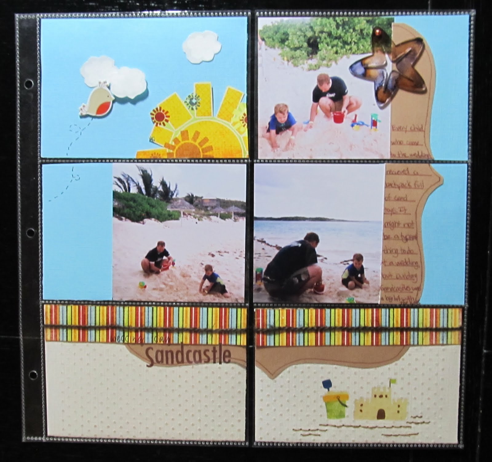 |
| Items from my July counterfeit kit: Fancy Pants Paper and rub on's Making Memories alphas not from kit: Jillibean soup twine dmc floss DCWV chipboard bird Studio G stamp in white inke with clear embossing powder Coredinations CS embossed with swiss dots folder and sanded Colorbok CS Maya Road Acrylic starfish coloured with eggplant and ginger alcohol inks |

Shown above, are the backs of some of the 4x6 blocks. The white sections are the photos. You can also see how I covered page scraps that would otherwise have had gaps or sections missing with other pieces of paper layered over it.
I could have left the tan paper and white clouds plain. However, embossing them gave just a tad more texture to the page. The sand coloured Coredinations cardstock was embossed with swiss dots using my texture boutique. I lightly sanded it to reveal the slightly darker core colour. I chose to use white ink in a cloud shaped stamp with clear embossing powder to add a subtle lining to the clouds. While these would have been just fine plain, this tone on tone embossing gives it a more finished look as does the hand stitching under the sand castle rub on.
Now that I have the hang of working with these type page protectors, I will certainly consider using them more often. I think I will try some soon with one of the kits that are designed for these. Maybe then, I will find I like them even more than I do now.
Friday, June 24, 2011
Frugal Friday Tip: DIY embossing folders
Last November, I was very happy to add a Sizzix Texture Boutique to my arsenal of scrapbook tools. Of course, what would an embossing machine be without the embossing folders? Since I purchased the Texture Boutique, I began to slowly acquire a variety of folders. However,most days, my budget did not allow me to purchase more. So you can imagine that I was quite intrigued by the idea that I could make my own. I had come across the photo of just such a handmade folder on Pinterest. The Photo led me to a blog post with directions. Mel, the owner of Mel Stampz blog, had shared, in detail, how she created an embossing folder out of recycled cereal boxes and mod podge. So the very next day, I went out to the craft store and purchased the mod podge so that I could get to work.
Now while I do have access to quite a lot of cereal boxes, I chose instead to raid my stash for some sheets of chipboard. I had a whole pack of this thick chipboard that I had purchased at the craft store. I felt that it would be a bit heavier and longer lasting than the cereal box. Next, instead of cutting chipboard pieces, I used some of the precut ones I had in my stash. Warehouse sales and Manufacturer grab bags have left me with quite the variety of chipboard pieces. The precut pieces are also thick and durable, which in my mind, would translate to better impressions when I used them to emboss.
The folders were incredibly easy to make. I simply used my embossing folders as a template to mark out the size I would need on the chipboard sheet. Once that was done, I cut the sheet and set to work adhering the chipboard shapes. For my first folder, I chose some chipboard stars from the rusty pickle. I laid the stars out onto the chipboard sheet, then used a brush and mod podge to adhere them. I did go back and cover the whole thing with a layer of mod podge. Very little mod podge was needed. The hard part was waiting for an hour so that it could cure. While I waited, I made another embossing plate with chipboard hearts from Maya Road.
Once the handmade embossing plates had cured and were dry, I next set about experimenting with a variety of sandwiches to use in my machine. I tried an extra sheet of the chipboard-cut down to size, a piece of craft foam, and also an old mouse pad. The results were very pleasing.
 |
| Handmade embossing folder made from Maya Road chipbaord hearts, Mod podge, and a sheet of chipboard |
The sandwich with the craft foam and the sandwich with the mouse pad produced the deepest embossed impressions on the paper. Some weights of paper worked better than others. I found a medium weight paper provided the best results. I also tried embossing pieces of soda can. I got a very light impressions which, though visible to the naked eye, did not photograph well. It seems that paper will work the best with these homemade embossing plates.
 |
| hand made embossing folder with rusty pickle stars, mod podge and chipboard |
I did try the recommendation of spritzing the paper with water prior to running it through the machine. I found however, that this caused the paper to stick to the hand made template. You can see the red fuzz it left behind on the star plate above. I believe mod podge does make a water proof sealer which may be worth looking into. All of the paper's I embossed were done without water though, except for the one. I tried it with Coredinations colour core card stock. Even with the water, the paper was so thick that a deep impression was not made. It does not even show well in the photo above. There was a slight impression on the star which showed through a little after I sanded it. I still recommend medium weight card stock.
While the hand made templates do not emboss every type of paper, I can still see them as a useful tool and a money saver. I plan to make some more and may even attempt cutting my own shapes or designs to use. Meanwhile, I have plenty of extra precut chipboard shapes with which to work with.http://melstampz.blogspot.com/2009/07/free-hand-diy-cereal-box-cuttlebug.html
Friday, May 6, 2011
Only You Can
This was going to be another simple page about my son and his boyish habit of playing with sticks. However, I decided to switch out the title. Something that simple can lead your journaling down a different path. in this case, that path led me to describe some of my son's best traits. I also, inadvertently, was able to place a little message in the text. I misspelled strength which led me to use acrylic paint to cover the error. It looked a bit unbalanced. This led to adding paint in other areas of the circle, including over some of the other words. I chose to use the words " capture, your and strength." Which leads to the little message for my son...Only you can capture your strength.
 |
| Pencil Lines Sketch 236 Contents from my May Counterfeit kit including: Sassafrass borders Buttermilk colour acrylic paint Recycled chipboard stars embossed with Swiss dots Papers-My Mind's Eye, Fancy Pants, Sassafrass Alphas- basic grey mini Marks Sassafrass |
Friday, March 25, 2011
Frugal Friday Tip: Tin Can Recycling
Last November, I got a Sizzix Texture Boutique. While I love what I can do with it, I really have not used it to its fullest potential. When I saw a recent tutorial about using soda cans and punches, I had the idea to dust off the texture Boutique and embossing folders to see what I could come up with. The results were quite wonderful!
Materials: Embossing machine and folders
soda cans, rinsed out
old scissors
a Bic Mark it or other permanent marker
optional: a child ( My son likes to use my embossing machine. So I cut the soda cans while he worked
the machine.My son thinks this is great fun. )

You will need to carefully cut a slit into the can. Then remove the top and bottom. You are left with a curled piece of aluminium. Then it's just a matter of placing this into an embossing folder and putting it through the machine. I would just advise caution since the can is a little sharp after you cut it.

We experimented with a variety of designs. Some look better than others. You can use some punches to create your own shapes or use the permanent marker to draw a design of your choice.Then use old scissors to cut it out. The marker also comes in handy to draw an inked look to the edges of your cut shape.

I found glue dots to be the best way to adhere the shapes to my page. It's also very easy to punch holes for brads with your paper piercing tool. You could also conceivably choose to hand stitch on your metal embellishment. I plan to dust off my alcohol inks to see how well they would look on my newly embossed designs.
All in all...a wonderful and inexpensive way to make your own page embellishments and recycle. If you have a Frugal Friday tip like this one, please share it at Scrap Our Stash.
Materials: Embossing machine and folders
soda cans, rinsed out
old scissors
a Bic Mark it or other permanent marker
optional: a child ( My son likes to use my embossing machine. So I cut the soda cans while he worked
the machine.My son thinks this is great fun. )

You will need to carefully cut a slit into the can. Then remove the top and bottom. You are left with a curled piece of aluminium. Then it's just a matter of placing this into an embossing folder and putting it through the machine. I would just advise caution since the can is a little sharp after you cut it.

We experimented with a variety of designs. Some look better than others. You can use some punches to create your own shapes or use the permanent marker to draw a design of your choice.Then use old scissors to cut it out. The marker also comes in handy to draw an inked look to the edges of your cut shape.

I found glue dots to be the best way to adhere the shapes to my page. It's also very easy to punch holes for brads with your paper piercing tool. You could also conceivably choose to hand stitch on your metal embellishment. I plan to dust off my alcohol inks to see how well they would look on my newly embossed designs.
 |
| Sassy Lil Sketches 3-14-11 design Cream Acrylic paint MME paper Maya road Chipboard motif inked in Colorbox black ink Paper Trunk Carson, black alphas Black paint stamped with a round lid DMC floss |
All in all...a wonderful and inexpensive way to make your own page embellishments and recycle. If you have a Frugal Friday tip like this one, please share it at Scrap Our Stash.
Friday, February 18, 2011
Add a little fur...
and this month's Counterfeit kit was purrfect! I truly love everything in the Counterfeit kit I made for the month of February. However, one of the reasons some of the things have sat in my stash is due to the fact that I had no clue how to use them. I admit, that I was stumped for a little bit...until I realized I could make these supplies work with photos of my sweet cat on one of her prissy days.
She is a steadfast companion and is often nearby while I scrapbook. Most days, she hangs out on a chair. On this particular day, she chose to get into my scrap basket. Keep in mind, she is not supposed to be on the table. She had been removed several times and deposited upon the chair or the floor...only to persistently hop back onto the table. I decided to snap these photos of her after she had defiantly crammed herself into the little basket.
I felt like the color palette of my kit lent a prissy, refined tone that these pages seemed to call for. I got the idea for the silver frames from the Counterfeit kit blog. Unfortunately, I did not have all of the same materials used in the recommended tutorials. So instead, I used a sizzix folder to emboss a piece of scrap pad cover. I then painted it silver with acrylic paint and inked the edges with Colorbox black ink. I think my version is quite passable and I love the texture it adds to the page. I also loved the ease of making a bling flourish with my i-rock and a Bazzill flourish stitching template.
Now that I was on a roll with my kit, I pulled out some photos of my dog running around after a bath. After all...furry cuteness is a good thing. Admittedly, some of these shots were not the best. It's hard to get your dog to pose for photos when he's busy running around the house and rolling on the rugs. I took care of bad lighting in the shots by converting them to black and white. The movement in the photos was something I loved. The photo in which part of my dog is cut off only serves to emphasize it...at least in my opinion.
 I will admit, I added an extra glimmer mist color to my kit. The moonlight blue just worked so well with the blue papers from the Bayberry cottage pad. I loved the way it looked splattered across the page. I used glossy accents on the hole punched circles to make my own mini pebbles. I also added some as droplets on the photo of my dog shaking.
 I wish my camera better emphasized the blue of the papers in these pages. It makes such a nice pop of color with the black and white papers.
I am really enjoying using my kit. It's been so much fun rediscovering things in my stash and finding photos to use them with. I am really looking forward to using more and to making up a kit for March( WOW...it's almost here!). Stay tuned for more creations with my counterfeit kit...
 |
| Sketch Inspiration #206 |
 |
| sketch inspiration #207 |
Now that I was on a roll with my kit, I pulled out some photos of my dog running around after a bath. After all...furry cuteness is a good thing. Admittedly, some of these shots were not the best. It's hard to get your dog to pose for photos when he's busy running around the house and rolling on the rugs. I took care of bad lighting in the shots by converting them to black and white. The movement in the photos was something I loved. The photo in which part of my dog is cut off only serves to emphasize it...at least in my opinion.


I am really enjoying using my kit. It's been so much fun rediscovering things in my stash and finding photos to use them with. I am really looking forward to using more and to making up a kit for March( WOW...it's almost here!). Stay tuned for more creations with my counterfeit kit...
Thursday, December 16, 2010
The Best Gift of All
Holidays and birthdays are often about the giving and receiving of gifts. For me, the best gift of all( and the true meaning of each celebration) is the warm, happy feeling I get from giving the gift. My son's birthday is no exception to that.

This is actually the title page for the layout I did recently in the Pagerize challenge. I used the rest of the My Mind's eye complete boy patterned paper sheet here as well as more of the Making Memories Just Chillin' Boys die cuts and trims. I used My Tim Holtz embossing folder, but instead of the whole sheet, I cut a star and a crown from it. They make nice accents at the top. I hand stitched around the star to make it pop out a bit more. I cut the K and Co. border into strips, using 3-d adhesive on sections of it for more dimension. You may be wondering about the little frame on the photo. Well, I just had to highlight my husband sitting there smiling.

You see, he also enjoys giving gifts to our son. You'll have to pardon the photo. One of my New year's resolutions is to learn to be a better photographer and to improve my photo editing. When I originally shot these photos, I was focusing on my son and not what was going on in the background. When I later saw my husband sitting there smiling, I knew this was one of those instances in which the background was really important to the story. I edited the photo as best I could, but as you can see, the lighting still hides my husband a bit. I chose the frame to draw more attention to him.
I hope you'll share your birthday celebration layouts with us at Scrap Our Stash. I know I can certainly use some heartwarming cheer during these cold days of December!

This is actually the title page for the layout I did recently in the Pagerize challenge. I used the rest of the My Mind's eye complete boy patterned paper sheet here as well as more of the Making Memories Just Chillin' Boys die cuts and trims. I used My Tim Holtz embossing folder, but instead of the whole sheet, I cut a star and a crown from it. They make nice accents at the top. I hand stitched around the star to make it pop out a bit more. I cut the K and Co. border into strips, using 3-d adhesive on sections of it for more dimension. You may be wondering about the little frame on the photo. Well, I just had to highlight my husband sitting there smiling.

You see, he also enjoys giving gifts to our son. You'll have to pardon the photo. One of my New year's resolutions is to learn to be a better photographer and to improve my photo editing. When I originally shot these photos, I was focusing on my son and not what was going on in the background. When I later saw my husband sitting there smiling, I knew this was one of those instances in which the background was really important to the story. I edited the photo as best I could, but as you can see, the lighting still hides my husband a bit. I chose the frame to draw more attention to him.
I hope you'll share your birthday celebration layouts with us at Scrap Our Stash. I know I can certainly use some heartwarming cheer during these cold days of December!
Saturday, December 11, 2010
A Birthday Theme
Since this month's theme at Scrap our Stash is all about birthdays, I decided that now would be a great opportunity to finish off my son's tenth birthday photos. I also used my new birthday present, a sizzix texture boutique, to make an embellishment for the page. While gifts are a great thing about birthday's, the best gift for me, as a parent, is giving them to my son. His joy sparks mine and inspired the journaling for this page.

In my take of the pagerize challenge, I chose to use wallet size photos and to place them into groups. I used the placement of the original page's pictures, omitting one, as my inspiration for placement. Rather than regular birthday theme papers, I chose paper from My Mind's Eye's complete boy collection and embellisments and trim from Making memories Just' Chillin' Boy collection. The bingo card was made on coredinations cardstock with a Tim Holtz folder.Small star brads finally found a way out of my stash and onto the paper to add to the star motif. I hand stitched around a star on the lower right corner to add some color and texture. I actually fussy cut that star from the above patterned paper strip. The bingo card hides the hole perfectly. Another stash saver I utilized here was the method in which I matted the photos. It also saved me time. I simply chose to leave a small border of white photo paper around each photo when I cropped it from the main sheet.
If you want the recipe for a fast, fun page than pagerizing is a great way to go. The inspiration is right there for you to take and make your own. We'd love to see your version of the challenge...so don't forget to send it in!

In my take of the pagerize challenge, I chose to use wallet size photos and to place them into groups. I used the placement of the original page's pictures, omitting one, as my inspiration for placement. Rather than regular birthday theme papers, I chose paper from My Mind's Eye's complete boy collection and embellisments and trim from Making memories Just' Chillin' Boy collection. The bingo card was made on coredinations cardstock with a Tim Holtz folder.Small star brads finally found a way out of my stash and onto the paper to add to the star motif. I hand stitched around a star on the lower right corner to add some color and texture. I actually fussy cut that star from the above patterned paper strip. The bingo card hides the hole perfectly. Another stash saver I utilized here was the method in which I matted the photos. It also saved me time. I simply chose to leave a small border of white photo paper around each photo when I cropped it from the main sheet.
If you want the recipe for a fast, fun page than pagerizing is a great way to go. The inspiration is right there for you to take and make your own. We'd love to see your version of the challenge...so don't forget to send it in!
Thursday, November 25, 2010
Another November Challenge from SOS
Recently, I bought a texture boutique. I have been wanting to have the ability to emboss. I love that I can use almost any brand name embossing folder in it. One of the things I stumbled across in my quest for embossing folders was a cricut kit to make your own embossing folder. Essentially, what you do is to cut a design on the provided sheets and then adhere the design to the plastic folder. This produces a custom design of your own.
What you will need: a cricut machine, the cricut embossing kit, 1 pack of extra sheets to cut( optional, but I highly recommend it if it's your first time. I messed up a few times and ended up using 3 sheets), a design to cut
I HIGHLY recommend thinking out the design you want to use very carefully. Choose something you just can't find in an already made folder. I bought my embossing kit at Joann's for $10 and then another $10 for the spare sheets. So this can be an expensive folder to make. The design needs to be unique for it to be worth the cost. Also, I won't lie...this was a lot of work. At least for me on my first folder. I think my mistake was in choosing such a small design. I had these chipboard people and I had decided to make an embossing plate to match them. I found a dingbat font of a man, woman and boy holding hands...which matched my chipboard people perfectly. It was a small design though! So it took me 3 hours to make the folder!( now that I know what I am doing, it will be a lot less next time- I hope!)
Step 1: choose your design and set your cricut to do a double cut. I used SCAL and a dingbat font. I do not have a deep housing blade. One is not necessary if you use the double cut. I didn't use the double cut the first time...so I had to use another sheet. thank goodness I had some!
Step 2: carefully remove the design from the cutting mat. the negative space will be on one side, so you will remove the backing and adhere, then run it through your embossing machine to make sure it sticks.
Step 3: take the parts that were cut out, remove the backing and stick them to the opposite side of the folder. this is where I had some trouble. Take the image that was cut out and put it back inside the negative space, then remove the backing on the image. Run it through the embossing machine and it will stick...in the right place to the opposite side of the folder.

As you can imagine...with such small images, this took me quite some time. It was especially hard to get all the little heads poked out and then adhered to the folder. I do think it was worth my efforts though! I used one of the November sketches to make a title page for an album.

I embossed 3 sheets of carstock and inked the edges on colorbox black ink. I used naked chipboard from K and company and Maya Road. Basic Grey June bug embellishments were added for a hint of color. Hand stitching softened the hard colors of the red cardstock and making memories 5th avenue ribbons.In place of the photo, I used a sheet of vellum with the title for the album. The word family was a die cut given to me by a friend. To create a visual triangle, I used a silver hat pin slipped inside the stitching. It helped balance the silver on the chipboard people and the silver S( for our last name) on the tag. The silver S was a find at a thrift store. It was inside a tin marked We R memory keepers for $1. A great find as I have a lot of metal letters now. You can see that I shifted some of the sketch elements around to make it work for my page.
 As far as the cricut embossing folder kit...I do plan to try it again. Now that I know what I am doing, I think it will take me less time and effort. I am very happy with the results of the folder I made. It's unique to me and to my page. That's what made it all worth it!
If you have a page to share, post it at Scrap Our Stash Show and tell Sunday!
What you will need: a cricut machine, the cricut embossing kit, 1 pack of extra sheets to cut( optional, but I highly recommend it if it's your first time. I messed up a few times and ended up using 3 sheets), a design to cut
I HIGHLY recommend thinking out the design you want to use very carefully. Choose something you just can't find in an already made folder. I bought my embossing kit at Joann's for $10 and then another $10 for the spare sheets. So this can be an expensive folder to make. The design needs to be unique for it to be worth the cost. Also, I won't lie...this was a lot of work. At least for me on my first folder. I think my mistake was in choosing such a small design. I had these chipboard people and I had decided to make an embossing plate to match them. I found a dingbat font of a man, woman and boy holding hands...which matched my chipboard people perfectly. It was a small design though! So it took me 3 hours to make the folder!( now that I know what I am doing, it will be a lot less next time- I hope!)
Step 1: choose your design and set your cricut to do a double cut. I used SCAL and a dingbat font. I do not have a deep housing blade. One is not necessary if you use the double cut. I didn't use the double cut the first time...so I had to use another sheet. thank goodness I had some!
Step 2: carefully remove the design from the cutting mat. the negative space will be on one side, so you will remove the backing and adhere, then run it through your embossing machine to make sure it sticks.
Step 3: take the parts that were cut out, remove the backing and stick them to the opposite side of the folder. this is where I had some trouble. Take the image that was cut out and put it back inside the negative space, then remove the backing on the image. Run it through the embossing machine and it will stick...in the right place to the opposite side of the folder.

As you can imagine...with such small images, this took me quite some time. It was especially hard to get all the little heads poked out and then adhered to the folder. I do think it was worth my efforts though! I used one of the November sketches to make a title page for an album.
I embossed 3 sheets of carstock and inked the edges on colorbox black ink. I used naked chipboard from K and company and Maya Road. Basic Grey June bug embellishments were added for a hint of color. Hand stitching softened the hard colors of the red cardstock and making memories 5th avenue ribbons.In place of the photo, I used a sheet of vellum with the title for the album. The word family was a die cut given to me by a friend. To create a visual triangle, I used a silver hat pin slipped inside the stitching. It helped balance the silver on the chipboard people and the silver S( for our last name) on the tag. The silver S was a find at a thrift store. It was inside a tin marked We R memory keepers for $1. A great find as I have a lot of metal letters now. You can see that I shifted some of the sketch elements around to make it work for my page.

If you have a page to share, post it at Scrap Our Stash Show and tell Sunday!
Wednesday, July 14, 2010
Bloom
It's been a long time since I have used my embossing powders.Years, in fact. So when Club CK had an embossing challenge for its summer camp, I pulled out my old heat gun. I ended up using a free paper piecing pattern from Club CK. I stamped the bird with colorbox blue lagoon and then heat embossed some blue powder over the top. Instead of using the branches that came with the pattern, I fussy cut some branches from a DCWV green stack paper. The nest is also from the green stack. I wanted the nest to "pop" so I tried another recommendation from Club CK. I used my crop-o-dile to emboss the dots on the paper. I don't have a cuttlebug yet, so this was a nice easy alternative.You can see a sample of the nest partially embossed here:
 A little tip...if it's a thick glossy paper, don't press too hard or you'll "crack" the finish. I decided to use a Maya road acrylic paisley which I had inked with Stream alcohol ink. I decorated with some diamond stickles, a staple in my supplies...and voila! A lovely bird in nest. I now have the Club Ck nature badge. I'll have to go back to earn the heat embossing badge...but it does help me use up some stash.
The background paper is DCWV greenstack. I loved the rest of the stack, but until today had no idea what I would use this particular sheet for. The edges are inked in prussian colorbox ink, while the yellow CS is inked in apple green. The inked edges just help define things a little more...at least in my eyes. the title was cut with the AMORE att font on my cricut. This was completed using the sketchy Thursday 7-8 sketch challenge. http://sketchythursdays.blogspot.com/2010/07/78-sketch-challenge.html
For anyone completeing the club CK heat embossing challenge, don't forget to submit your Lo to Practical Scrappers. They are having an embossing challenge this week: http://www.practicalscrappers.com/2010/07/this-weeks-challenge-is-embossing.html

I honestly do not know what the name of the berry is in the photos. Guess I need to do some research...

The background paper is DCWV greenstack. I loved the rest of the stack, but until today had no idea what I would use this particular sheet for. The edges are inked in prussian colorbox ink, while the yellow CS is inked in apple green. The inked edges just help define things a little more...at least in my eyes. the title was cut with the AMORE att font on my cricut. This was completed using the sketchy Thursday 7-8 sketch challenge. http://sketchythursdays.blogspot.com/2010/07/78-sketch-challenge.html
For anyone completeing the club CK heat embossing challenge, don't forget to submit your Lo to Practical Scrappers. They are having an embossing challenge this week: http://www.practicalscrappers.com/2010/07/this-weeks-challenge-is-embossing.html

I honestly do not know what the name of the berry is in the photos. Guess I need to do some research...
Subscribe to:
Posts (Atom)