Showing posts with label Club CK. Show all posts

Monday, April 1, 2013

Sketch It Out! Club CK April Edition

It's my turn to host for this month's Club CK Sketch It Out Challenge. I chose to use a sketch with a little twist this month.

This sketch was also recently featured on the Scrapbook News and Review Blog. You can see a little more inspiration for it over there.


Here is the twist! I used mostly die cuts and journal spots to create this layout. No patterned paper was used at all. Even the title letters are die cuts. The twist part is optional in this challenge. However, I hope it will have you seeing your die cuts and journal spots in a while new light. It is so easy to layer them on top of each other for a fast layout. Plus, you are using up your stash.

Cocooned by Christy Strickler Supplies| Cardstock: Colorbok;Letters: Colorbok; Die Cuts: My Little Shoebox; Journal Spots: K and Compant, Studio Calico;Flower: Maya Road; Chipboard: American Crafts; Stencil: Studio Calico; Ink: ranger; As published in Scrapbook News and Review Magazine- Fall 2012


Yes, I know the photo is dark. This is a layout about my son being cocooned in his blankets while he sleeps. I couldn't very well turn on the lights, now could I? Sometimes the story outweighs the need for a great photo.

How will you Sketch it Out? We'd love to see your take on this month's sketch. You can submit your project directly to the Club Ck thread.


Enhanced by Zemanta

Saturday, February 2, 2013

Sketch It Out: February Edition for Club CK

This is my first month hosting the Sketch It Out Challenge over at ClubCK with my friend, Ashely Horton. I hope you will check it out. There is a chance to win a small RAK.  You  have until midnight of February 28th to enter.

Fair warning: you are going to see a lot of Sketch It Out posts from me this month. Every time I participate in LOAD aka Layout A Day, I find it very helpful to use sketches. Over time, and several LOAD challenges, I have learned to create layouts in less than an hour with the help of a simple sketch. I use sketch challenge sites or websites, but I also use magazine ads or layouts. Wondering how? It's simply a matter of breaking a magazine article into basic shapes.

from Luxurious magazine 
During my current session of Guided Study Critique with Get It Scrapped, I was introduced to an article (on the left) which I felt was perfect for a layout. In fact, we were directed to consider just how we might use it given some of the design principles we are currently studying.

At first glance, you might think it wouldn't work. It seems to be visually complex. Taken piece by piece though, and you end up with the bare bones of a great scrapbook layout. I see that the large photo in the back is basically a large square. If you had the right photo, you could use it in the same manner. Otherwise, it's perfect for patterned paper. You are then left with a simple title over one photo with journaling underneath. This sits on a  strip of paper. Three photos sit to the right. You could use 4 small horizontal photos instead of the three.


I might have lost you there. This is, essentially, the same layout as the magazine page above. It's broken down into simple shapes such as rectangles and squares. A layout or sketch, in it's simplest form, is just a series of shapes placed in a visually appealing manner. Even blocks of text form shapes.  The title would, for example, fit inside a rectangle. The journaling would as well. What does that mean for you? Well, you can break down any ad or magazine layout into basic shapes. Then you choose to plug in photos, patterned paper or embellishments in place of those shapes.


You can see the bare bones or skeleton of the sketch in my layout. I had to make a few minor adjustments since I am working on a 12x12 canvas and the magazine is a different size layout. I accommodated my pictures by using a wide rectangular strip of vellum. While the article is very simple, I chose to use a few embellishments to support my story.

Quick Tip: I used the manual from the model my husband and son were building. It became the patterned paper. I was also able to cut a few images to be used for the title and embellishments. Many places currently sell book papers or ephemera. Why buy it when you can use the directions you receive with your packaging?


Anyone can learn to break apart magazine spreads and ads to create their own sketches. It's simply a matter of learning how to break apart the basic shapes contained within it. I do warn you though, that it becomes a little addicting. You will begin to see scrapbook layout inspiration everywhere.


Enhanced by Zemanta

Saturday, January 5, 2013

Sketch It Out!

January2013sketch1.CS.jpg


Every Friday, a sketch of the week is posted over at the Scrapbook News and Review Magazine blog. I shared another sketch that I created for yesterday's post. When I create a layout, I do sometimes use a sketch. If I do, I use one from another person or website. The majority of the time, I create a layout simply by manipulating the placement of the photo and the page elements. I don't draw my own sketches and then create my scrapbook layout. I reverse engineer the sketch from a layout I created. 

Today's sketch comes from a layout I created for Get It Scrapped. The placement of my photo and page elements was dependent upon the size of the photo and the orange scrap of paper that looks like a frame. The photo and that frame created the main focus of my layout. Everything else had to be proportionate to their size and to be arranged to continue to draw focus to them.

Always Test the Batter by Christy Strickler |Supplies: Cardstock: Colorbok; Patterned Paper: My Mind’s Eye, Little Yellow Bicycle; Alphas: Jillibean Soup, Sizzix; Ink; Clearsnap; Buttons and Enamel Dots: My Mind’s Eye; Sticker Border:Basic Grey; Flowers: Sassafrass; Twine: October Afternoon; Other: canvas, framed spoon photo, DMC floss


In 2013, you can expect to see Sketch It Out as a new regular feature on my blog. It's the name of a challenge over at Club Creating Keepsakes. My friend, Ashley Horton,  has invited me to share in the challenge with her as a host and sketch artist. I am adopting the name for my blog feature and plan to share the sketches I create for the challenge as well as sketches I create for Scrapbook News and Review magazine. I will also share tips and tricks for using sketches and how you can adapt them to your own personal style. I hope you will join in. Sketches are a wonderful creative jumpstart.


If you'd like to share your love of the Club CK Sketch It Out challenge, you are welcome to grab this badge and proudly display it in your blog sidebar or your signature.


Meanwhile, Ashley just posted the sketch for January's challenge. Participation will enter you in a chance to win an RAK from Ashley. You have until January 31st to enter. 


Enhanced by Zemanta

Monday, June 6, 2011

Echo Park's Fresh Face Campaign

   Recently, I realized that I have a big love of Echo Park's paper lines. Each kit is so easy to use and most of them are very unisex. I love that a quick change of embellishments can make the paper have a masculine or feminine feel. Papers from one kit easily interchange and mix with other kits. Of all the paper kits I have, I find theirs to be the most versatile.Since I have such a big crush on everything Echo park, I figured I would give their new fresh face campaign a shot. How awesome would it be to be featured on their blog?!?! So wish me luck, sit back and enjoy some layouts I have created using some fabulous Echo Park papers!
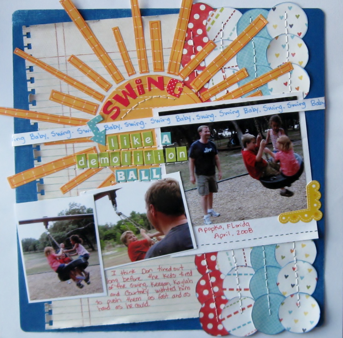
   This first layout is one of my new favourites. I love the bold, bright feel and overall tone of the page. Every time I see " Swing Like a Demolition Ball", I immediately smile. I love how the rich colour and layered details  highlight these wonderful photos of my husband as he pushes my son and his friends on a tire swing. I hand cut all of the elements on this page.Inking the patterned papers and using the Bic Mark It's added subtle detail to the page. Lately, I have really been favouring my pens and stamp inks as an inexpensive way to add a more finished look. I used an EK Success punch along the notebook style paper. I wanted it to look as though it was really torn from a notebook, so I bent and ripped the tabs a little to provide that effect. Rolling the paper at the edges also gave it a more worn feel, adding another subtle detail.
Scraplift of Little Stingray by Amy Peterman for Club CK Scraplift challenge
Card stock: white- Colorbok,
 blue-Coredinations sanded slightly to show the core
Patterned papers: notebook paper-Basic Grey
all other papers from Echo Parks' Summer Days,Sweet Summer time and Playground collections
Ek Success notebook border punch
Alpah stickers- Echo park - green alphas from Echo Park's Playground collection
all other alphas from the Echo Park's Summer days collection
Arrow and yellow photo corner from Echo park's Summer days collection
Bic mark it's: Rambunctious red,Sunset orange,tuxedo black and Blue Skies Blue
SEI ink blue ink on patterned papers
Studio G orange ink on the sun's papers
DMC floss-white
  If you are wondering about the title...it came from some song lyrics. I love using song titles or lyrics on my pages. They provide some very interesting titles that jump from the page and capture your attention. This particular set of lyrics comes from " Write a Song" by the Dave Matthews Band. It's part of challenge#173 over at Scrappin' the Music.
  When you think of the colour pink, you don't immediately think of boys or fish. So this next page may surprise you a little. I chose pink as the base card stock, not because of it's feminine quality, but rather for how it reminds me of the Caribbean. It ended up being a nice compliment to these photos of my son feeding stingrays at the Atlantis resort on Paradise Island, Bahamas. The bright shade of pink with this fun combination of  Echo Park Papers screams out "summer fun". Papers cut into round shapes give the hint of bubbles floating on the page. I used a black pen to add a bit more detail and to refine the idea of a bubble. Hand cut fish also lend to the theme.
Scrapbook Challenges Sketch #240
White Acrylic paint
Card stock-DCWV
Bic Mark it-tuxedo black
papers,border sticker and Alphas from Echo Park's Sweet Summertime collection
   Since the title of this page is feeding frenzy, I chose fun alphas over a layer of white acrylic paint. The messy paint and splatters of glimmer mist add to the feeling of chaos amidst a feeding frenzy. If you are now wondering whether or not to ever participate in a stingray feeding, have no worries. The stingrays are really quite gentle and are more like excited puppies wanting a treat when they see you holding that metal bucket full of fish.
   The last page I will share with you tonight is one you may remember is you have been following my blog. It features the only other female in my household, my cat Sweetpea. This page is the perfect example of how a few embellishments can make a page more feminine. For " A Pair of Roguish Eyes", I wanted a fun,yet girly page. I chose pink and yellow papers paired with prima flowers to achieve that effect. the use of an orange pen adds to the fun feel of the page and provides the added detail it needs without adding bulk.

Scrapbook challenges sketch#252
plum pudding spritz
martha stewart border punch on vellum
prima flowers
making memories jewels
chipboard stamped with a studio g stamp in colorbox white ink
K and co, wood alphas
making memories tiny type alphas
bread tags
Echo Park Sweet Summertime Papers
Bic Mark it in Sunset Orange

My husband captured this photo of Sweetpea peering out of the bathroom sink. It's one of her favourite places. She loves to lay init when she's warm. She also loves playing with the water out of the faucet. She is quite the little imp, hence the title of the page.
   I hope you have enjoyed these pages featuring some of Echo Park's paper collections. Now it's time for me to cross my fingers and hope that just maybe you will get to see some of my pages featured on Echo Park's blog.

Thursday, February 10, 2011

Valentine's Day Blog Hop

 WELCOME!!!
 Valentines day is about more than just love and romance. It's also about friendship. In the spirit of friendship, I am very excited to share a variety of wonderful projects from my scrapbooking friends(from Club CK). I hope you will enjoy this blog hop as much as I. Should you get lost along the way or have not arrived here from Kathy's post, just pop on over to Amanda's Blog. She'll get you back on the right track...and if you follow everything in the right order, she has a grand prize in store for you.

Here are all the wonderful blogs you will be touring:
Candice
Gina
Linda
Becky
Andi
Adele
Janice
Kathy
Christy- you are here now
Briana- Your next stop!
Veronica
Traci
Holly
Cassie
Laurie
Jackie
Margie

WOW! That's a lot of inspiration!


Now...back to the subject of friendship. It's something everyone feels...even animals. I decided to share a page about my cat today. Her name fits her personality. She is indeed a sweet little girl. Sweetpea loves to cuddle and to share time with those she loves. In these photos, she had cuddled up next to our dog, Max.


Basic grey Max and Whiskers papers and Embellishments
Bic Mark it pen in Misty blue and Honey brown
Kaisercraft mini alphas
page is based on CK Magazine 15 minute Layout Nov./Dec. 2010 issue

It was important to me to document this page, but as many of us know... we have more pictures than time. I have lately been exploring the world of 15 minutes pages. I am still learning how to let go a little as I move on in my quest to make fast, simple pages with impact. I can do a page in about 30 minutes now.  I invite you to try one too. You might be surprised with your results.

Thank you so very much for stopping by. I hope you will check out the rest of the blog. Now it's time to go see Briana.

Friday, September 10, 2010

Then and Now: One Concept, Two Takes

 Recently, I did a one hour challenge at club ck. I was very rushed. My son needed help with school, and that comes first. So after assisting him, I had about 30 minutes left to complete the challenge. I almost didn't...but then thought. What the heck, let's give it a go and see what you get. The overall result of my 25 mad dash of scrapping was not horrific. I had pulled out my Cosmo cricket earth love kit to make it easier on me. The challenge centered around showing a timeline of change. So I had quickly pulled together photos of my son highlighting 4 years of his life. I was in love with those photos. Each one depicting his sweet self at each wonderful stage of life.


There was just one problem...I was bothered by the fact that in my haste, I had covered my Sweet boy's hands in one of the photos. Not to mention the fact, that though I loved the border with the birds, as whimsical as it was ...it just wasn't working for me.


I generally come to a point in which a page is just considered done. This page, though simplistic, was important to me because it depicts my son's growth from 2001 until now. So I ended up making the page over. When I pulled the bird border off, the page was damaged. I wanted to salvage it, so I used an Martha Stewart punch to create a border on Cardstock. This, coupled with the Making memories ladybug trim from the Flutter collection, maintains the earthy feel of the paper while hiding the rips and tears. It also adds a little dimension to what was before, a very flat, basic page.


I changed the buttons from blue to yellow for a pop of color and also because the light blue just did not match the turquoise of the ladybugs. Though the page is still simplistic, I corrected what was bothering me about it and I feel, made it a little more interesting.

That being said, I will be shortly popping over to Scrapwhispers to enter this project in their "Then and Now' challenge.  I also have some future then and now projects planned. I would love to scrap about my son's change in favorite cartoons and also do a timeline for video games we have played from "then to now". So stay tuned...

Saturday, September 4, 2010

Seasons of Change Blog Hop


Scrapbook challenges has a whole new look which is perfect considering we are moving on toward Fall. Fall is my favorite time of year...cooler weather, more time spent walking and out of doors, my anniversary, Halloween... I could keep going. Like I said, I love Fall. Anyhow, I digress. A lot of great things are happening at Scrapbook Challenges this weekend which include a blog hop, prizes and lots of challenges. So check it out. Before you go, have a peek at my take of this sketch for the blog hop.

I captured my son reading. While he is not reading to me in this particular photo, I journaled about how much I enjoy it when he does. He's a late reader due to some hearing issues. So seeing him read and having him read to me means a lot. I became a more fluent reader by reading to my grandfather to sleep at night. It fills me with a lot of joy when my son reads to me and reminds me of those times with my grandfather.

I chose this journal spot which my friend, Toree made for me in a Club CK swap. I love the bookworm and have been dieing to use him on a page. I added some white stitches with a Martha Stewart opaque pen. I felt like it gave a chalkboard/school theme feel to the border. The patterned paper is My Mind's Eye complete Boy stack. I loved it's grungy look and fall like colors.The title is made with American crafts thickers.

To get moving on the Scrapbook challenges blog hop, start over at Pamela's blog. To see other Scrapbook challenge members blogs and their take on the sketch, dont' forget to stop by Scrapbook challenges.

Wednesday, September 1, 2010

September Challenge at Scrap Our Stash

The September challenge has posted!

The September Challenge is to use a Border Punch or decorative scissors on your project. You can use any kind of border punch or decorative scissors - no rules here - just use what you have. Be creative!

To participate in the Challenge just submit your projects by sending a picture and description to scrappinpsycho@live.com.

All projects will be posted here at Scrap Our Stash. All submissions must be received by 6:00 PM Central Time on September 30th. A winner will be chosen and given the opportunity to be a Guest Design Team Member for the month of November!

Be sure to check back daily for new Design Team, Guest Design Team, or Reader's projects to inspire you.

And to push you in the right direction, here is a wonderful Blog post that was just shared over at Club CK. You can create the look of the postage stamp punch by hand at home...
 http://abbygracevintage.blogspot.com/2010/08/how-to-create-border-punched-look.html

Sunday, August 29, 2010

Paper strips

  For those of you looking for the Goodbye Summer Hello Fall!blog hop, scroll down to the post below this one.

Paper strips can be an effective way to highlight a photo. In this case, I made a matte out of paper strips. It's easy to do. I used my cricut to cut two of the same shape. You could also use a stencil or circle cutter...or just cut two rectangles or squares of the same size. Next, layer the two shapes together so that all sides match, then use you paper trimmer to cut strips at even increments. You can then easily piece together alternate colors as you adhere them to the page in the shape of your photo matte.

I used an older Sketchy Thursday's sketch for this page. For the background below the matte, I spritzed glimmer mist in moonlight and frost. The main inspiration for this page were these cute die cuts which I received in a Club CK swap. I immediately knew I wanted to use them with these photos of my son's first experiences with snow. For added interest, I used 3-d adhesive on some of the letters and on the snowflake.

If you try a page with paper strips, you can submit it over at Scrapwhispers.There are other inspirational ideas there to help you use up leftover paper strips in your stash.

Thursday, August 26, 2010

Goodbye Summer! Hello Fall!

Welcome to the “Goodbye Summer, Hello Fall!” Blog Hop, hosted by a talented group of ladies from {Club CK}. If you did not arrive here from Toree's blog, please go to the beginning of the hop at Virtually Froggy and follow the blog hop in order. By following the blog hop from beginning to end you will collect words to a secret phrase which will make you eligible for the grand prize. The details for grand-prize entry are posted at the start of the blog hop. You won't want to miss it!

Here is list of the blogs you will be touring in order:
 Stephanie (start here)
Amanda
Adele
Toree
Christy ( you are here)
Veronica  ( visit here next!)
Janice
Michelle
Jen
Maribeth
Megan
Tammy
Natalie
Amy
Jennifer
Annie
 
  Quite honestly, Summer is my least favorite time of year. I have always lived where it is really hot and humid. So I am always looking forward to fall. A lot of good things happen for me in the fall. I met and married my husband in the Fall. I was also born in the fall.So fall colors are a staple in my scrapbook pages. I also love how Fall colors can be very masculine. I thought that the Basic Grey Granola line would be perfect in color for these photos of my husband and the best man at our wedding. They had a floral accent which would be great for our wedding album while they set a great tone for the page.

 I don't know about you, but I am always wanting to learn or try something new. I honestly don't have a lot of time or money for scrapbook classes, so I love finding things on the internet. One of my Club CK peeps posted a link to a great, free class on Basic grey's website.  You can do the same project with any paper of your choosing. I obviously chose BG granola. I also substituted a BG stamp in place of her heart cutout.

And now...what would a blog hop be without blog candy! I have a little for you.

For a chance to win, simply become a follower and leave me a little comment to tell me that you are. Thank you for stopping by. I hope you liked my project and feel inspired to try out something new.So pop on over to Veronica's Blog! Enjoy the rest of the hop!
 
P.S. my secret word is Autumn.

Friday, August 20, 2010

I was a Gallery Highlight!

  I am so excited that I just had to tell someone... one of my pages was featured as a Gallery highlight at Club CK. I have recently been working on some pages for my wedding album. For this page, I had used a sketch from Design Team member Brenda at Sketches for You. I made a square mask and used meadow glimmer mist to create a subtle background. I fussy cut Basic Grey Porcelain paper to create a scrolled border. I hand cut the hearts based on the shape of the pink Heide Swapp mirrors used on the page. I then used my bazzill stitch template to hand stitch the flourish.


There are a lot of great ideas in the Gallery highlights article for your pages. Some I hope to try myself.

Wednesday, August 18, 2010

Using a circle template

  Club creating keepsakes has proven to be a great source of tips and information. I learned about one of my best and cheapest tools from a club ck peep. I always liked hand stitching, but had never tried it. I thought it would be to hard or take up too much time. When I learned about using plastic canvas as a template, all of that changed. As you can see from this photo of a recent layout, nice even circle are a breeze!

I used the template to align the brads as well as to stitch the circles. This Layout was completed for sketches for you.The paper is Creative imaginations. The green brads are Basic grey. The star brads are Making Memories Just chillin' line.


  I have 2 templates. One is a rectangle and one is a circle. I purchased them for under a dollar in the plastic canvas and sewing section of my local craft store. I can use them not only for stitching, but also for brads or anything else I want to put on my page in a nice even manner. You simply lay the canvas template down, and use a pencil to mark where your brad(or in this case, punched circle) will go.

As you can see, it is easy to keep a nice even line. Because you can see through the canvas,You can easily change the size of the circle you want...simple select a circle and then follow the squares around that circle as you mark with your pencil.

Paper used is Cosmo cricket Boyfriend collection. this is a Let's Scrap Sketch and part of the club ck one hour challenge: use hole  punched circles.
For stitching, I usually mark every other hole. I then go back with a paper piercer to pre-make the holes before I stitch.


It really makes stitching so easy!

  For flourishes or designs, I recommend the Bazzill In Stitches templates.They make adding a little stitched flair to your pages so easy.

The paper is fussy cut Basic Grey. I also hand cut the stars from the porcelain collection. I used Heide Swapp mirror hearts.

 I will say, I don't find the need to use the ones for words or letters. I simply hand draw, use a die cut letter or use a stencil as a guide for my letters...then I use the paper piercer to poke the holes and stitch.

If you do hand stitch on a page, practical scrappers is having a stitch challenge this week!
***Updated: the Jeep LO was featured as a Practical Scrappers top 3!

Tuesday, August 10, 2010

Capturing A Hummingbird

  I had never seen a live hummingbird until recent years. Now I am lucky enough to see them quite frequently. The community which we recently moved to seems to support a thriving population. I have long wished to capture them on film. It's a daunting task considering that they won't come too close and fly at incredible speeds. For whatever reason, on this particular day, one hummingbird decided to hang out on our patio. Not to mention, that she was gracious enough to allow me to come within a few feet of her. I saw her flitting about, teasing our cat with her aerial acrobatics, and thought she would fly away as soon as I came out the front door with my camera. She just flew around...watching me. I snapped furiously...and though the photos are not of the greatest composition, I am so happy that I captured her photo.


I chose DCWV Far eastern stack paper for its red flowers...since hummingbirds love them so much. I fussy cut some of the branches and blooms.The background card stock is also DCWV. Since it had an oriental feel to the paper, I rubbed platinum colorbox ink on a red strip of card stock. I added a gold brocade Crate Paper trim. This is Sketchy Thursday's 8-5-10 sketch.

The above is page two of the layout. I completed page one during a Club CK one hour challenge. I used part of a chipboard stack remnant to create a frame. I inked it with Autumn Leaves red ink and colorbox Platinum. The alphabet has been in my stash for some time. I don't even remember who makes it. To update it and add dimension, I used glossy accents over the letters. The brads are K and company.

Thursday, August 5, 2010

Hand Lettering

  My Writing is something I am not always fond of. In fact, it was something I struggled with in school. Over time, I have come to terms with my printing. I am comfortable enough to hand journal( I feel it's quite important to do so)...but in print form. I tend to make a rough draft and then...slowly, carefully copy those thoughts onto the page so it's legible. Cursive? UGH! I hate mine. I taught myself calligraphy and since then there has been some improvement. So you can imagine my thoughts at a recent challenge to hand letter a title. I shuddered to think about it. How could I pull off anything halfway decent?

  My first thought was to use my cricut to make a stencil. I started to do just that. Then, I decided to challenge myself. Could I mimic the look of a simple font? Looking at the screen, I carefully practiced a few times on a scrap sheet of paper. I decided it wasn't half bad. Now for the big risk! I pulled over the sheet of background cardstock and started the title. My one and only tombow marker slowly ran along the surface of the page. what resulted was a close rendition of the font I had in mind. It still needed a little more. I filled in the letters with the brush tip end, then took my black pen and made an outline. I actually liked it!  I decided to challenge myself to a little cursive. this time, my orange marker slowly moved across the page...and somehow, the results seem to fit with the fun, kid feel of the page.


-Arrow papers and orange triangle print from Sassafrass monstruosity.
-MM chipboard arrow- I drew on it with a white crayon, then inked it
with fresh green with moss green edges
-crate paper ribbon
-basic grey brads
- MM just chillin boy's collection: metal pow sign, diecut and journal spot

submitted at:
Sketches for You August #1 Scraplift and Ink challenge
Frosted Designs: need a little direction challenge
Club CK August week 1 Scrap Challenge; hand drawn title

Wednesday, July 14, 2010

Bloom

 It's been a long time since I have used my embossing powders.Years, in fact. So when Club CK had an embossing challenge for its summer camp, I pulled out my old heat gun. I ended up using a free paper piecing pattern from Club CK. I stamped the bird with colorbox blue lagoon and then heat embossed some blue powder over the top. Instead of using the branches that came with the pattern, I fussy cut some branches from a DCWV green stack paper. The nest is also from the green stack. I wanted the nest to "pop" so I tried another recommendation from Club CK. I used my crop-o-dile to emboss the dots on the paper. I don't have a cuttlebug yet, so this was a nice easy alternative.You can see a sample of the nest partially embossed here:

 A little tip...if it's a thick glossy paper, don't press too hard or you'll "crack" the finish. I decided to use a Maya road acrylic paisley which I had inked with Stream alcohol ink. I decorated with some diamond stickles, a staple in my supplies...and voila! A lovely bird in nest. I now have the Club Ck nature badge. I'll have to go back to earn the heat embossing badge...but it does help me use up some stash.
   The background paper is DCWV greenstack. I loved the rest of the stack, but until today had no idea what I would use this particular sheet for. The edges are inked in prussian colorbox ink, while the yellow CS is inked in apple green. The inked edges just help define things a little more...at least in my eyes. the title was cut with the AMORE att font on my cricut. This was completed using the sketchy Thursday 7-8 sketch challenge. http://sketchythursdays.blogspot.com/2010/07/78-sketch-challenge.html

For anyone completeing the club CK heat embossing challenge, don't forget to submit your Lo to Practical Scrappers. They are having an embossing challenge this week: http://www.practicalscrappers.com/2010/07/this-weeks-challenge-is-embossing.html


I honestly do not know what the name of the berry is in the photos. Guess I need to do some research...

Tuesday, July 13, 2010

Love all Serve All

That's the slogan for the Hard Rock cafe. Since one of my photos already had a hard rock sign on it, I felt it would be redundant to use that as a title. The slogan seemed like a great fit. I also had these great stir sticks with hard rock guitars. Alone, though, they seemed to lack dimension. So I added a little more with some fancy pants felt shapes. I also made some shakers boxes by cutting some musical notes on my cricut. I used some leftover packaging, added some star sequins and a little diamond stickles...and there you have it. It earned me the First Aid badge over on CLUB CK.

This is the 3-24-10 sketch from Let's Scrap. It was completed for Let's Scrap Challenge 58 and for frosted designs felt challenge.