Showing posts with label Colorbok. Show all posts

Sunday, January 27, 2013

Sketch it Out! My Bat Mitzvah Journey Begins


scrapbook sketch by shimelle laine @ shimelle.com

If you are looking for the Scraphappier LOAD213 blog hop, check here.

First of all, I am not Jewish. Second of all, I am not coming of age. My best friend is planning her daughter's Bat Mitzvah and I have been asked to create a scrapbook album all about the young lady in question. I feel very privileged to have been asked. E is a very special young lady. I often see a bit of myself at that age in her, though of course she is uniquely her own self. I regard her, more as a niece, than just as my best friend's daughter. I want to ensure this album is extra special. I have begin making tentative plans with E's mom about what it should include.


E's mom is planning on sending some photos my way, but I wanted to get a headstart on the album. It's not something I want to leave to the last minute. E and her friend's seem to think that I am a cool enough mom to be part of their instagram accounts. The coolest part of this are the photos I get to snag from the accounts. Though they are not always the highest quality, I get photos that are not staged and that truly reflect E right now, interacting with her sister and her friends.

A Girl Named E_______ by Christy Strickler Supplies| Cardstock: Colorbok; Patterned Paper, Alphas, Stickers, DieCuts: American Crafts; sketch from Shimelle.com


I chose a sketch from Shimelle.com. Originally, the sketch called for two photos, each in their own quadrant. Instead, I chose to place patterned paper and to then place a single photo over it all. After that, you could say the embellishments just fell into their perspective places.

Yes, I know the journaling is missing. I am purposefully doing that on some of the layouts for the Bat Mitsvah album. I am hoping to have friends or family comment on some of the layouts later on. You will also notice that E's name is covered. I will be sharing the layouts I create for this very special album. However, I don't have permission from all of the kid's parents to share their photo. To protect the kids, I will be covering names and sometimes faces from time to time.

Since I don't have all of the photos's from E's mom yet, I am still in the beginning phases of planning the album. I do want to include some of these instagram shots, but I am not sure what layouts will make the final cut. I figure more layouts than less to choose from will be better. Plus, what mom isn't going to love getting extra layouts featuring their kid?!?!


Enhanced by Zemanta

Saturday, October 13, 2012

He Had Blue Bubbles

Ok, so sometimes I  am a sucker for those little items right beside the cash register. They are in, what is often know in retail as the impulse bins. When my son requested the blue bubbles, I immediately said yes without thinking. We did have a blast, but let's make one thing known... they are an absolute MESS!

Blue Bubbles by Christy Strickler Supplies| cardstock: Colorbok; Patterned Paper: Jillibean Soup; Alphas: Creative Memories; Mist: Tattered Angels, Ranger; Ink: SEI; Other: vellum, sequins; as seen in Scrapbook News and Review Magazine

Blue was the obvious choice to scrapbook these photos with. I loved the little circular elements in the Jillibean Soup papers.


 I used vellum to create pockets in the page. Simply cut away a shape, in this case, a circle, and glue vellum in the window it creates. Add a layer of solid cardstock behind with sequins glued into place. Glue some sequins on top of your pocket. Since the sequins are glued down, they won't move inside the pocket, however they still provide a sense of depth and movement.


For more ideas to scrapbook with the color Blue:
Scrapbooking with the Color Blue
Blue Inspiration on Pinterest


Enhanced by Zemanta

Friday, May 18, 2012

Load 512 Progress report

It's Friday! For the past few years, Friday has been my favorite part of the week. It means that when my husband comes home from work, there is nothing to do except for enjoying time as a family, scrapbooking and playing video games. This weekend is going to prove a bit challenging for me in regards to LOAD. Diablo 3 came out this week. I have been able to complete my pages in the early mornings, but now, with the weekend, Hubby is going to expect that I play this game with him. Quite honestly, I do want to play. Even my son can play with us. With rain in the forecast for the whole weekend, what better way to spend the weekend. The problem being, that hubby and I will most likely be playing the game pretty much non-stop. I know that sounds excessive, but you have to understand that this game has literally been a decade in the making. For fans like us, the Diable 3 release is EPIC. I guess I will be scrapping during the game's load time sequences. LOL It takes a long time to finish a page that way. However, you'd be surprised how doing a little thing here or there adds up to make a whole page. Last night, I stitched on an LO every time the game had to stop and load. Consequently, I have a page pretty much complete this morning.

As for the page I am sharing with you today, I must confess that part of it was made before hand. I started making base pages earlier on in the year. It's sort of a creative jump start for me. I play around with stamps, paints or found items in the house to see what effects I can get on paper. In the case of this layout, I had stamped with the bottom of a yogurt cup and some yellow acrylic paint.

Cardstock: Colorbok; Patterned Paper: American Crafts; Alphas: Sassafrass; Other: Buttons and ribbon
The daily prompt had been to use something from the trash. Since I had made this page a little while back,  and with the use of a yogurt cup rescued from the trash, it certainly fit the bill.

      It's a page made in under 30 minutes with a minimal use of supplies. Quick pages like these are another great way to jump start your creativity. I suggest choosing photos that don't have a great significance. You would not want to do a 30 minutes page of your wedding day( or maybe you would, but not me, I want it detailed and extravagant). These quick pages are also a wonderful way to use up scraps or spare supplies laying around on your desk.

I had taken these photos of my cat laying on my desk when I was practicing with my camera. Yep, you guessed it...another creative jump start for me. I am not a great photographer. So I like to practice and try things out with my camera settings. I end up with sets of photos like these that don't have a specific story to them. In this case, I did journal about practicing with my camera. However, you could easily use photos like these to tell a story about the subjects personality or to document a story for which you do not have any photos.

Ok, so now I am off to make my LOAD page for today. Ideas are already brewing in my head. I'll check back with more LOAD progress after the weekend. let's see of I can play my game and make my pages. Only time will tell!

Tuesday, May 15, 2012

Experimenting with Distress Ink

Disclaimer: Yes, I know it's another pet page. I made it for LOAD. Today's prompt was to scrap about a conflict. So I scrapped about whether I was a cat or a dog person. I do love both. Lately though, the difficulties of caring for a VERY senior dog have left me loving the ease of caring for a cat. Both types of animals are great, but for a long time, I thought I would never have a cat. I had been told I was allergic. I am, in truth, slightly allergic to them. However, I REALLY like having cats. A few years ago, we rescued some kittens which I hand raised. Sweetpea is one of those pictured in the page below. We thought at first we would care for them and then give them to good homes. Happily, caring for those little fur babies allowed me to realize my allergies were not all that intense. Now our home is populated with 2 cats and 1 dog.

  This page was quite the experiment for me. I have a few of the Tim Holtz distress inks but really had not delved into using them. I saw a video over at Scrapbook News and Review magazines forum which inspired me to try using them with stamps and misted water. I also decided to pull out a stamp which I had hand carved about a month or so ago. My original intent was to stamp just a little. I ended up covering the whole page. I confess. I was having quite a fun time with the stamps and inks.

Which leads to me the page itself ( Pardon the photo.It's late here). It kind of reminds me of those times you go to the hairdresser wanting something different. It takes you a while to get used to your new haircut.Well, I'm still getting used to this page. I based my design on Paula Gilarde's Ad Inspiration challenge. I liked the grid design that challenge #49 provided. Grids are often  difficult for me since I can rarely measure anything straight( despite quite a lot of tools designed for that purpose). I felt that adding the artsy water color stamp effect might be a nice way for me to keep crooked lines a little less noticeable. Initially, I used a brown marker to make the grid lines. It was too bright, so I diffused it with some white acrylic paint.

Cardstock and alphas: Colorbok; background stamp: hand carved by me;
pet stamps: Basic Grey; ink: ranger; Jewel: Making memories;
 brads: Basic grey and Karen Foster; other: acrylic paint, google eyes

The stamped background added a bit of difficulty in finding the right embellishments for the page. I solved the problem by stamping a cat and dog directly onto the layout. I then used pen to outline the images and added small embellishments like brads, jewels and google eyes. Now my flat stamps had a little more character. I stamped a subtle border of circles with white acrylic paint. I then added some small punched circles to the border. The punched circles are simply made with  ink on photo paper scraps.
   Experimenting like this is not just for fun. It's a way for me to try out something that may become part of my regular arsenal of techniques. I am more likely to use a technique again in the future if I try it out on a page or tag. I don't recommend trying something new out a page with special photos. New techniques, at least for me, are done on pages which, though wonderful to have and part of my story, are not as important as say, wedding photos.
   I am off to submit my page to the Second floor challenge. I've been wanting to try one of these for weeks now. It's a wonderful challenge to try to inspire you to do something new. Check it out at Balzer Designs. If you need a little more inspiration, pop over to Scrapbook News and Review Magazine. Inspiration is posted on the blog weekly.

Thursday, April 12, 2012

Spring Fling

 Spring is here.  Most notable for us this time of year, is the Easter holiday. Last year, we took our son to Atlantis' Easter fair. They had a lot of fun games along with the usual fair foods. What we enjoyed the most were the arts and crafts. My son had a blast making a candle, filling candy holders with treats and sand art. We did not do all of the crafts available. We picked and chose what seemed most interesting to a 10 year old boy. His favourite by far was making a wax hand.
glimmer mist- oriental poppy, Studio 18 jewels
Ribbon- Maya Road, Making memories
Alphas- Colorbok, Cardstock- Colorbok
Buttons- Basic Grey,Bazzill Basics
Sequins, homemade mask
I thought the Scrap Our Stash Pagerize this #20 challenge was the perfect jumping off point for making my page about our Spring Fling at the Easter Fair. Have you had a fling this Spring? Share it with us at Scrap Our Stash!

Monday, June 6, 2011

Echo Park's Fresh Face Campaign

   Recently, I realized that I have a big love of Echo Park's paper lines. Each kit is so easy to use and most of them are very unisex. I love that a quick change of embellishments can make the paper have a masculine or feminine feel. Papers from one kit easily interchange and mix with other kits. Of all the paper kits I have, I find theirs to be the most versatile.Since I have such a big crush on everything Echo park, I figured I would give their new fresh face campaign a shot. How awesome would it be to be featured on their blog?!?! So wish me luck, sit back and enjoy some layouts I have created using some fabulous Echo Park papers!
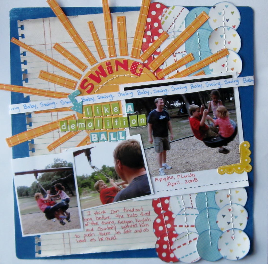
   This first layout is one of my new favourites. I love the bold, bright feel and overall tone of the page. Every time I see " Swing Like a Demolition Ball", I immediately smile. I love how the rich colour and layered details  highlight these wonderful photos of my husband as he pushes my son and his friends on a tire swing. I hand cut all of the elements on this page.Inking the patterned papers and using the Bic Mark It's added subtle detail to the page. Lately, I have really been favouring my pens and stamp inks as an inexpensive way to add a more finished look. I used an EK Success punch along the notebook style paper. I wanted it to look as though it was really torn from a notebook, so I bent and ripped the tabs a little to provide that effect. Rolling the paper at the edges also gave it a more worn feel, adding another subtle detail.
Scraplift of Little Stingray by Amy Peterman for Club CK Scraplift challenge
Card stock: white- Colorbok,
 blue-Coredinations sanded slightly to show the core
Patterned papers: notebook paper-Basic Grey
all other papers from Echo Parks' Summer Days,Sweet Summer time and Playground collections
Ek Success notebook border punch
Alpah stickers- Echo park - green alphas from Echo Park's Playground collection
all other alphas from the Echo Park's Summer days collection
Arrow and yellow photo corner from Echo park's Summer days collection
Bic mark it's: Rambunctious red,Sunset orange,tuxedo black and Blue Skies Blue
SEI ink blue ink on patterned papers
Studio G orange ink on the sun's papers
DMC floss-white
  If you are wondering about the title...it came from some song lyrics. I love using song titles or lyrics on my pages. They provide some very interesting titles that jump from the page and capture your attention. This particular set of lyrics comes from " Write a Song" by the Dave Matthews Band. It's part of challenge#173 over at Scrappin' the Music.
  When you think of the colour pink, you don't immediately think of boys or fish. So this next page may surprise you a little. I chose pink as the base card stock, not because of it's feminine quality, but rather for how it reminds me of the Caribbean. It ended up being a nice compliment to these photos of my son feeding stingrays at the Atlantis resort on Paradise Island, Bahamas. The bright shade of pink with this fun combination of  Echo Park Papers screams out "summer fun". Papers cut into round shapes give the hint of bubbles floating on the page. I used a black pen to add a bit more detail and to refine the idea of a bubble. Hand cut fish also lend to the theme.
Scrapbook Challenges Sketch #240
White Acrylic paint
Card stock-DCWV
Bic Mark it-tuxedo black
papers,border sticker and Alphas from Echo Park's Sweet Summertime collection
   Since the title of this page is feeding frenzy, I chose fun alphas over a layer of white acrylic paint. The messy paint and splatters of glimmer mist add to the feeling of chaos amidst a feeding frenzy. If you are now wondering whether or not to ever participate in a stingray feeding, have no worries. The stingrays are really quite gentle and are more like excited puppies wanting a treat when they see you holding that metal bucket full of fish.
   The last page I will share with you tonight is one you may remember is you have been following my blog. It features the only other female in my household, my cat Sweetpea. This page is the perfect example of how a few embellishments can make a page more feminine. For " A Pair of Roguish Eyes", I wanted a fun,yet girly page. I chose pink and yellow papers paired with prima flowers to achieve that effect. the use of an orange pen adds to the fun feel of the page and provides the added detail it needs without adding bulk.

Scrapbook challenges sketch#252
plum pudding spritz
martha stewart border punch on vellum
prima flowers
making memories jewels
chipboard stamped with a studio g stamp in colorbox white ink
K and co, wood alphas
making memories tiny type alphas
bread tags
Echo Park Sweet Summertime Papers
Bic Mark it in Sunset Orange

My husband captured this photo of Sweetpea peering out of the bathroom sink. It's one of her favourite places. She loves to lay init when she's warm. She also loves playing with the water out of the faucet. She is quite the little imp, hence the title of the page.
   I hope you have enjoyed these pages featuring some of Echo Park's paper collections. Now it's time for me to cross my fingers and hope that just maybe you will get to see some of my pages featured on Echo Park's blog.

Sunday, May 8, 2011

Day 2 of NSD!!!

First off...Happy Mother's Day!!!

It's been nice having so much time to relax and scrap this weekend. I have two more pages to share with you. Also, if you haven't checked it out,Scrapbook Challenges is having an NSD blog hop. You can start the hop here with Brynn's blog. The cool thing is that you too can participate in the hop by completing a Scrapbook Challenges sketch and then linking your blog to the hop. For my sketch, I chose a more current one.
Sketch 252 Scrapbook Challenges
Some items are from my Couterfeit kit for May
Echo park papers
prima flowers
making memories jewels
bread tags-recycled from pantry
recycled note pad cover, cut into circle then stamped with a studoi G stamp
colorbox white and chestnut roan inks
Plum pudding shimmerz spritz
making memories tiny type alphas
K and Co. wood veneer alphas
marth stewart opaque punch on vellum
Orange Bic mark it-faux stitching
I wanted to enter a current challenge while still getting a page completed. I love combining things. I get a lot of challenges done by combing them with others. It can be a challenge in and of itself, but it makes things a bit more fun.Which is why you may see this page at a few spots around the web like BPS, Frosted and Sketches for You. (hint: it will be part of an upcoming challenge over hosted by yours truly at Sketches for You). Since the word roguish means michievous, I wanted fun, playful colours. I paired them with pink and flowers for a feminine tone. My husband snapped this picture of our cat, Sweetpea hiding in the sink. She is always full of mischief but very girly...so I think the page suits her well.
  My second page features our other cat, Boo. He is one of those long slinky cats. I call him the contortionist, because he looks folded up when he sleeps. To capture the theme, I used bright colours and circus style papers. The paint and stars remind me of circus paint and clowns.
Sketchy Thursday 5-5-11
Sassafrass papers and borders
white paint
star punch
yellow stickles
My Mind's Eye chipboard frame centers
Colorbok die cuts-arrow and star
I chose to use some leftovers from some My Mind's eye chipboard frames. I wrapped them with thread and used them to frame the circles for a fun pattern.
  There is still a little more time to get in on the NSD fun. Don't forget about being part of the Scrapbook challenges blog hop. I am off to try to get a few more pages done...

Monday, March 7, 2011

The Cat in the Hat...a Pagerize this challenge from Scrap Our Stash

  When I saw Joni's page at Scrap Our Stash, I really loved the hand sewn grids and the diagonal layout of her design. As I perused my photos, I decided this photo of my husband and son in front of the Cat in the Hat ride at Islands of Adventure would be perfect for such a fun page. I also immediately grabbed my Echo Park summertime papers. I thought the fun, bright colors were a perfect match for a page about the Cat in the Hat. 

As I worked on the page, I realized that I was not digging a grid design with this photo. I wanted it to be a little less structured, so I substituted the hand stitched, streamer like lines.  I dusted off some white tags and stars. The chipboard star and the die cut red and yellow stars are so old I don't know who makes them. I think I bought the die cuts when my son was 2 years old! Eight years hidden in my stash! That is way too long to not be used! 
  Theme park photos sometimes mean that strangers get into your shot...no matter how hard you try! I hid the extra people with some strategically placed journal strips.

Now it's your turn...Pagerize Joni's page and share it here. Try dusting off a technique or a few supplies while you are at it! we can't wait to see what your project!

Monday, February 21, 2011

Just Us

The meaning of those two little words has changed so much over time. About ten years ago, it went from meaning just my husband and I to something more like "just we three" when my son came along. I like both, but I do want to share with my son what his parent's life was like when they first met. I don't have a lot of photos of that time period. The one I found for this page is one of those rare few.
   Of course, one of the first design elements that came to mind when making a page around this photo was "hearts." So I cut several of them out in a variety of colors from a Colorbok kit.3-D foam really made the hearts and title pop. Pink fruit punch stickers added a little zing to the Colorbok alpha punchouts in the title.

based on Scraphappy.org 15 minute page for December
The white Bazzill cardstock with embossed dots added some lovely texture to the page. I used my Martha Stewart punch across the bottom. I got out my trusty ruler and marker to pen a border, then added some hand stitching with my Sew Easy. Overall, it was a fast but fun page. I am working on page two which will be all journaling about the things we liked to do before having a child. Who knows...I might share it here with you(if it's not too mushy, that is). If you have a project centered around something or someone you love, please share it with us at Scrap Our Stash!