Showing posts with label Scrapbook Challenges. Show all posts

Wednesday, February 4, 2015

Scrapbook Challenges: Say What!?!?

The latest challenge is now up on the Scrapbook Challenges blog. It's  a journaling challenge with a focus on using a funny quote or conversation. At first, this one had me stumped. I set the challenge aside for a bit, thinking I would come back to it and begin with a chosen quote. However, as I flipped through my December photos, I came across a photo of my son with our holiday ham. It was perfect to tell a tale about a conversation we had with him when he was younger.

What Part of the Pig by Christy Strickler |Supplies Cardstock: Bazzill; Patterned Paper: Crate Paper, October Afternoon; Letter's Elle's Studio; Wood Veneer: Freckled Fawn, Studio Calico; Stickers: Lilybee; Chipboard: My Mind's Eye; Die Cuts: Studio Calico; Stamp: Kelly Purkey; Ink: Staz-on; Flowers: Sassafrass, Maya Road; Other Tag, Twine; Based on a Page Maps Sketch; Inspired by a prompt from Scrapbook Challenges


During Easter dinner, my son suddenly blurted out a question, " What part of the pig is this?" We told him that it was the leg. He then asked," So you just chop his leg off and  the pig is just walking around?" It was very random and unexpected. Of course, everyone at the table was laughing hysterically. I didn't have a photo of my son at dinner that day. Instead, I used this one to share the tale. The story is a lot more interesting than just creating a layout featuring our Christmas ham.

Since this is a page about a pig, I chose a pink patterned paper as my canvas. As luck would have it, there was a pig themed carving chart available in an older studio calico kit ( what are the odds of that). I also added in other pig elements such as the fussy cut vintage pig and the wood veneer shapes. The striped paper is a fun addition. I added in gingham flowers to complete the farm theme of the page. It's a nice mix of old stash with new.

Don't forget to check out the journaling challenge. You can submit your take on the scrapbook challenges website.


Saturday, July 2, 2011

So Much Energy

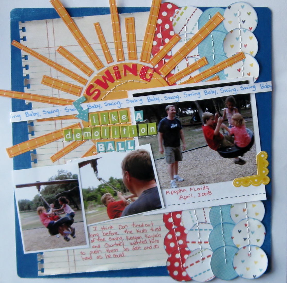
  I wish I had it. My son and his friends all seem to have it. Energy, that is. Kids seem to have it in overwhelming abundance. So it seemed fit to scrap these photo of my husband pushing my son and his friends on a tire swing with some bright energetic colours. The title sort of found me via the Scrap it With A Song challenge spot.
All papers and embellishments are from Echo park except:
notebook paper-Basic grey
brads-Basic grey
white CS-colorbok
blue cs-coredinations

Oh and speaking of energy... I hope you have enough to participate in a hop going on through scrapbook challenges. You can start at Brynn's blog. Brynn even came up with the sketch I used for this page. I love the fun banners which were perfect for this upbeat page. It's always fun to see how different people interpret a sketch. So if you'd like to see some other variations, check out the links found here.
 Sorry for the short post, but life is hectic right now. I am pleased to have found a little time to scrap. I am less pleased with myself for not reading all of my challenge list properly. By that, I am referring to the notepad I keep listing all the challenges I want to participate in. I had several I wanted to do for Sketches for all. I thought I was completing one of the challenges with the above LO only to find I was just supposed to use 1 flower and not three.Oh well! Back to the drawing board. I at least have another page done that I like. Happy scrapping everyone!!!

Monday, June 6, 2011

Echo Park's Fresh Face Campaign

   Recently, I realized that I have a big love of Echo Park's paper lines. Each kit is so easy to use and most of them are very unisex. I love that a quick change of embellishments can make the paper have a masculine or feminine feel. Papers from one kit easily interchange and mix with other kits. Of all the paper kits I have, I find theirs to be the most versatile.Since I have such a big crush on everything Echo park, I figured I would give their new fresh face campaign a shot. How awesome would it be to be featured on their blog?!?! So wish me luck, sit back and enjoy some layouts I have created using some fabulous Echo Park papers!
   This first layout is one of my new favourites. I love the bold, bright feel and overall tone of the page. Every time I see " Swing Like a Demolition Ball", I immediately smile. I love how the rich colour and layered details  highlight these wonderful photos of my husband as he pushes my son and his friends on a tire swing. I hand cut all of the elements on this page.Inking the patterned papers and using the Bic Mark It's added subtle detail to the page. Lately, I have really been favouring my pens and stamp inks as an inexpensive way to add a more finished look. I used an EK Success punch along the notebook style paper. I wanted it to look as though it was really torn from a notebook, so I bent and ripped the tabs a little to provide that effect. Rolling the paper at the edges also gave it a more worn feel, adding another subtle detail.
Scraplift of Little Stingray by Amy Peterman for Club CK Scraplift challenge
Card stock: white- Colorbok,
 blue-Coredinations sanded slightly to show the core
Patterned papers: notebook paper-Basic Grey
all other papers from Echo Parks' Summer Days,Sweet Summer time and Playground collections
Ek Success notebook border punch
Alpah stickers- Echo park - green alphas from Echo Park's Playground collection
all other alphas from the Echo Park's Summer days collection
Arrow and yellow photo corner from Echo park's Summer days collection
Bic mark it's: Rambunctious red,Sunset orange,tuxedo black and Blue Skies Blue
SEI ink blue ink on patterned papers
Studio G orange ink on the sun's papers
DMC floss-white
  If you are wondering about the title...it came from some song lyrics. I love using song titles or lyrics on my pages. They provide some very interesting titles that jump from the page and capture your attention. This particular set of lyrics comes from " Write a Song" by the Dave Matthews Band. It's part of challenge#173 over at Scrappin' the Music.
  When you think of the colour pink, you don't immediately think of boys or fish. So this next page may surprise you a little. I chose pink as the base card stock, not because of it's feminine quality, but rather for how it reminds me of the Caribbean. It ended up being a nice compliment to these photos of my son feeding stingrays at the Atlantis resort on Paradise Island, Bahamas. The bright shade of pink with this fun combination of  Echo Park Papers screams out "summer fun". Papers cut into round shapes give the hint of bubbles floating on the page. I used a black pen to add a bit more detail and to refine the idea of a bubble. Hand cut fish also lend to the theme.
Scrapbook Challenges Sketch #240
White Acrylic paint
Card stock-DCWV
Bic Mark it-tuxedo black
papers,border sticker and Alphas from Echo Park's Sweet Summertime collection
   Since the title of this page is feeding frenzy, I chose fun alphas over a layer of white acrylic paint. The messy paint and splatters of glimmer mist add to the feeling of chaos amidst a feeding frenzy. If you are now wondering whether or not to ever participate in a stingray feeding, have no worries. The stingrays are really quite gentle and are more like excited puppies wanting a treat when they see you holding that metal bucket full of fish.
   The last page I will share with you tonight is one you may remember is you have been following my blog. It features the only other female in my household, my cat Sweetpea. This page is the perfect example of how a few embellishments can make a page more feminine. For " A Pair of Roguish Eyes", I wanted a fun,yet girly page. I chose pink and yellow papers paired with prima flowers to achieve that effect. the use of an orange pen adds to the fun feel of the page and provides the added detail it needs without adding bulk.

Scrapbook challenges sketch#252
plum pudding spritz
martha stewart border punch on vellum
prima flowers
making memories jewels
chipboard stamped with a studio g stamp in colorbox white ink
K and co, wood alphas
making memories tiny type alphas
bread tags
Echo Park Sweet Summertime Papers
Bic Mark it in Sunset Orange

My husband captured this photo of Sweetpea peering out of the bathroom sink. It's one of her favourite places. She loves to lay init when she's warm. She also loves playing with the water out of the faucet. She is quite the little imp, hence the title of the page.
   I hope you have enjoyed these pages featuring some of Echo Park's paper collections. Now it's time for me to cross my fingers and hope that just maybe you will get to see some of my pages featured on Echo Park's blog.

Sunday, May 8, 2011

Day 2 of NSD!!!

First off...Happy Mother's Day!!!

It's been nice having so much time to relax and scrap this weekend. I have two more pages to share with you. Also, if you haven't checked it out,Scrapbook Challenges is having an NSD blog hop. You can start the hop here with Brynn's blog. The cool thing is that you too can participate in the hop by completing a Scrapbook Challenges sketch and then linking your blog to the hop. For my sketch, I chose a more current one.
Sketch 252 Scrapbook Challenges
Some items are from my Couterfeit kit for May
Echo park papers
prima flowers
making memories jewels
bread tags-recycled from pantry
recycled note pad cover, cut into circle then stamped with a studoi G stamp
colorbox white and chestnut roan inks
Plum pudding shimmerz spritz
making memories tiny type alphas
K and Co. wood veneer alphas
marth stewart opaque punch on vellum
Orange Bic mark it-faux stitching
I wanted to enter a current challenge while still getting a page completed. I love combining things. I get a lot of challenges done by combing them with others. It can be a challenge in and of itself, but it makes things a bit more fun.Which is why you may see this page at a few spots around the web like BPS, Frosted and Sketches for You. (hint: it will be part of an upcoming challenge over hosted by yours truly at Sketches for You). Since the word roguish means michievous, I wanted fun, playful colours. I paired them with pink and flowers for a feminine tone. My husband snapped this picture of our cat, Sweetpea hiding in the sink. She is always full of mischief but very girly...so I think the page suits her well.
  My second page features our other cat, Boo. He is one of those long slinky cats. I call him the contortionist, because he looks folded up when he sleeps. To capture the theme, I used bright colours and circus style papers. The paint and stars remind me of circus paint and clowns.
Sketchy Thursday 5-5-11
Sassafrass papers and borders
white paint
star punch
yellow stickles
My Mind's Eye chipboard frame centers
Colorbok die cuts-arrow and star
I chose to use some leftovers from some My Mind's eye chipboard frames. I wrapped them with thread and used them to frame the circles for a fun pattern.
  There is still a little more time to get in on the NSD fun. Don't forget about being part of the Scrapbook challenges blog hop. I am off to try to get a few more pages done...

Tuesday, April 26, 2011

Mad Libs...the Scrapbook version

 Mad libs are so much fun! I used them to help teach my son the parts of speech. What child wouldn't want to do school work when it's mad libs? So, when the chance came to play a scrappy version of the game I just could not resist trying it out. To play the scrappy version, you send in a list of paper colours, embellishments and a one word title. The hostess mixes up everyone's items and then sends a list back to you. I received the colours green, blue and purple. My embellishments were ribbon and brads. The title word was "happy". At first, I was very stumped. The colours seemed to me to be too strong if I used them as Jewel tones or too feminine if I used them in lighter tones. I began to flip through my papers searching for the right ones. I finally settled on K and Co.'s Poppyseed line. The colours were perfect and the hint of charcoal in them gave me the idea to use a Black and white photo.
K and Co. poppyseed papers
title and birds cut from K and CO. borders
Crate paper ribbon
all papers inked with SEI ink blue ink
Playful purple Bic Mark it
Basic Grey Brads
Scrapbook Challenges Sketch 250


  I love the results of the colour combo, so much that I made a second page. Stay tuned to see it later on.The base card stock is actually a little more white, but shows as a light purple in my photo. I love it when a hard challenge comes together in a good way. I often find I love the page because it's so different from what I usually make.

Monday, February 28, 2011

Counterfeit Kit Challenge February Blog Hop

Welcome to the Counterfeit Kit Challenge February Blog hop!!!

  Blog hopping is always fun. I love seeing everyone's blogs and the inspiration they have to offer. I will admit, I often end up getting distracted and find my way off the trail of the hop. If you are easily distracted like me or did not arrive here from Kim's blog, just pop back over to the Counterfeit Kit site so you can get back on the right path.

I have really enjoyed utilizing the kit I made this month. There is always such a good feeling when I see a completed page...knowing a page is done and stash is used. I love my stash but it sure can be a bit overwhelming as it slowly consumes my dining room. I have quite a collection after around a decade of scrapbooking. Which brings me to my subject today...collections. 
  Some people collect stamps or magnets. I collect and acquire scrapbook supplies. My son collects action figures. They usually have a science fiction theme. He started doing this at the tender age of 3. He is fascinated with all things alien. In the last few years, he has acquired an obsession for predators. One morning, he decided to photograph his collection. Off he went with my camera, posing and shooting photos of his beloved toys. I was, at first, a bit unsure of the photos. What would I do with them? Being 10, my son is not the world's best photographer( then again, neither am I). As I examined his work, I realized that some of them could be said to have interesting merit. I had wanted to document his collection, so why not use his photos...his perspective. So I discarded the blurry shots and cropped some of the photos. In a weird way, they seemed sort of artistic. Next came the daunting task of finding the right papers and embellishments to scrap about his love of the most ugly of alien toys.

Scrapbook Challenges Sketch # 241
I quickly realized that the colors I had in my kit were perfect...black ,green and pink. In the right tone, they sort of could be, well...alien colors. I chose to smear black paint onto the page, then added a black K and Co. border for some tone on tone texture. Staples seemed a perfect accent to harden the scroll work of the border. I cut apart a Making memories pink leather frame. The leather reminded me of the alien's armor. The clear pink paislee flower reminded me of the crystal stealth predator and his weapons.

Counterfeit Kit Scraps of Darkness Sketch
 Hand stitching added to the rough grunge feel. On page 2, I used some basic grey flourish stamps with white ink. They reminded me of alien plant life. To add a touch of pink to this page, I used another scrap of the leather frame. I also added Shimmerz Plum Pudding spritz to the flocked MME Lush paper. On both pages, I highlighted certain photos by raising them with 3-d adhesive. It was a fun way to document one of my son's collections.

Thank you for stopping by. It's time for you to hop on to Melissa's Blog.  If you haven't tried it, I hope you try making your own counterfeit kit in March.

Saturday, September 4, 2010

Seasons of Change Blog Hop


Scrapbook challenges has a whole new look which is perfect considering we are moving on toward Fall. Fall is my favorite time of year...cooler weather, more time spent walking and out of doors, my anniversary, Halloween... I could keep going. Like I said, I love Fall. Anyhow, I digress. A lot of great things are happening at Scrapbook Challenges this weekend which include a blog hop, prizes and lots of challenges. So check it out. Before you go, have a peek at my take of this sketch for the blog hop.

I captured my son reading. While he is not reading to me in this particular photo, I journaled about how much I enjoy it when he does. He's a late reader due to some hearing issues. So seeing him read and having him read to me means a lot. I became a more fluent reader by reading to my grandfather to sleep at night. It fills me with a lot of joy when my son reads to me and reminds me of those times with my grandfather.

I chose this journal spot which my friend, Toree made for me in a Club CK swap. I love the bookworm and have been dieing to use him on a page. I added some white stitches with a Martha Stewart opaque pen. I felt like it gave a chalkboard/school theme feel to the border. The patterned paper is My Mind's Eye complete Boy stack. I loved it's grungy look and fall like colors.The title is made with American crafts thickers.

To get moving on the Scrapbook challenges blog hop, start over at Pamela's blog. To see other Scrapbook challenge members blogs and their take on the sketch, dont' forget to stop by Scrapbook challenges.

Thursday, August 19, 2010

Using a Speech Bubble

  Recently, I came across a a challenge at ScrapWhispers to use a thought bubble. At first, I was a little unsure. However, when I printed the photos of the sea lions, I could just see the little girl sea lion asking my son if he would play. These Sea lions are in quarantine b/c they are new to the place my husband works at. He brought us to see them and they immediately perked up when they saw my son. It was as if they knew he was a little kid just like them. They walked back and forth...following him as he walked in front of their enclosure. When it was time to go, My son started protesting and then the little boy sea lion started barking at me as if to say " no...we aren't done playing yet!". It was all just so cute.


I wanted some fun paper for this page, so I chose Sassafrass. All of the paper is Sassafrass except for a tiny bit of Fancy pants where I journaled and matted the photos. For the thought bubble, I used a chipboard sticker which I  mounted on chipboard and cut out. The brads(except for the decorative ones) and the buttons are Basic grey. I inked the edges of the buttons and the papers with Autumn leaves red ink and colorbok inks. I love the bright Sassafrass in stitches flowers for this page. I did a little bit of handstitching as a small accent with some orange floss.There is an acrylic arrow just visible under the orange page protector. I wanted to keep it neutral but wanted the eye to go from the title to the journaling.This is sketch 213 from Scrapbook challenges.

Wednesday, August 18, 2010

jump for Joy: a recipe challenge

Recipe challenge can be...well, a challenge. That is the fun in them though...and they are a great way to use up you stash. Frosted currently has one underway. As I perused the ingredients list, I realized that the page I had just made using Scrapbook challenges sketch #212 fit the bill.


Lets see: bird(check),ribbon(check), felt flowers( that marks of two ingredients),buttons(check), and glitter(in the form of stickles). I believe that covers it! 6 ingredients! YES! There were 10 to choose from. perhaps you should head on over and see the list for yourself.

Meanwhile, I am a firm believer in combining challenges. So going through my challenge notebook, I realize I can also submit this page to:
                                             Big picture Scrapbooking for the "I Live" challenge today
                                             Scrapbook Challenges August color challenge
                                             Club Creating keepsakes Scrap your stacks challenge
                                             Sketches for you: Brenda's Fall colors challenge
                                             Challenge masters:go green inspiration challenge

being organized means being able to track and submit my work for a variety of challenges while still getting lots of pages done. I find I am creating more a lot more. So go get organized  and see just what you can come up with!

Tuesday, July 27, 2010

Count Me In

So ...once again, there is another new release of some wonderful Sassafrass paper. I can't wait to use some of this for homeschool layouts. The colors are great for fall and late summer. Count me in is one of my new favorites! It's just released at CHA.

Meanwhile...

I am busy trying to use up some stash while I await all the wonderful new papers. Today, I challenged myself to make a 3-d pop up. I have not made a pop up page in years...so it was fun to try again. So lift up the tab that says "our shelter" and one can read about our home and see a pop up house...template courtesy of club ck.

In truth, it was a contest at club CK. I love combining challenges, so I used sketch 208 from Scrapbook Challenges. Thanks to a club ck peep, I figured out that the paper is Cloud 9 design. I used some chipboard and a My Mind's Eye transparency frame to reinforce the cover of the pop up. The title was cut on my cricut with Basic George. The idea behind the page is to document our hurricane preparedness. We may not always live somewhere in which a storm like that will come. It will be nice to see an "everyday" preparation.

Monday, July 5, 2010

Owls and BellBottoms

I was recently challenged to scrap a graduation day photo( a challenge over at Sketches for You). I don't have any of my own. My Dad has those. I have a few of DH and none of DS( who is too young for high school). I do have this one of my mom...which caught my eye and got me to thinking. I was thinking, not of her graduation day ( I obviously was not there), but of growing up in the 70's. Seeing her photo brought back memories of Brown and orange furniture, the Macrame Owl she made for the living room, and the outfit she made me wear. It was all white with Blue and orange owls all over it. AN owl T-shirt and white bell bottoms(literally plastered with owls). So, inspired by these thoughts, I created an LO all about her day. I'll have to call my Dad for the specific details(my mom is no longer with us), but I must say, I really feel like I captured the feelings of the era quite well.


I used mostly Sassafrass PP. I fussycut the owl, stitched on his belly and added real buttons for eyes( he had printed ones). I used more yellow DMC floss around the mat.The brown PP is Recollections. I loved how the blue diffused the brown and yellow tone of the older photo. The flowers are also Sassafrass. The title was cut on my cricut using CK Far Out font.

 This was a Scraplift project on Scrapbook Challenges. I am proud to say it was one of today's featured photos.

Tuesday, June 22, 2010

Summer kick off Blog hop at PPC


I love a blog hop(who doesn't) and I love a color challenge. So I decided to participate in Picture perfect creations summer blog hop. I used Sketch 204 from Scrapbook challenges.


I loved how the color palette from PPC complemented the photos of DH and DS playing at an outdoor restaurant. We often go to the Green parrot. It's a little hole in the wall place, but it has good food and the harbour views are amazing. Not to mention that the sea breezes are great on a warm summer day.


I added a green feather from an actual green parrot. Now in reality, there are no live green parrot's at this restaurant.However, there are green parrot's in the Bahamas...and that is where this feather came from. I figured it was the perfect touch. I did clean the feather before placing it in the layout by gently wiping it down with a baby wipe. One must be careful with bird feathers as they might harbour small bugs or other unpleasant germs. In cleaning the feather, you must also be quite gentle so you don't pull it apart.


I cut the title on my cricut with the CK Jolly elf font.

Thursday, June 3, 2010

Pinch me...cuz I might be dreaming

It's been a few days since I found out...but I still can't quite believe it. I was asked to be a guest designer for July over on Scrap Our Stash Challenge. http://scrapourstash.blogspot.com/
WOW...I am so excited!!! this is my first guest design spot ever!!! Here is the LO that started it all...


It's my son's hand on mine. I completed it for the "get out of your box" challenge over at Scap Our Stash and for the Color room's Palette#7 challenge. My box...well, I tend to only use color photos. so I decided to experiment with black and white. Fussy cutting is something I never did before, b/c it looked like so much work and time was involved. Boy was I wrong! Now I really love fussycutting. In this case, I fussycut some Sassafrass PP and then used 3-d foam at intervals to add dimension to the page. the fussycutting was just what the page needed.

So...now I am off to work on some more challenges. I'd love to get that sketch challenge and June stitch challenge done. I have had some ideas floating around in my head. And i just need to get them down on paper...

If you need some ideas, stop by Scrap Our Stash  http://scrapourstash.blogspot.com/
or one of my other favorite challenge sites:
The Color Room: http://thecolorroom.ning.com/
Let's Scrap: http://letsscrap.ning.com/rapbook
Scrapbook Challenges: http://scrapbookchallenges.ning.com/
Just to name a few.

Sunday, May 2, 2010

NSD Challenges

I've done a lot of scrapbook challenges over the weekend for National Scrapbook Day. Here is  my last one:

I made it for a challenge on The Scrapbook Challenges page :http://scrapbookchallenges.ning.com/
I really like the sketches they have for their challenges. They are very easy to use and translate to some
great LO's. I first learned about the group on Pamela's blog:
I really enjoyed participating in the NSD blog hop and found a lot more talented Ladies to follow.

And lastly, here is the sketch I used from Pamela's Blog:


I hope everyone else had a fun and productive NSD. For a little more fun HOP ON Scrapbook Challenges here: http://scrapbookchallenges.ning.com/forum/topics/nsd-hop-on