Showing posts with label Making Memories. Show all posts
Monday, May 14, 2012
LOAD 512 Progress report
At this point, we are nearing the halfway mark for LOAD. My husband paid me a compliment about it today. He told me that he was amazed that I had managed to keep up with the housework, homeschool my son, work on submissions for SNR magazine and make a page a day. Honestly, I am still not sure how I am doing this. I guess the creative juices are flowing and I am taking advantage while I can. I will say this...when you are doing LOAD some things do get sacrificed. LOAD pages are not always the ones with the deepest of stories. They are not always the pages with the most intricate details. Nor are they always the ones with the best photographs to upload to the gallery. Often times, they look a tad blurry. That's all ok though. At the end of the day, you are supporting a good creative habit and the rewards will benefit you so much more down the line. LOAD pages done now translate to more pages done on a daily basis each month. Once the creativity starts flowing, it's good to let it keep on growing.
On a side note: I'm noticing quite a trend in my pages lately. My cats seems to be making an appearance on almost each and every page I have been making in the past week or so. Can you tell our pets are a huge part of our lives?!?! I took a ton of photos of both Boo and Ju Ju Bee over the past few months. Having a new kitten in the house certainly calls for many photo ops.
I'm off to create some more. I know I made my page for today, but I want to keep on going. I hope you do to. Oh...and if you want to see another pet themed page, head on over to the SNR blog. This week's color palette features a page with my itty bitty kitty.
Thursday, April 12, 2012
Spring Fling
Spring is here. Most notable for us this time of year, is the Easter holiday. Last year, we took our son to Atlantis' Easter fair. They had a lot of fun games along with the usual fair foods. What we enjoyed the most were the arts and crafts. My son had a blast making a candle, filling candy holders with treats and sand art. We did not do all of the crafts available. We picked and chose what seemed most interesting to a 10 year old boy. His favourite by far was making a wax hand.
I thought the Scrap Our Stash Pagerize this #20 challenge was the perfect jumping off point for making my page about our Spring Fling at the Easter Fair. Have you had a fling this Spring? Share it with us at Scrap Our Stash!
![]() |
| glimmer mist- oriental poppy, Studio 18 jewels Ribbon- Maya Road, Making memories Alphas- Colorbok, Cardstock- Colorbok Buttons- Basic Grey,Bazzill Basics Sequins, homemade mask |
Thursday, April 5, 2012
Eggs-tavagant Easter blog hop
Welcome to the Eggs-travagant Easter Blog hop. There are a dozen eggs in a carton and so we've chosen a dozen colours to share with you today. You should have started out at Jordan's Blog. If you arrived here first, pop on over there to start your colourful journey.
Egg dyeing is a lot of fun. I could have shared a page about that. I have oodles of photos. However, I have been working on photos of last year's Easter fair and figured I would share some of those. My son made a ton of crafts. My favourite was the sand art bottle. While I loved the bottle itself, what I loved more were the expressions my son made as he created his sand art. He was so serious as he measured and poured the sand.
As you can see, my colour for the hop was Orange. the vibrant colour was perfect to highlight the precise pouring action in the photos. Don't be afraid to go monochromatic with your pages. It makes paper choice and embellishing easy as you can choose a wide array of items in various shades of the same colour.
While butterflies might be a feminine embellishment( my son even asked why I had them on this page), I was able to slip them in here. I think of Spring when I see butterflies. Using them in the bright orange also made them less feminine. If you have a son, look for opportunities to use things like butterflies and flowers in symbolic terms on a page.
Now it's time to head off to the next blog in the hop. I am dyeing( pun intended) to see what Lorri has for us! So head on over to Lorri's blog to take a peek!
Egg dyeing is a lot of fun. I could have shared a page about that. I have oodles of photos. However, I have been working on photos of last year's Easter fair and figured I would share some of those. My son made a ton of crafts. My favourite was the sand art bottle. While I loved the bottle itself, what I loved more were the expressions my son made as he created his sand art. He was so serious as he measured and poured the sand.
![]() |
| Sequins, glimmer mist- Oriental poppy Ribbons- Maya road and Making memories Studio 18 jewels, Paper trunk alphas |
As you can see, my colour for the hop was Orange. the vibrant colour was perfect to highlight the precise pouring action in the photos. Don't be afraid to go monochromatic with your pages. It makes paper choice and embellishing easy as you can choose a wide array of items in various shades of the same colour.
While butterflies might be a feminine embellishment( my son even asked why I had them on this page), I was able to slip them in here. I think of Spring when I see butterflies. Using them in the bright orange also made them less feminine. If you have a son, look for opportunities to use things like butterflies and flowers in symbolic terms on a page.
Now it's time to head off to the next blog in the hop. I am dyeing( pun intended) to see what Lorri has for us! So head on over to Lorri's blog to take a peek!
Wednesday, April 4, 2012
Easter is almost here
My son is counting down the days. He is pretty spoiled. Last year we took him to the Easter Fair at the resort my husband works at. We might go again this year, since we all had a blast. They had a ton of crafts, games and of course, the usual fair foods like slushies and cotton candy.
Wednesday, March 28, 2012
12 tags of 2012
I must admit, that I did not do one for February. There was just too much going on. I decided that I MUST try the one for March. Quite honestly, tags are not my thing. I like making them. I just don't remember to use them on my pages. So, I decided to make a 4x6 card for my March Project life pages. I know it will get used!
I ended up making four leaf clovers out of chipboard. I hand drew them, then cut up a few stickers. Since I did not have the same embossing powder Tim used, I substituted stickles. I think it will be a nice addition to my March Project life page. Now, I just need to finish the February PL pages so I can start March.
| Kraft cardstock base, American crafts stamp Stazon ink, chipboard, stickles various stickers, glossy accents Making Memories Alphas |
Tuesday, March 13, 2012
Princess of Purr
She is very happy here. The evidence is the frequent, almost non-stop purring. Sometimes I swear she purrs for hours on end, just happy to play and share some time cuddling. So, I decided to dub her the Princess of Purr.
At first glance, one might not notice that there is absolutely no pattern paper on this page. I used the package backing from an embossing folder for the matte. I covered the text using some ribbon scraps and the crochet flower. The chipboard alphas were chosen, in part because they cover the price tag. I noticed the alphas had this awesome border on the bottom, so I cut it off and used it here on the page. A very thrifty page that does not look thrifty at all!
Calvinball update:
1st time player- 1 point
late to the party- 1 point
1st time sub- 1point
layouts-3 points
spreading the word-1 point
daily blogging- 1point
total: 8 points
| Inspiration Challenge #41 from Paula Gilarde Artsylicious Chipboard Alphas Maya road stick pins Prima Stamp in Colorbox Ruby Satin ink Basic Grey Rub ons, black magic glimmer mist Making memories button Crochet flower- found in a thrift store, antique button leftover packaging- photo matte, chipboard border |
Calvinball update:
1st time player- 1 point
late to the party- 1 point
1st time sub- 1point
layouts-3 points
spreading the word-1 point
daily blogging- 1point
total: 8 points
Sunday, December 4, 2011
Becoming Mr. And Mrs.
Every once in a while, it's good to follow the step by step instructions in the making of a layout. Why? It introduces you to a new technique without the stress and guesswork of what to do with the rest of the page. During November, I took a free class at Miss Arts Paper Crafting School. The class led me through a series of steps to add texture and dimension to my page. It was an enjoyable experience and led to the creation of a page that, while not my usual style, is truly wonderful.
I did not have all of the materials suggested to complete the Layered Layouts class. Rather than purchase the supplies, I made a kit, attempting to match the supply list as much as I could from my stash. By doing so, the page became unique to me, despite the fact that I was following a series of step by step instructions.
Though I may not use everything I learned in the making of this page, I will take parts of the process to incorporate into future pages.
By completing the step by step instructions, I was able to learn the how and the why behind the page's design.I also learned that I love altering pre-made embellishments to meet my needs. I have always loved metal embellishments, for example, but never really liked the way they looked on many of my pages.They seemed to dominate aspects of the page. By altering them, I was able to give them a one-of-a-kind look and better able to blend them into my page's overall design.
The metal tags have so much more character. I even think it's easier to read them now.
This page will become the title page of my wedding album. Though it might not be my usual style, it's very special to me, both because of the amount of work I put into it and because of the end result.
Now it's your turn! Scrap Our Stash is celebrating it's birthday! Share a page or project you've made to help celebrate two wonderful years of using your stash in new ways!
I did not have all of the materials suggested to complete the Layered Layouts class. Rather than purchase the supplies, I made a kit, attempting to match the supply list as much as I could from my stash. By doing so, the page became unique to me, despite the fact that I was following a series of step by step instructions.
Though I may not use everything I learned in the making of this page, I will take parts of the process to incorporate into future pages.
By completing the step by step instructions, I was able to learn the how and the why behind the page's design.I also learned that I love altering pre-made embellishments to meet my needs. I have always loved metal embellishments, for example, but never really liked the way they looked on many of my pages.They seemed to dominate aspects of the page. By altering them, I was able to give them a one-of-a-kind look and better able to blend them into my page's overall design.
The metal tags have so much more character. I even think it's easier to read them now.
This page will become the title page of my wedding album. Though it might not be my usual style, it's very special to me, both because of the amount of work I put into it and because of the end result.
Now it's your turn! Scrap Our Stash is celebrating it's birthday! Share a page or project you've made to help celebrate two wonderful years of using your stash in new ways!
Friday, October 28, 2011
First Gondola Ride
I started off with just one page. I ended up with two! The page on the left is a scraplift for the Pagerize this Challenge #15. Tamara's page was easy to work with and I was inspired enough to stretch over to a second page.
Now it's your turn! Do you have a moment to highlight? Pagerize Tamara's LO and share it at Scrap Our Stash!
Tuesday, October 4, 2011
Christmas Is Not Too Far Away!
If you are like me, you may already have Christmas on your mind. My son is already accumulating his list of things he might like to get. Which only serves to remind me of last Christmas' photos waiting patiently to be documented. For whatever reason, I always struggle with getting those holiday photos on a page. So as I shuffled through my small stash of pre-printed and stamped quotes, I thought it just might be the right time to get out those holiday photos. I had come across a stamped quote which I had received in a stamped image swap. It's a quote by Washington Irving which reads " Christmas is here- Merry Old Christmas, gift bearing, heart-touching, joy- bringing Christmas." Definitely a wonderful quote for a holiday page!
With quote in hand, I pulled out my holiday paper pack. It's chock full! I have promised myself not to buy any more holiday paper until I use some of it up. We shall see how that goes. Anyhow, awhile back, I had begun scrapping the 2010 Christmas photos with a crate paper kit.I decided to carry on with the same paper in order to keep the similar look to all of the pages.
| PageMaps Sketch jillibean Soup gift wrap paper all other papers Crate paper Crate Paper chipboard peices and stickers Maya Road trim-brown velvet MM trim- red Foofala buttons |
While I did add part of a sheet of Jillibean soup, the rest of the paper used is all scraps. Even the ribbon used are pieces of scraps. With careful thought, scraps can really compose a wonderful page.
Tuesday, September 13, 2011
Reach for the Sky
Now you may think I had photos of us riding horses or spending time on a farm, but in reality, I have these photos of my husband playing with our cat. So how does that go with a western theme?He gets our cat to put his paws up in the air. It's very silly and a lot of fun to watch. It makes me think of a little kid playing cowboy and my cat is just sort of happily going along with it all.
So now that I had decided to go with a western theme, I set about trying to carry it to the page. I decided I wanted to use a phrase like " get your paws up" or " reach for the sky". I imagined using western themed papers and embellishments. However, in going through my supplies, I really had very little in that genre. What I did finally find were some die cuts, well over 10 years in age( still not sure why I have those. I bought them when my son was about two.) and some more current My Mind's Eye die cuts in a boy theme which just happened to feature a saddle. With die cuts in hand, I set out to find the perfect paper to go with them. I asked myself what reminded me of the western theme. I came up with denim, bandannas ,hand-tooled leather...all with a somewhat weathered look.
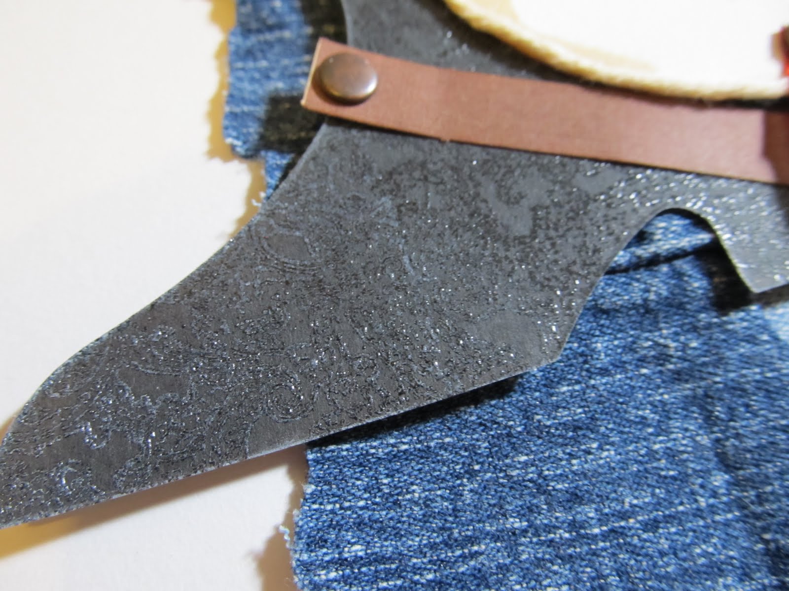
For the hand- tooled leather, I decided to stamp and heat emboss the old boot die cut. It's subtle, but I think it gives just enough texture and adds to the theme.
It reminds me of the fancy boots and leather saddles I saw as a child.
I used an off colour cowboy die cut as a mask. The colour just did not work well with the rest of the page, but as a mask, it was perfect. I think I have discovered a use for all those old, plain die cuts sitting un-loved in my stash.
Leftover scraps from old jeans made the perfect background since I never could find just the right paper. Twine outlining the circle and accents of gingham ribbon also added to the texture and theme. All in all, a page proving that having specifically themed papers is not a necessity to set the right tone for your page.
So now that I had decided to go with a western theme, I set about trying to carry it to the page. I decided I wanted to use a phrase like " get your paws up" or " reach for the sky". I imagined using western themed papers and embellishments. However, in going through my supplies, I really had very little in that genre. What I did finally find were some die cuts, well over 10 years in age( still not sure why I have those. I bought them when my son was about two.) and some more current My Mind's Eye die cuts in a boy theme which just happened to feature a saddle. With die cuts in hand, I set out to find the perfect paper to go with them. I asked myself what reminded me of the western theme. I came up with denim, bandannas ,hand-tooled leather...all with a somewhat weathered look.
For the hand- tooled leather, I decided to stamp and heat emboss the old boot die cut. It's subtle, but I think it gives just enough texture and adds to the theme.
It reminds me of the fancy boots and leather saddles I saw as a child.
I used an off colour cowboy die cut as a mask. The colour just did not work well with the rest of the page, but as a mask, it was perfect. I think I have discovered a use for all those old, plain die cuts sitting un-loved in my stash.
Leftover scraps from old jeans made the perfect background since I never could find just the right paper. Twine outlining the circle and accents of gingham ribbon also added to the texture and theme. All in all, a page proving that having specifically themed papers is not a necessity to set the right tone for your page.
Saturday, August 20, 2011
To See My World Before My Eyes
This was one of those incredible photos that just begged to be scrapped in a special way. It captured my son as he beheld the beauty of the mountains around him, something that a kid raised at sea level could really be amazed by. I feel very lucky that I got this shot. I would like to say it was intentional. However, it's one of those pictures that are discovered and coveted, hidden like a treasure amidst the photos on the camera's memory card.
So now, with this awesome photo in hand, came the job of figuring out just how to scrap it. I wanted it to stand out from others in my album. While I love the myriad assortment of winter themed papers and embellishments in my stash, they did not quite capture the spirit of the photo. This then, leaves me with an argument I find myself facing all too often lately...why buy such themed papers? I guess I will address that later. After all, I rarely let go of anything in my stash. I was drawn to it, and so, I eventually find a use for everything. Anyway, back to the photo...
I have long been drawn to winter themed paper kits with unusual colour palettes. Sadly, I have none in my current supplies. Given a colour challenge at Club CK to use orange, brown and pink, I chose to reach for my Crate Paper Pink Plum collection. I figured that I could use my Martha Stewart snowflake punch as a way to theme the papers as needed. I also had some word art in mind for the page. The only problem...it was yellow and orange. The yellow completely clashed with everything else I wanted to use.
In the past, I would have sighed and put the word art away. I would have kept it for another day when I found the right paper to go with it.Now that I have figured out there are no rules with my stash, I grabbed some pink paint and a detail brush. Three coats later, the word art is looking more like it belongs with the papers I chose. The paint was a little dull and the orange was lost in the pink. So I used a woodsy brown bic mark it to edge the letters and then covered the whole thing in a coat of glossy accents.
The page itself took form quickly thanks to the kit and a Sassy lil Sketch. Inspiration from Scrappin to the Music's challenge #178 shaped the title. I ended up with a page I loved. One with a variety of texture and tone which perfectly match the story I wanted to tell.
The warm, vibrant colours match my son's snow suit as well as conveying a bright happiness. The texture of the trims remind me of my son bundled into the snow suit. Snow flake embellishments remind me that we were in the snowy mountains. Best of all, despite the pink in the colour palette, I don't find the page to be feminine. I love when I get to use pink on a boy page!
So now, with this awesome photo in hand, came the job of figuring out just how to scrap it. I wanted it to stand out from others in my album. While I love the myriad assortment of winter themed papers and embellishments in my stash, they did not quite capture the spirit of the photo. This then, leaves me with an argument I find myself facing all too often lately...why buy such themed papers? I guess I will address that later. After all, I rarely let go of anything in my stash. I was drawn to it, and so, I eventually find a use for everything. Anyway, back to the photo...
I have long been drawn to winter themed paper kits with unusual colour palettes. Sadly, I have none in my current supplies. Given a colour challenge at Club CK to use orange, brown and pink, I chose to reach for my Crate Paper Pink Plum collection. I figured that I could use my Martha Stewart snowflake punch as a way to theme the papers as needed. I also had some word art in mind for the page. The only problem...it was yellow and orange. The yellow completely clashed with everything else I wanted to use.
| Original Marcella K chipboard word art before I altered it. |
In the past, I would have sighed and put the word art away. I would have kept it for another day when I found the right paper to go with it.Now that I have figured out there are no rules with my stash, I grabbed some pink paint and a detail brush. Three coats later, the word art is looking more like it belongs with the papers I chose. The paint was a little dull and the orange was lost in the pink. So I used a woodsy brown bic mark it to edge the letters and then covered the whole thing in a coat of glossy accents.
The page itself took form quickly thanks to the kit and a Sassy lil Sketch. Inspiration from Scrappin to the Music's challenge #178 shaped the title. I ended up with a page I loved. One with a variety of texture and tone which perfectly match the story I wanted to tell.
The warm, vibrant colours match my son's snow suit as well as conveying a bright happiness. The texture of the trims remind me of my son bundled into the snow suit. Snow flake embellishments remind me that we were in the snowy mountains. Best of all, despite the pink in the colour palette, I don't find the page to be feminine. I love when I get to use pink on a boy page!
Sunday, August 14, 2011
Raising Polliwogs
Last summer, we had a unique experience. We found some tadpole eggs in a local pond and were lucky enough to watch them hatch. We have raised tadpoles before, but they had always been caught just after hatching. This time, we had found the eggs, conveniently sitting on a lilly pad close to the water's edge. I scooped them up in an empty water bottle and we set up a habitat for them in our kitchen. Little did I know, our kitchen was the perfect environment for the polliwogs. Shortly after they came home, my son noticed the eggs wiggling and jiggling. Almost every egg hatched totalling about 30 of the tiny creatures! Of the thirty, most of them survived and were released back into the pond from which they had come.
Now here is is a year later, and I am just getting to scrap those photos. Technically, I picked out the papers in this kit for my counterfeit kit challenge carnival kit. Yet when I saw this green print paper from echo park, it reminded me so much of frog eggs that I decided to use it right away.
I stuck with a sort of green theme, mixing and matching some of the textures that seemed to feel right for the page. Since I had many photos of this event, I used many of the same materials over the next few pages.
My favourite part of both pages are the hand made alphas. I followed the tutorial at the counterfeit kit challenge to copy the design behind some Fancy pants alpha stickers. It's such a simple thing to do, however, it's one of those things that I never would have though of on my own. I love how they look and have a good feeling about using up my stash.
Speaking of stash, the original intent of these kits for August were to scrap some very specific photos. I am glad I was inspired to get these frog photos done, however, I guess I really need to figure out where my honeymoon photos are. Off to look for those and hopefully scrap a bit more...
Now here is is a year later, and I am just getting to scrap those photos. Technically, I picked out the papers in this kit for my counterfeit kit challenge carnival kit. Yet when I saw this green print paper from echo park, it reminded me so much of frog eggs that I decided to use it right away.
| Echo Park paper with white acrylic paint, Making Memories Chloe's closet leather frame cut into part, Webster' spages green satin pleated trim, K and CO. Transparency frame, DMC floss, KI Memories alpha stamps, Inkadinkadoo circles and dots stamps, Colorbox olive ink, Autumn leaves red ink Submitted at Frosted Designs for the Fabulous Friday Animal challenge |
I stuck with a sort of green theme, mixing and matching some of the textures that seemed to feel right for the page. Since I had many photos of this event, I used many of the same materials over the next few pages.
| Sketch Inspiration #232, white acrylic paint, green water color crayon, Meadow green glimmer mist, echo park papers, colorbox ink: olive and chestnut roan, Autumn leaves ink:red, KI memories alpha stamps, inkadinkadoo circles and dots stamps, Fancy pants grid paper,Making Memories leather frame by Chloe's closet, webster's pages ruffles |
My favourite part of both pages are the hand made alphas. I followed the tutorial at the counterfeit kit challenge to copy the design behind some Fancy pants alpha stickers. It's such a simple thing to do, however, it's one of those things that I never would have though of on my own. I love how they look and have a good feeling about using up my stash.
Speaking of stash, the original intent of these kits for August were to scrap some very specific photos. I am glad I was inspired to get these frog photos done, however, I guess I really need to figure out where my honeymoon photos are. Off to look for those and hopefully scrap a bit more...
Friday, August 5, 2011
My August 2011 Counterfeit Kit
I must confess that for this month's Counterfeit Kit challenge, I sort of just did a grab and go type of thing. I am in the middle of packing for a move. We are not moving far, but far enough. ;) Anyway, my hopes are to still be able to play with my stash while we await for our moving day. So I am trying to pack my supplies in such a way that I can still use them. Since I have been busy packing, I really did not have a lot of time to dedicate to making kits. I chose to grab some of my pre-packaged kits to which I then went overboard adding embellishments. I think I have enough variety in them to work with plenty of photos in various themes.
I decided that it might be a good idea to work some more on my wedding album. I started it last year. I hate to admit it, but it's been a little over 13 years since I was married. I really didn't start scrapbooking until my son was born. His birth and the invention of the affordable digital camera really pushed my scrapbooking career( along with my husband's encouragement). Last year, I had gotten Basic Grey's periphery collection pack. Many of it's papers will be perfect for my main kit and for scrapping my special day.
And while I am at it, I might as well have a go at my honeymoon photos. I have not yet touched my Treasure Box Club kit from last month. It has the Basic Grey Out of Print line in it. I figure that it's whimsical patterned papers might be a fun way to scrap our trip to New Orleans. I did add a few items to the kit. I can't help but add stuff sometimes. ;)
For the album kit, I decided to just use last month's Fourth of July kit. I loved the kit I had made and I still have a few photos I did not get to scrap with it. I could have made a birthday kit similar to what was shown, but the Fourth is America's Birthday...right? So to save time and scrap the photos I am motivated to work with, that's what I chose to do.
Since life right now is going to involve a new home and also because I still have Easter photos to scrap, I chose Crate paper's neighborhood collection for my Creative kit. I felt it gave me a nice variety of papers for various topics. Finding embellishments to match it also came quite readily for me.
When I saw the Theme park/fair add on kit, I knew exactly the one to use...my new echo park Summer days kit! I have some photos I have been wanting to scrap about us at a small fun park. I can't wait to see what the challenge will be for this kit!
Last month, I managed to make 7 layouts with my kits.I had so many ideas for more pages, but life had other ideas for me. I have managed to add past kits and past kit items to my August selection of supplies. I hope I can use up some partial packages and add to my page count for this month.
Tuesday, August 2, 2011
Quite the Trip!
I will start off with a confession. I have an addiction to travel themed papers. This means that I have several travel theme paper collections, in their entirety, waiting to be used in my stash. I think I have more travel paper than I have trips to take. So either I need to take more trips or I need to find a way to use this paper up.( The same can be said for Halloween themed papers and pet papers, but that's a whole other post or two) So, now that I have that out of the way, I am happy to say that I have two travel themed pages to show you today. Two is a start in using stash up, right?
I am very lucky, in that, when my husband travels he takes us along with us whenever he can. Earlier this year, he had a business conference in Aspen, Colorado. My son and I were very excited at the opportunity to see snow. Living in a warm climate means that snow is a wonderful, rare thing and not the hassle those who live with it know it to be. So I booked the tickets, knowing full well that travelling from where we lived to Colorado would take four connecting flights and an entire day of travel.
I have had this wonderful map paper by little yellow bicycle for awhile now. I had the great idea of using brads and hand stitching to document our flights. This is one of those pages I just made. By that, I mean that there was not a big plan. I had a sort of idea and then just began putting stuff onto the page. It may not be perfect, but it's a page done. The process of doing a page like this is also very freeing. I find that when I am stuck and can not get myself inspired to scrap, making a page in this manner sort of opens the creative flood gates.
Now that the creative flood gates were open, page two was completed in a snap. I saw this Sassy lil Sketch and the elements I wanted to use came together quickly and easily from my July Counterfeit Kit.
I wanted to document how light we chose to travel. So the suitcase paper worked well. I cut the subtitle from the name of the paper. I always check out the paper edges for small sections of pattern paper or words that can be used on pages. This was one of those rare pages in which the only card stock used was to matte one of the photos. As a time saver, I cut the two wallet photos directly from the printed sheet leaving white edges from the photo paper for the matte.
Traveling light had been an essential part of this trip. With four connecting flights between two airlines, our suitcases would have never made it safely to our destination. Our return trip was not much easier. We had three connecting flights with a ten hour layover in one airport and an overnight red eye. It was important for me to document how good a travel companion my son can be despite hard circumstances like that. He actually was a lot less cranky than I was. I had initially wanted to take photos of him at each airport. However, in some instances we were so busy scrambling to grab a meal or get to the next flight that this was not feasible. So I simply made sure to journal about our experience. Photos are not always necessary to tell the story.
The next time you are feeling stuck or overwhelmed by the prospect of scrapping, relax and just begin putting stuff down on the page. You may end up loving what you create. You may learn a little more about the process you use when you scrap.Most of all, you will find your creative streak again.
I am very lucky, in that, when my husband travels he takes us along with us whenever he can. Earlier this year, he had a business conference in Aspen, Colorado. My son and I were very excited at the opportunity to see snow. Living in a warm climate means that snow is a wonderful, rare thing and not the hassle those who live with it know it to be. So I booked the tickets, knowing full well that travelling from where we lived to Colorado would take four connecting flights and an entire day of travel.
I have had this wonderful map paper by little yellow bicycle for awhile now. I had the great idea of using brads and hand stitching to document our flights. This is one of those pages I just made. By that, I mean that there was not a big plan. I had a sort of idea and then just began putting stuff onto the page. It may not be perfect, but it's a page done. The process of doing a page like this is also very freeing. I find that when I am stuck and can not get myself inspired to scrap, making a page in this manner sort of opens the creative flood gates.
Now that the creative flood gates were open, page two was completed in a snap. I saw this Sassy lil Sketch and the elements I wanted to use came together quickly and easily from my July Counterfeit Kit.
| Sassy lil Sketch 7-14-11 Scrapfit workout #49-put a banner on it We R Memory keepers papers and stickers Making memories rub on planes |
I wanted to document how light we chose to travel. So the suitcase paper worked well. I cut the subtitle from the name of the paper. I always check out the paper edges for small sections of pattern paper or words that can be used on pages. This was one of those rare pages in which the only card stock used was to matte one of the photos. As a time saver, I cut the two wallet photos directly from the printed sheet leaving white edges from the photo paper for the matte.
Traveling light had been an essential part of this trip. With four connecting flights between two airlines, our suitcases would have never made it safely to our destination. Our return trip was not much easier. We had three connecting flights with a ten hour layover in one airport and an overnight red eye. It was important for me to document how good a travel companion my son can be despite hard circumstances like that. He actually was a lot less cranky than I was. I had initially wanted to take photos of him at each airport. However, in some instances we were so busy scrambling to grab a meal or get to the next flight that this was not feasible. So I simply made sure to journal about our experience. Photos are not always necessary to tell the story.
The next time you are feeling stuck or overwhelmed by the prospect of scrapping, relax and just begin putting stuff down on the page. You may end up loving what you create. You may learn a little more about the process you use when you scrap.Most of all, you will find your creative streak again.
Thursday, July 28, 2011
Flowers for the Fourth? July Counterfeit Kit Challenge blog hop
Welcome to the July Blog Hop for the Counterfeit Kit Challenge! You should have arrived here from Angela's Blog. If you are lost or arrived here first by mistake, hop on over to The Counterfeit Kit's website to find the right path. I hope you enjoy all of the projects being shared!
If you had come to me last month and asked me which papers from my stash would be used to scrap our family Fourth of July memories, Floral prints would definitely not have been on the list. Yet here they are on this next page! I got the idea from the counterfeit kit club challenge.If you don't know what it is( though most likely you do if you are hopping along)... The idea is to scraplift a kit from a kit club using what you have in your stash. One of the kits I saw had a lot of blue and red floral papers in them. Since flowers are not always easy to use on a page for boys, I felt this would be a great opportunity to use them. Oh...and would you believe there are travel themed items on the page too!?!? The journal spot and the tab sticker on the corner of the photo are from travel collections.
| page maps sketch For Counterfeit Kit's 4th of July sketch challenge starburst paper- Cosmo Cricket all other papers Sassafrass sassafrass border Prima flowers foof a la buttons 7 gypsies tab sticker and paper clip Journal spot unknown( Maybe K and Co.) Making Memories rub on alphas hand made denim flowers Basic grey Border sticker-cut apart |
Originally, this was going to be a page about sparklers. However, I kept looking at this photo of my son and a sort of, deeper meaning manifested itself. He doesn't have the "trying too hard,sicky sweet smile" that he has had lately. It's the real him...just sweet and pure. So I journaled about that. The title for this page comes from a song by Bob Marley called "three little birds" which is the current challenge at Scrapping the Music.
I did manage to make another page about the sparklers. We have not had any at the fourth for several years. So it was a nice treat for my son to have some and to share the fun with friends this year. Once again, the floral paper came through for me. I think it gives it sort of a vintage, yet warm feel to the page.
| Sketch Inspiration #229 diamond Stickles otherwise, everything use are scraps are from the above layout |
I printed out my photos in wallet size. They were so nicely done on the photo paper, that I trimmed it down and used it as a collage style block. It was a HUGE time saver. My rub on alphas did not go on perfectly. I used a black marker to fix the letters as best I could. The "f" is still a little wiggly though.
The next time you are feeling a little blue about not having the right themed papers in your stash, check out a kit club or the counterfeit Kit challenge. It just might give you some ideas to help you rethink how to use products you already own. Now it's time for you to hop on to Emily's Blog.
Sunday, July 24, 2011
Wedding Day Sandcastle
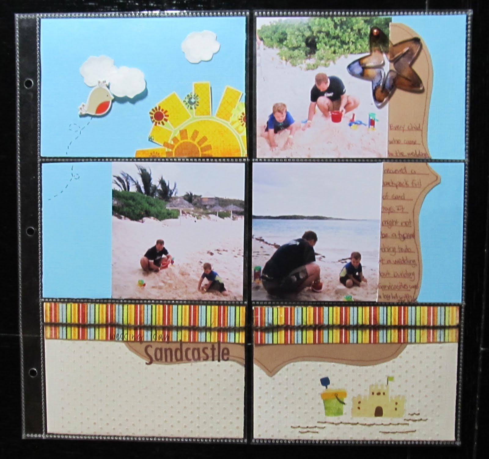
A few years ago, We were invited to attend a beach wedding. It was a lot of fun, though I will admit it felt very odd to attend a wedding dressed in a bathing suit and beach attire. My son thought it was awesome. He hates to dress up. The bride also made sure all of the kids who attended would receive a backpack of sand toys. The sand toys kept all of the kids( and my husband) occupied while we awaited for the wedding to start. It was a definite win-win scenario!
I left my camera at home since the wedding was at a beach. I opted for some disposable waterproof cameras as I had no idea what we might encounter in regards to sand and water. When I began scrapping these pictures, I decided to try some of the 4x6 pocket sleeve style page protectors rather than the traditional 12x12. I had received a package of them for free with an album purchase.I figured this would be a great opportunity to use them since the photos were all standard 4x6 prints. I found there were a lot of pro's and cons to using these page protectors. You really need to plan where these will go in your album as the pockets are on both sides of the page protector. Using the photo sizes the pockets are intended for makes things a lot easier. I think If I had used one of the kits, like the simple stories line, which are designed for these types of page protectors, I would have had a much easier time. Once I got going though, it made for a quick and easy page.
I did crop the 4x6 photos down. Not cropping them would have allowed me to just slip them in the pocket. I also chose a Pagemaps sketch, which meant it took a little more time and thought. For a faster page, I could have just decorated 4x6 cards and journal spots and slipped those in. On a positive note, I was able to use scraps for almost the entire page!
Shown above, are the backs of some of the 4x6 blocks. The white sections are the photos. You can also see how I covered page scraps that would otherwise have had gaps or sections missing with other pieces of paper layered over it.
I could have left the tan paper and white clouds plain. However, embossing them gave just a tad more texture to the page. The sand coloured Coredinations cardstock was embossed with swiss dots using my texture boutique. I lightly sanded it to reveal the slightly darker core colour. I chose to use white ink in a cloud shaped stamp with clear embossing powder to add a subtle lining to the clouds. While these would have been just fine plain, this tone on tone embossing gives it a more finished look as does the hand stitching under the sand castle rub on.
Now that I have the hang of working with these type page protectors, I will certainly consider using them more often. I think I will try some soon with one of the kits that are designed for these. Maybe then, I will find I like them even more than I do now.
I left my camera at home since the wedding was at a beach. I opted for some disposable waterproof cameras as I had no idea what we might encounter in regards to sand and water. When I began scrapping these pictures, I decided to try some of the 4x6 pocket sleeve style page protectors rather than the traditional 12x12. I had received a package of them for free with an album purchase.I figured this would be a great opportunity to use them since the photos were all standard 4x6 prints. I found there were a lot of pro's and cons to using these page protectors. You really need to plan where these will go in your album as the pockets are on both sides of the page protector. Using the photo sizes the pockets are intended for makes things a lot easier. I think If I had used one of the kits, like the simple stories line, which are designed for these types of page protectors, I would have had a much easier time. Once I got going though, it made for a quick and easy page.
Shown above, are the backs of some of the 4x6 blocks. The white sections are the photos. You can also see how I covered page scraps that would otherwise have had gaps or sections missing with other pieces of paper layered over it.
I could have left the tan paper and white clouds plain. However, embossing them gave just a tad more texture to the page. The sand coloured Coredinations cardstock was embossed with swiss dots using my texture boutique. I lightly sanded it to reveal the slightly darker core colour. I chose to use white ink in a cloud shaped stamp with clear embossing powder to add a subtle lining to the clouds. While these would have been just fine plain, this tone on tone embossing gives it a more finished look as does the hand stitching under the sand castle rub on.
Now that I have the hang of working with these type page protectors, I will certainly consider using them more often. I think I will try some soon with one of the kits that are designed for these. Maybe then, I will find I like them even more than I do now.
Wednesday, July 20, 2011
Swim America
This month's Red, White and Blue challenge was the perfect motivation for me to scrap the photos of my son learning to swim. He participated in the Swim America program and finished up with it a little over a year ago. I've had the photos sitting, printed and grouped by theme begging for me to get them onto pages, but I was never sure of what paper to use. I had even bought swim team themed stickers quite some time ago when I knew he was going into the program. I realized that the small star print paper and borders in my little 6x6 kit of Pink Paislee's home town summer line would go swimmingly with the photos.
I set to work, happily splattering sapphire glimmer mist onto the card stock.After fidgeting with the photos, I settled on a design. However, I was not happy at all with the team photo. My son seemed lost in the large group of children. I wanted some way to highlight him while still having him a part of the group. I chose to use a scrap piece of vellum. I used an craft knife to cut out a little window. It was a wonderful solution to my dilemma.
I was very pleased to use up some older Making Memories silver snaps. I used my son's first ribbon as a part of the page while adding some of the sticker's I had been holding onto for so many years. In these photos, my son could not yet swim well, but they allowed him to participate with a coach as a spotter. he raced in the seahorse race(pool noodle) and a paddle board race.
My second page started off with the best of intentions. When I was almost done, I realized I had a big problem. My photos were off-centre.
I chose to draw attention away from that using markers and hand stitching. The off kilter squares sort of hide the off kilter photos and border. It may not be as noticeable here due to the lovely straightening feature of my photo editing software. ;)
We'd love it if you shared some patriotic themed pages and projects with us here at Scrap Our Stash. With all of the wonderful events this month, I am sure you will have plenty of photo ops!
Monday, July 18, 2011
Cool...Like a Fool in a Pool
It's a fun title. The rhyming sing song chant of it sort of gest you amped up for a fun scrapbook page. It's one of the rub on titles from Fancy pant's beach bum line. It was perfect for these shots of my son and husband in the pool. My son was actually being quite the silly fool on this particular day. Apparently, it's quite fun to swim underneath a waterfall...which he then decided to do over and over again. I guess it's a kid thing. My favourite part about these photos is how my husband is always nearby and smiling. He's not one to pose for photos very often ( partly because I take too many photos). Quite truthfully, these are candid shots of him watching our son...which makes the shots all the more special to me.
I went a little out of my comfort zone for this page. I chose to try some free collage software recommended by Club CK. It's called Photovisi.You just go to their website, pick a collage and add photos. Then you can move your photos around and edit it.After you are done editing, you save the collage to your computer and print.The only downside is that when you print your collage, there is a small watermark on one corner. I cleverly hid it with the ric rac trim and swimsuit style banner.
The rub on and swimsuit trunks are from my July Counterfeit kit. I fussy cut those swim trunks from some of the fancy pants paper. The photo corners were my son's idea. I had scraplifted this page from Kathleen Summers ( see her page here- Fabulous 4th). Her page has photo corners. looking through my stash just did not reveal the right thing. I had this MM frame from the Sabrina collection and my son made the comment that it was a shame it wasn't blue. This gave me the great idea to paint it with turquoise acrylic paint. I cut it apart and did just that. It left enough pieces for use of my second, complimentary page.
I can feel really good about these pages because I used up several things from my stash that, before now, I had no clue what to do with: the frame, bathing suit patterned paper, and the road sign. Combining the travel and beach theme in my counterfeit kit really helped me see these products in a new way.
* also submitted at Scrapfit for WWU#9
I went a little out of my comfort zone for this page. I chose to try some free collage software recommended by Club CK. It's called Photovisi.You just go to their website, pick a collage and add photos. Then you can move your photos around and edit it.After you are done editing, you save the collage to your computer and print.The only downside is that when you print your collage, there is a small watermark on one corner. I cleverly hid it with the ric rac trim and swimsuit style banner.
| Making Memorie sabrina frames, cut and painted turquoise dmc floss twinery twine in carribbean Fancy Pants paper and rub on maya road Ric rac Basic grey brads |
The rub on and swimsuit trunks are from my July Counterfeit kit. I fussy cut those swim trunks from some of the fancy pants paper. The photo corners were my son's idea. I had scraplifted this page from Kathleen Summers ( see her page here- Fabulous 4th). Her page has photo corners. looking through my stash just did not reveal the right thing. I had this MM frame from the Sabrina collection and my son made the comment that it was a shame it wasn't blue. This gave me the great idea to paint it with turquoise acrylic paint. I cut it apart and did just that. It left enough pieces for use of my second, complimentary page.
I can feel really good about these pages because I used up several things from my stash that, before now, I had no clue what to do with: the frame, bathing suit patterned paper, and the road sign. Combining the travel and beach theme in my counterfeit kit really helped me see these products in a new way.
* also submitted at Scrapfit for WWU#9
Friday, July 15, 2011
The Magic Mirror
We all have those papers we don't know what to do with. It has been suggested that I should purge my stash and get rid of them. I find it hard to do. One reason being that I would hate to take the time to do that. It's time I could spend creating. The other reason being that it's sometimes those odd papers that end up being just the right thing. Take Graphic 45's Halloween in Wonderland papers. I won a pad last year. It's one of those papers that has a nice weight and quality but that frankly, is just not my normal style. I used some for a swap hoping for inspiration. I still had a lot left. So there it sat. Then last November, I found the perfect photos for using some of the paper up. Or rather, the opportunity to take photos that would compliment the paper arose.
We were waiting in the kid's fitting room of a department store. The attendant had gone to get my son some more pants to try on. In the corner was this fun house mirror. As my son began making faces in it, I snatched my camera out of my purse and began snapping away( I never leave the house without lip gloss and the camera). All I could think of as I was taking the photos was the silly Alice in Wonderland paper. The layout was taking shape in my mind right there. I guess that's the sign of a true scrapbook addict. LOL
The first page was made last December shortly after the photos were taken. I had 2 sheets of this tea party paper. I took one, cut out the center square and flipped it to reveal the pattern on the back. I used scraps of black card stock to help adhere it back together. By allowing some of the black card stock to peek out, I was able to roll it and tear it to create the look of a window.
Some of the elements were fussy cut from other papers. I cut the heads off of matchsticks and glued cut embellishments to them.
Sometimes, I don't make the second page right away. If I am not making a traditional two page layout, I may save the photos for a later date. Sometimes I save them for a specific challenge or for when they inspire me again. I just completed page two this week.
I saw the song challenge for Scrap it with a song and I thought I could alter some of the lyrics to make a great subtitle for this page. This week's song is by the Police..." Every Little Thing She Does is Magic." I chose to use the subtitle of " It's magic" to fit in with the Alice and Wonderland theme of the page. Seeing this particular challenge had made me want to go back and complete page two. If you get in a rut, scrapping photos or challenges that you find interesting are often a great way to find your creative spark again.
We were waiting in the kid's fitting room of a department store. The attendant had gone to get my son some more pants to try on. In the corner was this fun house mirror. As my son began making faces in it, I snatched my camera out of my purse and began snapping away( I never leave the house without lip gloss and the camera). All I could think of as I was taking the photos was the silly Alice in Wonderland paper. The layout was taking shape in my mind right there. I guess that's the sign of a true scrapbook addict. LOL
The first page was made last December shortly after the photos were taken. I had 2 sheets of this tea party paper. I took one, cut out the center square and flipped it to reveal the pattern on the back. I used scraps of black card stock to help adhere it back together. By allowing some of the black card stock to peek out, I was able to roll it and tear it to create the look of a window.
Some of the elements were fussy cut from other papers. I cut the heads off of matchsticks and glued cut embellishments to them.
Sometimes, I don't make the second page right away. If I am not making a traditional two page layout, I may save the photos for a later date. Sometimes I save them for a specific challenge or for when they inspire me again. I just completed page two this week.
I saw the song challenge for Scrap it with a song and I thought I could alter some of the lyrics to make a great subtitle for this page. This week's song is by the Police..." Every Little Thing She Does is Magic." I chose to use the subtitle of " It's magic" to fit in with the Alice and Wonderland theme of the page. Seeing this particular challenge had made me want to go back and complete page two. If you get in a rut, scrapping photos or challenges that you find interesting are often a great way to find your creative spark again.
Friday, July 8, 2011
I want this thing off me...a Pagerize this challenge!
A very short time ago, we had a very sick cat. He had several surgeries and fought off severe infections and complications from kidney crystals. At one point, we thought we would lose him. In January, I got these photos of him trying to take the cone off of his head. It was one of those defining moments when I knew he'd be ok. Boo was back to being his clown self. He has since gained back all of the weight he lost and his personality is as playful as it ever was. When I saw Joni's page, I knew it would be perfect for this series of photos featuring Boo's attempt's at taking his cone off.
Now it's your turn to find the right photos and papers so that you can play along with the Scrap Our Stash Pagerize This challenge!
Subscribe to:
Posts (Atom)