 |
| Sketchy Thursday 12-8-11 sketch Little Yellow Bicycle canvas border Basic grey papers Sassafrass alphas with glossy accents and glass beads glimmer mist in Candy apple red and meadow October afternoon stickers I-rock gems K and Co. brad coffee filter |

Showing posts with label Sketchy Thursday. Show all posts
Showing posts with label Sketchy Thursday. Show all posts
Monday, December 12, 2011
Cookies For Santa
No...we did not bake them this year. At least not yet. I just finally got around to scrapping about last year's cookies. LOL. Nothing like being a bit behind, right? Months ago, I scrapped the photos of my son baking said cookies. As I was flipping through last December's album, I thought now might be a good time to use the scraps up. I must say, that when I saw that the Sketchy Thursday sketch really helped this page come together quickly.
Perhaps soon, I shall get to baking this years cookies. Those photos sure make me hungry for some!


Tuesday, December 6, 2011
The Silly Rabbit
Yes, I know it may seem odd to scrap an Easter page during December. However, the photo wwas really begging me to scrap it. I was keeping current pretty well up until a few months ago. Now I am woefully behind. Aren't we all though!?!? Anyway, here's a little something spring during the cold months of winter. We had taken my son to an Easter carnival earlier this year. When I saw the rabbit walking around, I knew I wanted a photo of my son with him. My son obliged and the rabbit added a little silliness to the whole thing which equaled the perfect photo!
update: on 12-8-11, this page was chosen as a Sketchy Thursday Fave! I am so excited. This is the first time I have been picked!
 |
| Sketchy Thursday 12-1-11 sketch- Cosmo cricket papers-floral and bunnies, polka dot paper-sassafrass, sassafrass flowers, cosmo cricket border sticker, Sassafrass chipboard, pink paislee button, DMC floss, MM ribbon, American crafts rub on letters, Webster's pages alph stickers with glossy accents, glimmer mist in Electric blue and viva pink |
Tuesday, September 13, 2011
Reach for the Sky
Now you may think I had photos of us riding horses or spending time on a farm, but in reality, I have these photos of my husband playing with our cat. So how does that go with a western theme?He gets our cat to put his paws up in the air. It's very silly and a lot of fun to watch. It makes me think of a little kid playing cowboy and my cat is just sort of happily going along with it all.
So now that I had decided to go with a western theme, I set about trying to carry it to the page. I decided I wanted to use a phrase like " get your paws up" or " reach for the sky". I imagined using western themed papers and embellishments. However, in going through my supplies, I really had very little in that genre. What I did finally find were some die cuts, well over 10 years in age( still not sure why I have those. I bought them when my son was about two.) and some more current My Mind's Eye die cuts in a boy theme which just happened to feature a saddle. With die cuts in hand, I set out to find the perfect paper to go with them. I asked myself what reminded me of the western theme. I came up with denim, bandannas ,hand-tooled leather...all with a somewhat weathered look.
For the hand- tooled leather, I decided to stamp and heat emboss the old boot die cut. It's subtle, but I think it gives just enough texture and adds to the theme.

It reminds me of the fancy boots and leather saddles I saw as a child.
I used an off colour cowboy die cut as a mask. The colour just did not work well with the rest of the page, but as a mask, it was perfect. I think I have discovered a use for all those old, plain die cuts sitting un-loved in my stash.
Leftover scraps from old jeans made the perfect background since I never could find just the right paper. Twine outlining the circle and accents of gingham ribbon also added to the texture and theme. All in all, a page proving that having specifically themed papers is not a necessity to set the right tone for your page.
So now that I had decided to go with a western theme, I set about trying to carry it to the page. I decided I wanted to use a phrase like " get your paws up" or " reach for the sky". I imagined using western themed papers and embellishments. However, in going through my supplies, I really had very little in that genre. What I did finally find were some die cuts, well over 10 years in age( still not sure why I have those. I bought them when my son was about two.) and some more current My Mind's Eye die cuts in a boy theme which just happened to feature a saddle. With die cuts in hand, I set out to find the perfect paper to go with them. I asked myself what reminded me of the western theme. I came up with denim, bandannas ,hand-tooled leather...all with a somewhat weathered look.
For the hand- tooled leather, I decided to stamp and heat emboss the old boot die cut. It's subtle, but I think it gives just enough texture and adds to the theme.
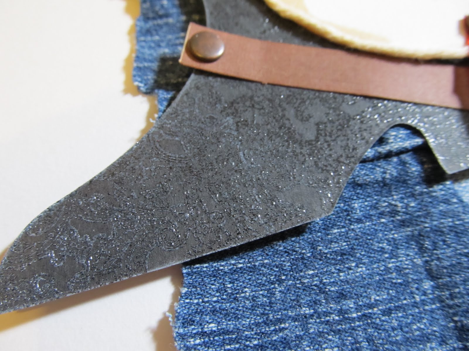
It reminds me of the fancy boots and leather saddles I saw as a child.
I used an off colour cowboy die cut as a mask. The colour just did not work well with the rest of the page, but as a mask, it was perfect. I think I have discovered a use for all those old, plain die cuts sitting un-loved in my stash.
 |
| Sketchy Thursday 9-8-11 sketch scrap of old blue jeans sapphire glimmer mist My Mind's eye die cuts unknown die cut boot from the dawn of scrapping i-rock jewels- brown square metal Making Memories snaps(antique) unknown gingham ribbon colorbox chestnut roan ink |
Leftover scraps from old jeans made the perfect background since I never could find just the right paper. Twine outlining the circle and accents of gingham ribbon also added to the texture and theme. All in all, a page proving that having specifically themed papers is not a necessity to set the right tone for your page.
Sunday, August 14, 2011
Baker, Baker
When I started scrapbooking a little over a decade ago, I never imagined that I would be using anything other than traditional supplies. Yet here I am today, using things like coffee filters. What a wonderfully versatile and cheap supply! I do admit that I spray mine with archival mist before using them on a page. Since beginning to use coffee filters( just this past week), I have discovered a variety of tutorials and crafting ideas for using them. I anticipate using them often in the future!
In the Mother Load class at Big Picture Classes, we have been discussing the reasons we choose specific items for a layout. Sometimes we choose things unconsciously or because they are an obvious means of conveying our story. In this page,I chose to use a single coffee filter. The filter itself reminds me of an oversize cupcake liner. The texture of the filter paper also reminds me a bit of a chef's paper hat or of being in the kitchen. So it was an easy fit in the page about my son and our holiday baking.
I chose the papers and embellishments for their colour and mood. The red and green symbolize traditional Christmas colours. While the papers patterns and gently aged appearance remind of cosy times in the kitchen with my Mom and Grandma. In my home, baking goes hand in hand with a mess. We try our best, but things always get splattered around a bit. So I felt the splashes of glimmer mist would be a subtle reminder of that.
Though the reasons behind the items I chose may not be traditional ones or even obvious to everyone, the overall composition of the page delivers the tone I wanted to convey. I invite you to explore some non-traditional supplies in your scrapbooking. Like the coffee filters, they just might help you embellish your story in just the right way.
In the Mother Load class at Big Picture Classes, we have been discussing the reasons we choose specific items for a layout. Sometimes we choose things unconsciously or because they are an obvious means of conveying our story. In this page,I chose to use a single coffee filter. The filter itself reminds me of an oversize cupcake liner. The texture of the filter paper also reminds me a bit of a chef's paper hat or of being in the kitchen. So it was an easy fit in the page about my son and our holiday baking.
 |
| Sketchy Thursday 8-11-11 sketch glimmer mist in Meadow and Candy Apple Red coffee filter,cut in half Little Yellow Bicycle canvas border Basic grey paper and border sticker Colorbox chestnut roan ink Artsylicious brads and flower Sassafrass alpha-Burlap with glossy accents |
I chose the papers and embellishments for their colour and mood. The red and green symbolize traditional Christmas colours. While the papers patterns and gently aged appearance remind of cosy times in the kitchen with my Mom and Grandma. In my home, baking goes hand in hand with a mess. We try our best, but things always get splattered around a bit. So I felt the splashes of glimmer mist would be a subtle reminder of that.
Though the reasons behind the items I chose may not be traditional ones or even obvious to everyone, the overall composition of the page delivers the tone I wanted to convey. I invite you to explore some non-traditional supplies in your scrapbooking. Like the coffee filters, they just might help you embellish your story in just the right way.
Sunday, August 7, 2011
A Kitty Comparison Part One
Anyone who has pets will tell you that each pet has their very own, unique personality. My two cats are no exception to that rule. Each of my cats prefers to be held and cuddled in different ways. I decided this might be a good thing to document. So for once, the idea for the layout and the journalling to go with it came before the photos. So last fall, I staged some photo ops with my son and both of our cats.
I did get around to making one of the the pages last December. In the coming days, you will get to see that page as part of my post for Scrap Our Stash. For now, you'll have to be satisfied with seeing the page about Sweetpea, my female cat.
Sweetpea is one of those cats who can't get enough time to cuddle with you. You can hug her, carry her around the house in a basket, throw her over your shoulder...whatever the method, she just wants to be close to you and she is happy. Sometimes though, as in the photo, she can be a bit of a distraction during school work. She has a tendency of climbing onto you and then sort of draping herself over your shoulder like a scarf.
In the next few days, you will see the post with the layout about Boo. He is a little more aloof than Sweetpea is. He prefers to hang out close by. When he does want to be held, he wants to be held like a baby being rocked. GO Figure! So stay tuned...
I did get around to making one of the the pages last December. In the coming days, you will get to see that page as part of my post for Scrap Our Stash. For now, you'll have to be satisfied with seeing the page about Sweetpea, my female cat.
 |
| Sketchy Thursday's 8-4-11 sketch Basic Grey max and Whiskers collection: Stickers, papers and trim Maya Road heart Twinery twine in cappucino Fancy Pants alphas white acrylic paint Smooch Spritz in spun sugar DMC floss |
Sweetpea is one of those cats who can't get enough time to cuddle with you. You can hug her, carry her around the house in a basket, throw her over your shoulder...whatever the method, she just wants to be close to you and she is happy. Sometimes though, as in the photo, she can be a bit of a distraction during school work. She has a tendency of climbing onto you and then sort of draping herself over your shoulder like a scarf.
In the next few days, you will see the post with the layout about Boo. He is a little more aloof than Sweetpea is. He prefers to hang out close by. When he does want to be held, he wants to be held like a baby being rocked. GO Figure! So stay tuned...
Tuesday, July 19, 2011
The Method Behind the Little Monsters
I am in the process of training for a Marathon. It's not the kind you run. It's the kind you scrap. It's also known as the Mother LOAD. Over the next few weeks, we'll be training to scrap 26 pages over the course of 26 days. For those of you who don't know what LOAD stands for, it means LayOut A Day. Finding the time to make a scrapbook page every single day is quite the undertaking. I have completed two other LOAD's this year. During the first one, in February, I managed to create a page every day. For the second one, in May, I managed to make a lot of pages but did not get to scrap daily. I did learn a lot during both. The main thing being that letting go of perfection is fine. Just choose your photos and products and start scrapping. I have made a lot more pages since then. I find that I am loving more of my pages now that I have freed myself from making them perfect. After all, people are looking at your albums for the story, not your page composition.
As part of the Mother Load, we were asked to go over our creative process. While creating pages this week, I realized that I have more than one process. I think this is a good thing, as it open me up to different means of inspiration. I thought I would share a couple of those creative methods with you today.
The first page was inspired by an HTC phone ad that I saw while reading a magazine at the hair salon. It looked a lot like this one:

So I snapped a photo of it on my smart phone. What I liked most about it was how the phone made the letter O in the center of You. I wanted to do something like it on a page.I actually held onto it for awhile until I came across the right photos. I ended up using a photo and hand stitching to create the O in Monster's.
This was one of those photos that I had been unsure what to do with. Sometimes ideas or thoughts sort of stew around for a bit in my head.The same went for the paper( no clue how to use it), but once I got the idea for the title, the page came together. By sticking with the SEI kit, I was able to quickly select papers and stickers to go on the page. Paint has become a go to medium for me. I can always get the colour I need versus spending time searching for the perfect Cardstock. In this case, the paint helped tone down the busy pattern. I used to hang onto elements like the sticker because I felt they had to be used a certain way as they were intended. Now, I have no fear about altering them. In this case, it was designed to be about one person. I just chose to cross over the word "is" and write in the word "are" so that I could include all of the kids' names. I also made an error on this page. I wrote the date incorrectly. While I was able to wipe it off, it left a smudge. I decided I was ok with it, since the page was a bit messy anyway.
Sometimes photos inspire me. Other times, I see a sketch and instantly know what photo to use with it. I tend to print off a bunch of photos and I have them in my albums in the order I want the finished pages to be in. When I saw the Sketchy Thursday 7-14-11 sketch, I knew at once which photo I wanted to scrap. I had a second little monster themed photo.
Having made the prior page, it was easy to find and use the same supplies. In fact, I often tuck scraps from the first completed page into the album right along with the other photos. Then they are right there when I am ready to work on page two. Having the sketch right there meant it was easy to pull the elements I wanted for the page from the scraps. The title took a little more thought. often on the second page, I will not include a title or will make a subtitle. In this case, the title is part of the journaling which reads " I could hear them giggling. So I peaked under the bed and 6 eyes stared back at me." The white paint helps anchor the photo on the page along with the shelf created by the scraps and stitching. A visual triangle has been created with the orange monster, orange writing in the journaling, and the orange strip of paper under the title.
I have a few other creative methods that inspire me to work. Most of the time it's a photo. Sometimes, it's a new product or a kit I made from shopping my stash. What allows me the most time to scrap is the way I arrange my photos. I think that's something I shall have to photograph and share in another blog post.
As part of the Mother Load, we were asked to go over our creative process. While creating pages this week, I realized that I have more than one process. I think this is a good thing, as it open me up to different means of inspiration. I thought I would share a couple of those creative methods with you today.
The first page was inspired by an HTC phone ad that I saw while reading a magazine at the hair salon. It looked a lot like this one:
So I snapped a photo of it on my smart phone. What I liked most about it was how the phone made the letter O in the center of You. I wanted to do something like it on a page.I actually held onto it for awhile until I came across the right photos. I ended up using a photo and hand stitching to create the O in Monster's.
 |
| SEI papers and sticker Basic Grey alphas paper trunk Black alphas colorbox black ink |
This was one of those photos that I had been unsure what to do with. Sometimes ideas or thoughts sort of stew around for a bit in my head.The same went for the paper( no clue how to use it), but once I got the idea for the title, the page came together. By sticking with the SEI kit, I was able to quickly select papers and stickers to go on the page. Paint has become a go to medium for me. I can always get the colour I need versus spending time searching for the perfect Cardstock. In this case, the paint helped tone down the busy pattern. I used to hang onto elements like the sticker because I felt they had to be used a certain way as they were intended. Now, I have no fear about altering them. In this case, it was designed to be about one person. I just chose to cross over the word "is" and write in the word "are" so that I could include all of the kids' names. I also made an error on this page. I wrote the date incorrectly. While I was able to wipe it off, it left a smudge. I decided I was ok with it, since the page was a bit messy anyway.
Sometimes photos inspire me. Other times, I see a sketch and instantly know what photo to use with it. I tend to print off a bunch of photos and I have them in my albums in the order I want the finished pages to be in. When I saw the Sketchy Thursday 7-14-11 sketch, I knew at once which photo I wanted to scrap. I had a second little monster themed photo.
 |
Sei papers and puffy black alphas Cosmo Cricket tiny type alphas dmc floss white acrylic paint Sassafrass chipboard number Sketchy Thursday's 7-14-11 sketch |
Having made the prior page, it was easy to find and use the same supplies. In fact, I often tuck scraps from the first completed page into the album right along with the other photos. Then they are right there when I am ready to work on page two. Having the sketch right there meant it was easy to pull the elements I wanted for the page from the scraps. The title took a little more thought. often on the second page, I will not include a title or will make a subtitle. In this case, the title is part of the journaling which reads " I could hear them giggling. So I peaked under the bed and 6 eyes stared back at me." The white paint helps anchor the photo on the page along with the shelf created by the scraps and stitching. A visual triangle has been created with the orange monster, orange writing in the journaling, and the orange strip of paper under the title.
I have a few other creative methods that inspire me to work. Most of the time it's a photo. Sometimes, it's a new product or a kit I made from shopping my stash. What allows me the most time to scrap is the way I arrange my photos. I think that's something I shall have to photograph and share in another blog post.
Sunday, February 27, 2011
Down by the Covered Bridge
I know I should not scrap every single photo I take...but there were so many wonderfully beautiful pictures of our trip to Vail,CO. Though these two were similar, I loved the serene beauty and could not resist including both on a page. My Son looks so cute and little near the covered bridge.
I had begun using this color scheme on another page from this trip, so I continued it here. I love how the deep blue looks against the forest inspired green. It felt perfect to capture our hike through the town.I used a border from a swap I was in. The embossed snowflakes in it's design were perfect for this page. My Sew Easy made it a snap to stitch the snowflake style border.
 |
| Sketchy Thursday 2-24-11 challenge PageFrame Designs acrylic snowflake Imagine That- Winter Fun paper Pink Paislee Alphas in coconut |
Friday, February 18, 2011
Home Economics
I don't know about you, but I never learned to cook in school. I have heard that some took such classes. Home economics in my school was all about sewing...which I never have done well(except for on a Layout). Anyhow, cooking is and important skill. I learned only a tiny bit from my mother and grandmother. The rest I learned on my own. I am no gourmet chef, but I can feed my family just fine. I didn't want for my son to one day go out in the world without the skills he would need to cook and care for himself. So I set out to make cooking part of our homeschool curriculum. I figure that he's there with me anyhow and I also admit that I really enjoy these moments with him in the kitchen.
On this particular day, my son had decided he wanted to cook a whole chicken. So we got out some rosemary and other spices and set to work. As you can see, he quite enjoyed the experience. Little Yellow Bicycle's Savor collection was the perfect line for this page. I have been saving bread tags and this was the perfect page to use them on. I added a little pen detail and a recollections sticker, then hung them on some Twinery Pea pod baker's twine. For a fun twist to the title, I substituted the Maya Road house motif for the "o" in the title.
I chose to use scraps from the first page to create a second layout. Going with today's LOAD211 prompt, I kept it simple with 5 patterned papers, alphabet stickers and journal strips.
 I am finding these LOAD prompts fun and inspiring. It is wonderful to make quick, decisively made pages that I like the overall look of. Almost as wonderful as enjoying a meal I have made with my son.
 |
| Sketchy Thursday 2-17-11 sketch Scrap Whispers Go Green Recycle challenge-bread tags |
I chose to use scraps from the first page to create a second layout. Going with today's LOAD211 prompt, I kept it simple with 5 patterned papers, alphabet stickers and journal strips.

Saturday, January 22, 2011
The Pink Pancake Party
Pink is not a color most boys would love. I admit, it is not always one I favor. However, pink is the main color for Valentines day. So when I saw pink pancake mix, I thought it would be a sweet way to treat my little sweethearts. I also picked up some vanilla pancake mix with red, white and pink sprinkles, however, it was truly the pink pancakes with chocolate chips that garnered all of the attention. After all, how often do you see a pink pancake?!?!
I wanted a Valentine's feel for the page, but I also wanted a homey, cozy feel. Basic Grey's Bittersweet collection was the perfect choice. I loved the pinks, reds and whites while the brown prints reminded me of the chocolate chips. Add in some Pink Paislee Bayberry cottage brads, Prima lace and some hand stitching and I had the cozy feel I was going for.After dotting the "i" in pink with a heart, I accented the title with glossy accents and marker to make it pop out a bit more.
Since I was on a roll, I continued onward with page two, this time adding a 7gypsies journaling tag and a bread tag. I recycled that bread tag from my cupboard and added some stickers with glossy accents. I love the way it looks hanging off the thread.
 I do apologize that my son never smiled nicely in the photos. It was, evidently, due to the large quantity of pink present at the time the photos were taken. He did, however, eat his pink pancakes down to the last crumb.
 |
| Sketchy Thursday's Feb. GDT challenge sketch |
Since I was on a roll, I continued onward with page two, this time adding a 7gypsies journaling tag and a bread tag. I recycled that bread tag from my cupboard and added some stickers with glossy accents. I love the way it looks hanging off the thread.

Tuesday, January 11, 2011
Warm Wishes
If you live in a cold climate, then this page may very well make you laugh. I live in a tropical clime and recently, we had a cold snap with record low temperatures. I took a photo during the afternoon of our patio thermometer. I like to document the weather. I think it's good to remember that, wherever you may live, the weather is sometimes the same, but at other times unexpected. I know that's a given...but I also know many times we have a tendency to overlook such small details. Those small details may prove interesting later on. But I digress...
So back to the page at hand. We reached a high in the low 60's. It's not really a big deal...except when you factor in that we have no central heat. We live in a place that rarely gets this cold. So this means that the house is only 3-5 degrees warmer than whatever it is outside. So this was taken during the day, and you can well imagine when the temperature dropped 10 plus degrees at night how cold the house was. For us it was freezing! We survived though...bundled up, with lots of hot cocoa to drink and some warm wishes.

Some of you may recognize the cute snowman 4x6 card from the WE R Memory Keepers merry January line. I love the paper. For whatever reason, I thought I'd be satisfied with the 4x6 pad. I don't know why I thought this. Anyhow, since I am currently on a spending freeze, this meant I had to get really creative with my stash. The white polka dots of MY Mind's eye's Andrea Victoria line reminded me of snow. Since the color seemed to fit well, I added the matching black sheet and then inked both with colorbox white ink. For a little added texture, I ran some leftover clear packaging through my texture boutique with a Swiss dot embossing folder.
 I sanded it a bit and then layered on making memories chipboard snowflakes and lush brads. Some prima lace and hand stitching finished off the page. If you like the page design, then check out Sketchy Thursday's Jan. 6th post. BTW, there is a wonderful challenge to scrap about winter over at Sketches for all in the challenge forum. Maybe I'll see some of your creations over there. I hope so. Meanwhile, I am off to start page 2...
So back to the page at hand. We reached a high in the low 60's. It's not really a big deal...except when you factor in that we have no central heat. We live in a place that rarely gets this cold. So this means that the house is only 3-5 degrees warmer than whatever it is outside. So this was taken during the day, and you can well imagine when the temperature dropped 10 plus degrees at night how cold the house was. For us it was freezing! We survived though...bundled up, with lots of hot cocoa to drink and some warm wishes.

Some of you may recognize the cute snowman 4x6 card from the WE R Memory Keepers merry January line. I love the paper. For whatever reason, I thought I'd be satisfied with the 4x6 pad. I don't know why I thought this. Anyhow, since I am currently on a spending freeze, this meant I had to get really creative with my stash. The white polka dots of MY Mind's eye's Andrea Victoria line reminded me of snow. Since the color seemed to fit well, I added the matching black sheet and then inked both with colorbox white ink. For a little added texture, I ran some leftover clear packaging through my texture boutique with a Swiss dot embossing folder.

Sunday, August 29, 2010
Paper strips
For those of you looking for the Goodbye Summer Hello Fall!blog hop, scroll down to the post below this one.
Paper strips can be an effective way to highlight a photo. In this case, I made a matte out of paper strips. It's easy to do. I used my cricut to cut two of the same shape. You could also use a stencil or circle cutter...or just cut two rectangles or squares of the same size. Next, layer the two shapes together so that all sides match, then use you paper trimmer to cut strips at even increments. You can then easily piece together alternate colors as you adhere them to the page in the shape of your photo matte.
 I used an older Sketchy Thursday's sketch for this page. For the background below the matte, I spritzed glimmer mist in moonlight and frost. The main inspiration for this page were these cute die cuts which I received in a Club CK swap. I immediately knew I wanted to use them with these photos of my son's first experiences with snow. For added interest, I used 3-d adhesive on some of the letters and on the snowflake.
If you try a page with paper strips, you can submit it over at Scrapwhispers.There are other inspirational ideas there to help you use up leftover paper strips in your stash.
Paper strips can be an effective way to highlight a photo. In this case, I made a matte out of paper strips. It's easy to do. I used my cricut to cut two of the same shape. You could also use a stencil or circle cutter...or just cut two rectangles or squares of the same size. Next, layer the two shapes together so that all sides match, then use you paper trimmer to cut strips at even increments. You can then easily piece together alternate colors as you adhere them to the page in the shape of your photo matte.

If you try a page with paper strips, you can submit it over at Scrapwhispers.There are other inspirational ideas there to help you use up leftover paper strips in your stash.
Tuesday, August 10, 2010
Capturing A Hummingbird
I had never seen a live hummingbird until recent years. Now I am lucky enough to see them quite frequently. The community which we recently moved to seems to support a thriving population. I have long wished to capture them on film. It's a daunting task considering that they won't come too close and fly at incredible speeds. For whatever reason, on this particular day, one hummingbird decided to hang out on our patio. Not to mention, that she was gracious enough to allow me to come within a few feet of her. I saw her flitting about, teasing our cat with her aerial acrobatics, and thought she would fly away as soon as I came out the front door with my camera. She just flew around...watching me. I snapped furiously...and though the photos are not of the greatest composition, I am so happy that I captured her photo.

I chose DCWV Far eastern stack paper for its red flowers...since hummingbirds love them so much. I fussy cut some of the branches and blooms.The background card stock is also DCWV. Since it had an oriental feel to the paper, I rubbed platinum colorbox ink on a red strip of card stock. I added a gold brocade Crate Paper trim. This is Sketchy Thursday's 8-5-10 sketch.
The above is page two of the layout. I completed page one during a Club CK one hour challenge. I used part of a chipboard stack remnant to create a frame. I inked it with Autumn Leaves red ink and colorbox Platinum. The alphabet has been in my stash for some time. I don't even remember who makes it. To update it and add dimension, I used glossy accents over the letters. The brads are K and company.


I chose DCWV Far eastern stack paper for its red flowers...since hummingbirds love them so much. I fussy cut some of the branches and blooms.The background card stock is also DCWV. Since it had an oriental feel to the paper, I rubbed platinum colorbox ink on a red strip of card stock. I added a gold brocade Crate Paper trim. This is Sketchy Thursday's 8-5-10 sketch.
The above is page two of the layout. I completed page one during a Club CK one hour challenge. I used part of a chipboard stack remnant to create a frame. I inked it with Autumn Leaves red ink and colorbox Platinum. The alphabet has been in my stash for some time. I don't even remember who makes it. To update it and add dimension, I used glossy accents over the letters. The brads are K and company.

Monday, June 21, 2010
For My Husband
My DS tends to dominate my lay outs. It's no secret that he is the center of the universe for DH and I. Add to that, the fact that DH is very rarely a willing subject for photos. DH will turn away or make silly faces. A few weeks ago, I issued a challenge on Club CK to take some must have summer photos. DH has a sunglasses fetish...so I figured I would do my best to capture him with them on and scrap the photos, silly or not. Well, I got those photos. Only they are not at all silly... and the more that I looked at them, The more that I realized this was not going to be an LO just about DH's love of sunglasses. So I waxed sentimental and the journaling became about my love of my wonderful husband. When I saw the 6-17 sketch on Sketchy Thursday, I felt these photos fit right onto it.
http://sketchythursdays.blogspot.com/2010/06/617-sketchy-thursdays-challenge.html

I wanted paper that made the lay out feel warm and special to me. I ended up choosing Basic grey's periphery because it was masculine, while capturing some of DH's favorite colors. I had the matching Basic grey ribbon and buttons. I cut the title on my cricut with the CK invitation font. The border is cut from a free svg file. A freind of mine made it. You can find it on her blog:
http://paperscrapsandpicturepassion.blogspot.com/2010/06/freebie-svg-file-day-5.html
I used some My Mind's Eye rub-ons on page 2.

Tuesday, June 8, 2010
Let's Gloss over it!
Because I love gloss. When I was younger, I preferred lipstick.Now...it's almost always lip gloss. My favorite splurge being a small tub of Christian Dior gloss that just makes my lips so soft and shiny. But wait...this blog isn't about beauty tips. It's about scrapbook pages. So what does gloss have to do with anything? Well, It's about a bottle of Glossy Accents to be exact. And I have discovered that I love it about as much as my lip gloss.
Initially, I had wanted a bottle of Diamond Glaze. Unfortunately, the Little Scrapbook store closest to me does not carry it...but they do carry Glossy accents. Same difference, or so I am told. I still want to try Diamond Glaze, if only to compare. For now though, I am liking what I can create with the Glossy Accents.
So, what did I make? Well, I wanted to do something special for DH's birthday photo. I decided to make a frame for the photo that said Happy Birthday...and then use the glossy accents to suspend some sequins into the letters. It was a lot of work, but I do like what I made. AND... I was able to submit it for the Sketchy Thursday's 6-03 challenge:

So, Now you are asking yourself, how did I make this frame? Well, If life were easy, I'd have a Big Cricut. As it stands, I only have a baby bug. So, I couldn't just make the frame fit into the cutting mat. Honestly, you could make this type of frame even without a cricut or die cut machine. You will need to have the following:
-Patience
-an exacto knife or other craft knife
-letters( these can be chipboard letters, stencils, or print letters using your word processor and cut them out to make your own stencil)
-Glossy accents or Diamond Glaze

You can see in this photo the white CS letter I traced.
1. Trace around the edge of the photo that you want to frame onto a piece of Cardstock.
2.Take your letters(or numbers or even shapes for that matter), trace them around the edge of the rectangle( in this case 4x6) as desired.
3. use your craft knife to fussycut the frame out.
4. apply the glossy accents or Diamond glaze to the letters. Before I did so, I put pieces of cut up sequins onto the letters. On some letters, I painted with smooch ink so it would have a slight shimmery effect under the clear glaze. You could also use confetti, glitter, small beads, sand...use your creativity to figure out what you want to add to your creation.
5. let dry and then adhere photo.
Here is a photo at an angle so that you can see the raised effect of the glaze. The Glossy Accents are also a great way to turn old flat stickers into epoxy style stickers.

Wednesday, June 2, 2010
Danger! Sharks!!!
A few years ago, we had the wonderful opportunity to go on a deep sea fishing excursion near Nassau,Bahamas. it also happened to be my son's first ever fishing trip. I ended up with a lot of great photos! So many, that I ended up with two 2-page Layouts!
I created this first LO using a sketch from Let's scrap.
http://letsscrap.ning.com/photo/ls128-november-25?context=album&albumId=2186252%3AAlbum%3A94293
I have been wanting to scrap these photos for a long time. I had even bought a specialty paper from Wubie papers for this LO. However, for the longest time, I never knew how I wanted to work with that paper. Now that I am doing more fussycutting, I felt a little more confident about cutting the paper. I cut a slit along the fishing rod which allowed me to slide in a photo of my son and, at the same time, hide someone's arm that had gotten into the shot. I had so many oddly sized photos that I wanted to use. So, on the right hand page, I tore a strip of DCWV white core cardstock. This allowed me to group like photos together while distracting from the various sizes.

The 2nd LO utilized a Sketchy Thursday's 5-27-10 sketch:
http://sketchythursdays.blogspot.com/2010/05/527-sketch-challenge.html

I loved the way that the words wrapped around the borders on the sketch...but every time I tried to type a word border or write one, I was unhappy with the results. I have seen a lot of color on color punches used lately and have wanted to experiment with the look. So I used my cricut and cut arrows and "Danger Shark" with the Cry Kitty font in white cardstock. I then created a border around the edges. The red "danger" signs are fussy cut from a sheet of Creative imaginations transparency. I cut the sharks using an SVG file on my cricut and then sprayed them with Sapphire glimmer mist. For the background, I framed the white 12x12 cardstock so i would leave a white border...and then spritzed the center with Patina Glimmer mist. I journaled on leftover paper strips, then inked the edges with Colorbox Prussian blue. Overall I like the results...it's just hard to keep the page flat as the glimmer mist made it buckle a little.

On a side note...I have just found another great challenge site: http://www.practicalscrappers.com/
and I hope to submit this page there for the vellum and transparency challenge.
Monday, May 24, 2010
Cockatiel Hair
Sometimes my son's hair sticks up in the back. Today was one of those days. I only had my phone camera with me, but still wanted to catch DS being silly while DH teased him about it. The camera in my phone is just not that great. So sadly, the photos are very grainy. I converted them to Black and white to help. They looked a tad bit better than in color...not much better, but at least I have the photos. I used a paper napkin band( on the left side) from Bennigan's since that is where the photos were taken. the ribbons are Cosmo Cricket- jack's World. I used a K and Company citronella journal tag. The alphas are Sassafrass Lass chipboard in juicy. I inked an MM chipboard arrow with colorbox Blue Lagoon ink. I inked the edges of the PP in Colorbox chestnut roan. The PP is Sassafrass Lass- take a chance and golden love. the flower is sassafrass Lass- in a stitch blossoms:blue.
Once again, I used a Sketchy Thursday sketch. This time, it's for the 5-20 sketch challenge:
http://sketchythursdays.blogspot.com/2010/05/520-sketch-challenge.html
I handmade the bird accent. I got the idea from Club CK to make something if I couldn't quite find the right thing in my stash. The bird that inspired me was a DCWV chipboard bird from the green stack collection. You can see it here with my bird:

I sketched the shape by hand and cut...2 times. I used 3-d adhesive foam to make the accent have more dimension.I did the same for the wing. I used a yellow marker to add "stitches" to the edges and a black marker to make the eye. I used my orange pencil to color the beak. The legs are just scrap pieces of orange CS.To make the plumes, I cut thin strips of scrap CS. I then rolled it and let the roll come undone until it looked as I desired it. My zig glue pen came in very handy here. To adhere the plumes to the head and to make the tail, I twisted the paper to make it flat, added glue and stuck it on. I used a dot of glue between each tail plume to keep them from coming apart. You can see how I twisted the paper here:


Add a Comment
Once again, I used a Sketchy Thursday sketch. This time, it's for the 5-20 sketch challenge:
http://sketchythursdays.blogspot.com/2010/05/520-sketch-challenge.html
I handmade the bird accent. I got the idea from Club CK to make something if I couldn't quite find the right thing in my stash. The bird that inspired me was a DCWV chipboard bird from the green stack collection. You can see it here with my bird:

I sketched the shape by hand and cut...2 times. I used 3-d adhesive foam to make the accent have more dimension.I did the same for the wing. I used a yellow marker to add "stitches" to the edges and a black marker to make the eye. I used my orange pencil to color the beak. The legs are just scrap pieces of orange CS.To make the plumes, I cut thin strips of scrap CS. I then rolled it and let the roll come undone until it looked as I desired it. My zig glue pen came in very handy here. To adhere the plumes to the head and to make the tail, I twisted the paper to make it flat, added glue and stuck it on. I used a dot of glue between each tail plume to keep them from coming apart. You can see how I twisted the paper here:

And finally, the big reveal:

Add a Comment
Saturday, May 22, 2010
Danger: Falling Coconuts!
I decided I would try out the sketch for the June Guest design team challenge on Sketchy Thursdays. I really like their sketches. At first, I wasn't going to submit it because I am just not sure if my SB pages are "there" yet. I am definitely still evolving in this craft. Then I thought about it and figured "why not." It doesn't hurt to submit and in the end, even if I don't get chosen, I have another page completed.
To that end, I had some photos of the damage caused by a coconut falling from the palm tree into our courtyard. I also just happened to get the PP I had ordered from Club Scrap. On a side note, I simply ordered the Castaway PP b/c it so very much fits a lot of the photos I have taken in Florida and the Bahamas. I am still not so sure about becoming a monthly subscriber. So back to the LO, I used some of the castaway PP as the background for this LO. I fussy cut the palm trees so I could slide white CS under the branches. The coconut diagram, "Oh nuts" die cut and the journal spot are also from the Castaway collection.I cut a small danger sign from a piece of creative imagination acetate. The red PP and (on the 2nd page) the teal PP are Making memories passport collection as is the blue ribbon border. The red ribbon is Cosmo Cricket Cogsmo. I inked the edges of the CS and chipboard arrows with Catseye colorbox ink in moss green. The arrows are making memories jigsaw arrows.
This is the single page inspired by the Sketchy Thursdays June guest design team sketch( found here: http://sketchythursdays.blogspot.com/2010/05/june-guest-design-team-challenge.html )

and the 2 page LO showing the complete coconut story:

Saturday, May 15, 2010
Just in the Nick of Time
First off...pardon the appearance of my blog. I am still getting the hang of this. I am trying to personalize it a bit, but found I haven't had much time to play with it. We are getting ready for a week long trip, which is part of the reason the blog is a work in progress. Of course, when given the choice for my spare time, I chose to scrap rather than play with the blog settings. I just managed to finish the latest Sketchy Thursday challenge:
http://sketchythursdays.blogspot.com/2010/05/513-sketchy-thursdays-challenge.html
I chose to use some photos of my pets sitting together. Some of the photos had some goofy shadowing in them, so I used the title tag to hide it. The tag is from My Mind's Eye...one of the great pieces I scored from a peachycheap purchase. All of the PP is DCWV from the pet stack(one of my favorites). The stack is literally in tatters. I really hope to get the new Max and Whiskers collection on my trip. Anyway, back to the LO. I had some red ribbon that I had bought in the dollar bin. I managed to use up some EK success fibers too. The fibers look so good in the package but always seem to be a challenge for me to use. I so prefer ribbon.
And without further digression, my LO:

Tuesday, May 11, 2010
Another sketchy Thursday challenge-determined for Victory
So here I am again...I love these sketches. I can see the sketch and can visualize the photos and the pp. Suddenly, I'm off and the Lo comes together. Seems easy...though there are often hitches along the way. I saw the sketch for this week and visualized using my Black orchid pad...that lovely set with all of those great paper patterns...which has been sitting unused for months waiting for the right photos. In 5 minutes flat, I had cut the PP and laid it out on the cardstock. Excited that it was going so fast, I then hit the first bump in the road. I had these great brads with letters from my stash. It would seem though that I lacked enough e's. I really wanted to title the Lo " Determined for Success" but after playing around with the thesaurus and the available letters( because I was determined to use them) I settled on "Determined for Victory." *It's a little hard to read them because the camera won't pick them up.
So I am off and running again now. I decided to use this Lo as part of a journaling assignment for the Textuality class I am taking at Big Picture Scrapbooking. Here comes hitch 2... I played for an hour with the word processor trying to make the journaling "just so." In the end, I called it quits...deciding I liked what I had. So as usual, a fast Lo quickly turns into several hours of tweaking.
Ahh, the Lo...I made this about my son being determined to blow up a balloon and tie it. My husband had done one, so he figured he could. DS literally tried for hours! This from the Sketchy Thursday 5-6 Challenge. BTW, the font used is CK boutique and as mentioned above, the pp is SEI Black orchid, the letter brads are unknown.
And so, without further ado, the grand reveal:


So I am off and running again now. I decided to use this Lo as part of a journaling assignment for the Textuality class I am taking at Big Picture Scrapbooking. Here comes hitch 2... I played for an hour with the word processor trying to make the journaling "just so." In the end, I called it quits...deciding I liked what I had. So as usual, a fast Lo quickly turns into several hours of tweaking.
Ahh, the Lo...I made this about my son being determined to blow up a balloon and tie it. My husband had done one, so he figured he could. DS literally tried for hours! This from the Sketchy Thursday 5-6 Challenge. BTW, the font used is CK boutique and as mentioned above, the pp is SEI Black orchid, the letter brads are unknown.
And so, without further ado, the grand reveal:

And as usual, I made a 2 page lo:

Tuesday, April 27, 2010
A Sketchy Thursday challenge
I have been learning about all of these new blogs lately and found myself on the Sketchy Thursday blogspot. I love page maps and sketches, so when I saw this sketch, I immediately thought of the photos I had of my cat. So here's my take on the latest sketch.


Subscribe to:
Posts (Atom)