When you hear Emerald, you think of words like bright, rich and vibrant. Emerald isn't shy. It's the kind of green that puts itself out there without being garish. It's one of my favorite colors. In fact, I used it in my wedding.
Wedding Day: with my Mom by Christy Strickler |Supplies: Patterned Paper: Jenni Bowlin, Cartabella; German Foil: JBS Mercantile; Chipboard: Maya Road; Wood Veneer: Studio Calico; Die Cut: Jenni Bowlin for Silhouette; Mist: Pink Paislee; Embossing Powder: Ranger; Stamp: Jenni Bowlin; Doily: Martha Stewart; as seen for Get It Scrapped
Emerald alone is very powerful. Personally, I love to pair it with gold and tan. It's a very elegant palette. I chose to use Emerald sparingly here. I didn't want to overpower the portraits. I used tone on tone embellishments to add interest. The butterflies represent the change that was about to occur in my life.
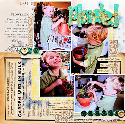
While the first layout might be a formal setting, emerald green is awesome for less formal occasions as well. Planted is a lighthearted layout about my son at a homeschool co-op. The materials used in both of these layouts are similar. The addition of the fun lettering in the title and an array of garden themed papers make the second layout fun and energetic.
Though Emerald green is a jewel tone, pairing it with brighter blues, pinks or sunshine yellow helps keep it more fun and less formal.Choices in patterned paper and motif also play a role in how you perceive emerald green. I invite you to explore some more inspiration for emerald green at Get It Scrapped. If youare looking for more inspiration, you can Go Green with my mood board at Pinterest.


Great use of the Emerald, Christy!! I don't use a lot of Green, so I definitely need to give this color a try!!
ReplyDelete