I can look right at the ad and know just how the embellishments would fit in. The lady becomes a spot for a photo.The shoes become buttons,die cuts and brads. My text and title will fit in quite nicely.Be fore you know it, I have a completed page.
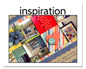
The page I am sharing with you today is chock full of inspiration.Not only did I use an ad, I also used the weekly inspiration piece from Scrapbook News and Review magazine. In the world of creativity,it's always ok to combine your inspiration.

A Firm Foundation by Christy Strickler Supplies Patterend Paper: my Little Shoebox; Alphas: Sizzix; Canvas Border: Little Yellow Bicycle; Die Cuts: Basic Grey; Buttons: Basic Grey, Crate Paper, Love Elsie; Brad: Sassafrass;Flower: Pink Paislee; Other: DMC floss, denim
 For more ideas on how to use the inspiration you can find all around you, check out Masterful Scrapbook Design's August Seminar.
 Also check in weekly at the scrapbook News and Review blog for sketches, inspiration prompts and color palettes.


Great page Christy!! LOVE how you used the ad for inspiration!!
ReplyDelete