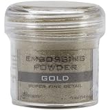
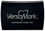
Totally Rad Gamers by Christy Strickler |Supplies Patterned Paper: Studio Calico, Amy Tangerine; Cork, Wood Veneer, Tape, Run-ons, Transparency,Die Cut: Studio Calico; Ink: Versamark; Stamp: Hero Arts; Letters: Basic Grey; Embossing Powder: Ranger; Enamel Dots: Teresa Collins; Sketch from Paper Issues
I always get asked about photos with blurry faces. I don't have permission from the boys moms to post their picture online. I chose to blur their photos rather than not share the layout.
The initial sketch called for a series of circles in the band on the left side. I really had a desire to use some paper scraps. I opted to use paper strips instead. The papers I chose have a graphic feel. I also felt that the journal strips added a nice amount of weight to the design. Therefore, I decided to limit my layering and embellishing. I used several acrylic diamonds. Some were cut in half to extend the design off the page. Others hint at full shapes beneath the photo.
I wanted to add a heat embossed stamped image to the title. I did try to stamp directly to the photo, however, the heat gun warped the photo. It's a good thing I can print at home. I instead chose to stamp and emboss a piece of vellum.
Some might question the use of pink on a layout about a group of boys. There are a lot of strong colors in the layout that prevent the use of pink from feeling feminine. This layout isn't just about kids playing in an arcade. It's also about their friendship. Pink is a color that denotes caring. It also helps to soften some of the stronger colors and images of the layout.
I still have a lot of sorting through my supplies to do. I keep getting distracted. It will be interesting to see what projects might unfold during the coming weekend. Meanwhile, I will keep alternating between creating and organizing.
Supply Options


I like the use of the geometric shapes!
ReplyDelete