 |
| Love Birds sitting on a Branch by Shannacreations |
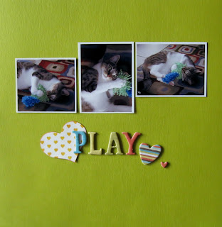
Looking at it, I was struck by the way the paintings looked against the background. I wanted to replicate this look on a page. I chose some bright green Bazzill cardstock and 3 photos of my cat playing.
 |
| made with items from March's counterfeit kit challenge |
I placed the title in the spot where the painting description was placed on the photo. Simple, easy and fast. I really liked the way it looked! I imitated the design on the second page, improvising a bit by adding a second set of photos.
The bright green paper really helped the photos stand out. Simple lets your photos be the star of the page...as they should be.


I totally agree! I love the inspiration, and your page turned out great!!
ReplyDeleteThat trio of painting is stunning! Great take on it! I recently posted a layout about one of my kitties too :)
ReplyDeleteThose painting are so amazingly beautiful. Your LO's turned out very well..
ReplyDeleteJust adorable!!!! xoxo
ReplyDeleteI love it! While I like to play around with different techniques, I'm always drawn to clean lines and simple pages where the photos are the focus.
ReplyDeleteSo much to say... first, I love your esty inspiration - I would totally buy that. I also like what you did with it... the colors are beautiful, love the use of your "white" space.
ReplyDeleteGreat job on the layouts!
I love those paintings! You did a great lift from them.
ReplyDeleteSuper use of inspiration to create something really classy! Love the cat, love the photos, love the pages! Great job!!!!
ReplyDelete